PRISM POINT STUDIO logo review
4/5
Logo score
Logo review of

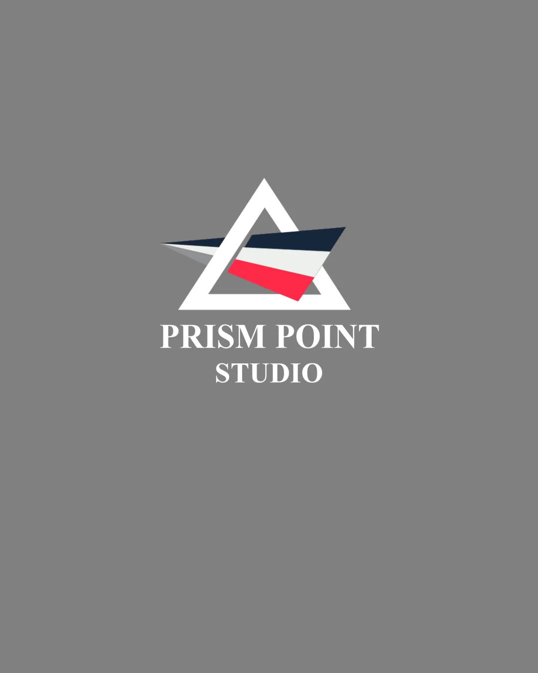
Prism Point Studio

A visually strong, professional combination mark that captures a creative studio feel, with minor refinements needed for small-scale clarity and unity.

Combination Mark Modern Geometric With Classic Typography Creative Services
5/5
Legibility
4/5
Originality
5/5
Misread
3/5
Balance
3/5
Scale
Your next steps

What to fix first

Focus on the changes that matter. Keep what makes the logo work.

1

standalone mark (colored facets within triangle)

Test the mark for clarity and legibility at smaller sizes and simplify internal details if needed.

Worth testing High priority Medium effort
Area to inspectApproximate location

Thin negative spaces and overlapping colored facets may lose clarity at small sizes.

How to check

Render the logo at small icon/favicon scale and inspect for lost detail or visual merging.

See the category review
2

wordmark and mark alignment

Explore reducing the space and adjusting the mark/wordmark sizing for firmer connection.

Optional refinement Medium priority Low effort
Area to inspectApproximate location

The mark and wordmark feel slightly disconnected due to the large gap and visual weight differences.

How to check

Print the logo as-is and with revised spacing to compare unity.

See the category review
Detailed review

Logo performance breakdown

4/5

Brief & logo match

Based on an inferred industry
Compared with

No direct brief; inferred creative studio/visual identity focus from name and imagery.

Logo clearly expresses a creative, professional studio with a modern, directional visual.

  • Creativity/Visual Identity

    The geometric prism form and bold colors suggest creative direction and vision, fitting a studio or modern creative enterprise.

  • Professionalism

    Classic serif wordmark balances the modern mark to support a trustworthy, capable image.

5/5

Legibility

  • Serif wordmark is crisp and highly readable.
  • Letter spacing is balanced.
4/5

Originality

  • Distinctive geometric mark.
  • Color blocking adds interest.
4/5

Color harmony

  • Navy, white, and red are strongly contrasted and memorable.
White#FFFFFF
Navy#1A2238
Red#E94F4F
Grey background#A7A7A7

Estimated colors. Use the original design file for exact values.

Create a full color palette using these colors

Create new palette
3/5

Balance alignment

  • Core geometry is stable.
  • The mark and wordmark feel slightly disconnected due to the large gap and visual weight differences.

    Optional refinement wordmark and mark alignment

    Try: Explore reducing the space and adjusting the mark/wordmark sizing for firmer connection.

    Check: Print the logo as-is and with revised spacing to compare unity.

    Area to inspectApproximate location
Uploaded logoAlignment guide overlay

Inspect spacing with the guide. Optical balance may differ from geometric centering.

3/5

Scalability

  • Simple triangle frames are robust.
  • Thin negative spaces and overlapping colored facets may lose clarity at small sizes.

    Worth testing standalone mark (colored facets within triangle)

    Try: Test the mark for clarity and legibility at smaller sizes and simplify internal details if needed.

    Check: Render the logo at small icon/favicon scale and inspect for lost detail or visual merging.
    Area to inspectApproximate location
Uploaded logo at 200 pixels wide
200 × 250 px
Uploaded logo at 100 pixels wide
100 × 125 px
Uploaded logo at 50 pixels wide
50 × 63 px

Compare the detail at different sizes. Labels show the full image dimensions.

5/5

Misinterpretations

  • No plausible misinterpretation.
4/5

Symbol & text fit

  • Mark and wordmark share a professional, sharp tone.

Black & white

Does the shape still work without color?

These tests are available only for logos uploaded in vector (SVG) format.

Background contrast

Find the surfaces where your logo stays clear.

These tests are available only for logos uploaded in vector (SVG) format.

Blur & silhouette

A 3px blur softens fine details so you can check whether the overall shape stays recognizable. If key gaps close or elements merge, the logo may rely too heavily on detail.

These tests are available only for logos uploaded in vector (SVG) format.

Try your own review

Wondering how your logo performs?

Get a clear logo score, key risks, and priority fix ideas before your client or audience sees it.

Review my logo