Wondering how your logo performs? 🧐
Get professional logo reviews in seconds and catch design issues in time.
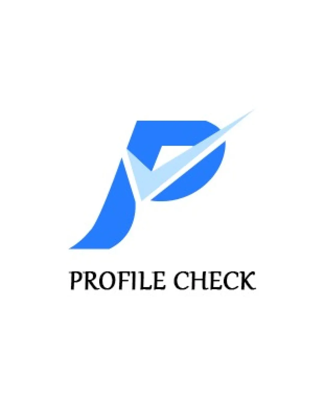
Try it Now!Logo review of PROFILE CHECK
 Logo analysis by AI
Recognized style:
Logo type:
Detected symbol:
Detected text:
Business industry:
Review requested by Vansh
**If AI can recognize or misinterpret it, so can people.
Structured logo review
Legibility
![]() The business name 'PROFILE CHECK' is clear and legible.
The business name 'PROFILE CHECK' is clear and legible.
Scalability versatility
![]() The boldness of the symbol ensures good scalability.
The boldness of the symbol ensures good scalability.
![]() The thinness of the check mark might be problematic at very small sizes.
The thinness of the check mark might be problematic at very small sizes.
200x250 px
100×125 px
50×62 px
Balance alignment
![]() The symbol and text appear well-balanced and aligned.
The symbol and text appear well-balanced and aligned.

Originality
![]() The integration of the check mark adds a unique touch to the letter P.
The integration of the check mark adds a unique touch to the letter P.
![]() The concept of a check mark is commonly used.
The concept of a check mark is commonly used.
Logomark wordmark fit
![]() The text and symbol complement each other, creating a cohesive unit.
The text and symbol complement each other, creating a cohesive unit.
Aesthetic look
![]() The design is clean and professional.
The design is clean and professional.
![]() The color gradient could be simplified for a more timeless look.
The color gradient could be simplified for a more timeless look.
Cultural sensitivity dual meaning
![]() No cultural sensitivity issues detected.
No cultural sensitivity issues detected.
Color harmony
![]() The blue tones work well for conveying trust and reliability.
The blue tones work well for conveying trust and reliability.
![]() The gradient might reduce clarity at smaller sizes.
The gradient might reduce clarity at smaller sizes.


