What to preserve
Integrates an energetic, angular pulse line motif directly into the custom typography, reinforcing the name's meaning through both letterforms and graphic rhythm.
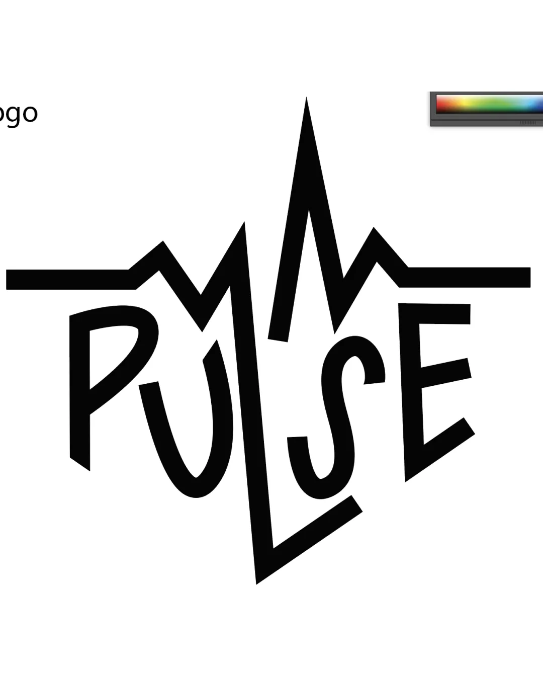
A dynamic, visually engaging wordmark with strong conceptual integration, held back only by minor craft inconsistencies that can be addressed for a polished final asset.
Focus on the changes that matter. Keep what makes the logo work.
Integrates an energetic, angular pulse line motif directly into the custom typography, reinforcing the name's meaning through both letterforms and graphic rhythm.
Current letter height and weighting are uneven; smoothing these will enhance professional polish.
Boosts recognizability and strengthens first-glance impact.
Energetic, bold wordmark feels stylistically on-brand for youth-driven streetwear or nightlife fashion. Punk/electric undertones echo movement and modernity.

Inspect spacing with the guide. Optical balance may differ from geometric centering.
Get a clear logo score, key risks, and priority fix ideas before your client or audience sees it.
More credits needed
Add credits to continue without losing your work.
Then $7/month. Cancel anytime.
Essential logo review with AI
Estimated progress