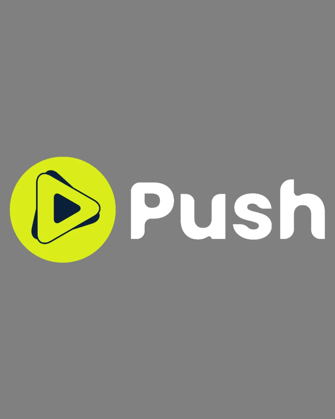
Push logo review
3.5/5
Logo score
Logo review of

Push

Competent and functional, but lacking distinctiveness to truly stand out in a crowded tech landscape.

Combination Modern, Geometric Technology / Digital
5/5
Legibility
2.5/5
Originality
5/5
Misread
4/5
Balance
4/5
Scale
Your next steps

What to fix first

Focus on the changes that matter. Keep what makes the logo work.

1

Standalone mark

Consider introducing a unique twist to the symbol or integrating local/contextual cues.

Visible issue High priority Medium effort
Area to inspectApproximate location

The play button within a circle is a very common motif in tech and media logos, lacking distinctive or unique elements.

How to check

Test alternative symbol treatments for memorability.

See the category review
2

overall

Explore a more vibrant or dynamic background or accent color to better represent next-gen tech.

Optional refinement Medium priority Low effort

The bright yellow-green and white provide good contrast, but the pairing with flat gray can feel subdued and does not evoke energy or innovation.

How to check

Test the palette for vibrancy and modern appeal.

See the category review
Detailed review

Logo performance breakdown

3/5

Brief & logo match

Based on your brief
Compared with

Studio de développement web nouvelle génération et académie tech basé en Afrique de l'Ouest.

Strong baseline fit for tech but does not convincingly express next-gen innovation or regional uniqueness.

  • Digital/Tech Focus

    The play button motif signals digital interaction and tech orientation, fitting the agency profile.

  • Next-generation Positioning

    Standard play icon feels generic and does not communicate innovation or new-generation ambition strongly.

5/5

Legibility

  • Wordmark is highly readable.
  • Letterforms are bold and clear.
2.5/5

Originality

  • The play button within a circle is a very common motif in tech and media logos, lacking distinctive or unique elements.

    Visible issue Standalone mark

    Try: Consider introducing a unique twist to the symbol or integrating local/contextual cues.

    Check: Test alternative symbol treatments for memorability.

    Area to inspectApproximate location
3.5/5

Color harmony

  • Basic palette is clear and contrasts well.
  • The bright yellow-green and white provide good contrast, but the pairing with flat gray can feel subdued and does not evoke energy or innovation.

    Optional refinement overall

    Try: Explore a more vibrant or dynamic background or accent color to better represent next-gen tech.

    Check: Test the palette for vibrancy and modern appeal.

YellowGreen#CBDF35
White#FFFFFF
DarkGray#444444
MediumGray#7D7D7D

Estimated colors. Use the original design file for exact values.

Create a full color palette using these colors

Create new palette
4/5

Balance alignment

  • Icon and text are well-proportioned and aligned.
Uploaded logoAlignment guide overlay

Inspect spacing with the guide. Optical balance may differ from geometric centering.

4/5

Scalability

  • Simple icon and wordmark scale well.
Uploaded logo at 200 pixels wide
200 × 250 px
Uploaded logo at 100 pixels wide
100 × 125 px
Uploaded logo at 50 pixels wide
50 × 63 px

Compare the detail at different sizes. Labels show the full image dimensions.

5/5

Misinterpretations

  • No unintended or problematic dual meanings observed.
4/5

Symbol & text fit

  • Symbol and wordmark have matching rounded, friendly characteristics.

Black & white

Does the shape still work without color?

These tests are available only for logos uploaded in vector (SVG) format.

Background contrast

Find the surfaces where your logo stays clear.

These tests are available only for logos uploaded in vector (SVG) format.

Blur & silhouette

A 3px blur softens fine details so you can check whether the overall shape stays recognizable. If key gaps close or elements merge, the logo may rely too heavily on detail.

These tests are available only for logos uploaded in vector (SVG) format.

Try your own review

Wondering how your logo performs?

Get a clear logo score, key risks, and priority fix ideas before your client or audience sees it.

Review my logo