 View review
Logo score
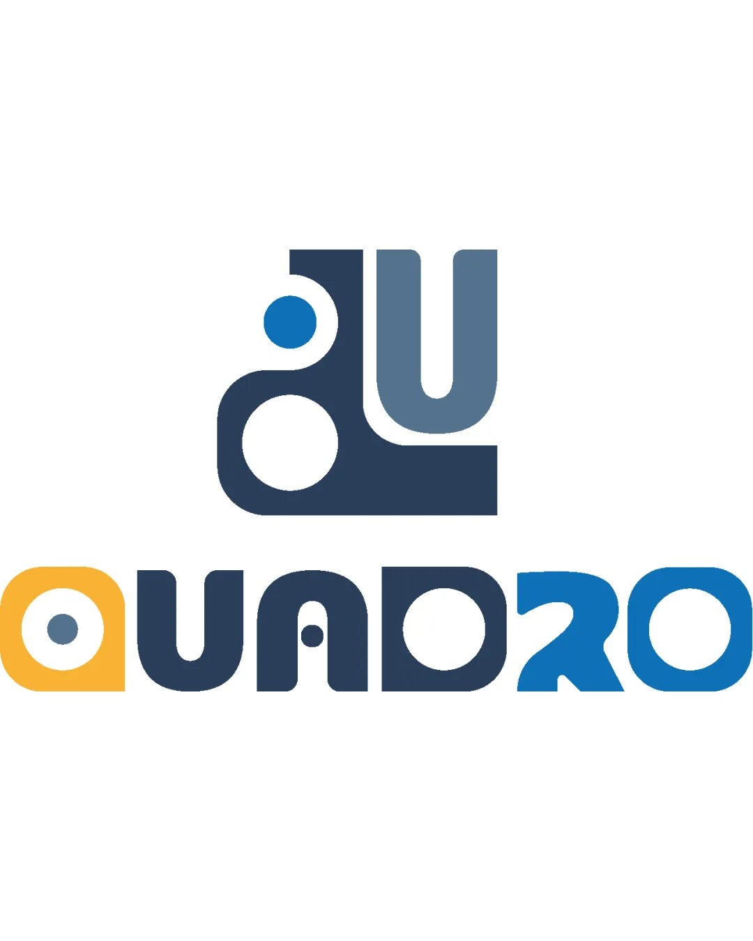
Logo review ofQuadro
Review the detailed scores below to see what is working and what should be refined first.
Legibility
Originality
Misread
Balance
Scale
Detailed review
Logo performance breakdown
Legibility
![]() Distinct geometric shapes make some letters pop
Distinct geometric shapes make some letters pop![]() Color changes help separate letterforms
Color changes help separate letterforms
![]() Several letterforms, especially the 'R', are difficult to recognize at first glance
Several letterforms, especially the 'R', are difficult to recognize at first glance![]() Over-stylization affects wordmark clarity, especially at small sizes
Over-stylization affects wordmark clarity, especially at small sizes
Originality
![]() Customized letterforms and monogram show creative thought
Customized letterforms and monogram show creative thought![]() Distinct geometric motif stands out compared to generic text logos
Distinct geometric motif stands out compared to generic text logos
![]() The concept of geometric abstraction is popular, so some risk of blending with other modern brands
The concept of geometric abstraction is popular, so some risk of blending with other modern brands
Color harmony
![]() Color palette is contemporary and energetic
Color palette is contemporary and energetic![]() Well-coordinated across the mark
Well-coordinated across the mark
![]() Yellow ‘Q’ stands out a bit too much compared to other elements
Yellow ‘Q’ stands out a bit too much compared to other elements![]() Slight risk of too many tones if further expanded
Slight risk of too many tones if further expanded
yellow
#F4B63A
blue
#295370
light blue
#3B6A8C
bright blue
#5396D7
white
#FFFFFF
Your palette is close. Explore sharper color combinations with Colorfly.design before updating the logo.
Explore palettesBalance alignment
![]() Logo elements are visually weighty and generally well distributed
Logo elements are visually weighty and generally well distributed![]() Good symmetry in the monogram
Good symmetry in the monogram
![]() Letter spacing in the wordmark feels inconsistent due to geometric abstraction
Letter spacing in the wordmark feels inconsistent due to geometric abstraction![]() The bright yellow ‘Q’ draws more attention than the rest, unbalancing the logo
The bright yellow ‘Q’ draws more attention than the rest, unbalancing the logo

Scalability
![]() Bold shapes maintain some presence at smaller sizes
Bold shapes maintain some presence at smaller sizes![]() Simple geometric elements translate adequately on most mockups
Simple geometric elements translate adequately on most mockups
![]() Thin counters and complex abstract forms might get lost in very small applications or embroidery
Thin counters and complex abstract forms might get lost in very small applications or embroidery![]() Detailed logo may not always read well as a favicon or small product label
Detailed logo may not always read well as a favicon or small product label
200x250 px
100×125 px
50×62 px
Misinterpretations
![]() No obvious negative or inappropriate visual associations
No obvious negative or inappropriate visual associations
Symbol & text fit
![]() Monogram reflects the style of the accompanying wordmark for consistency
Monogram reflects the style of the accompanying wordmark for consistency
![]() Shapes share visual language, enhancing cohesion
Shapes share visual language, enhancing cohesion
![]() Monogram is slightly more abstract, which may not immediately connect to the wordmark for all audiences
Monogram is slightly more abstract, which may not immediately connect to the wordmark for all audiences
Try your own review
Review my logo
Wondering how your logo performs?
Get a clear logo score, key risks, and priority fix ideas before your client or audience sees it.
Keep exploring


