Wondering how your logo performs? 🧐
Get professional logo reviews in seconds and catch design issues in time.
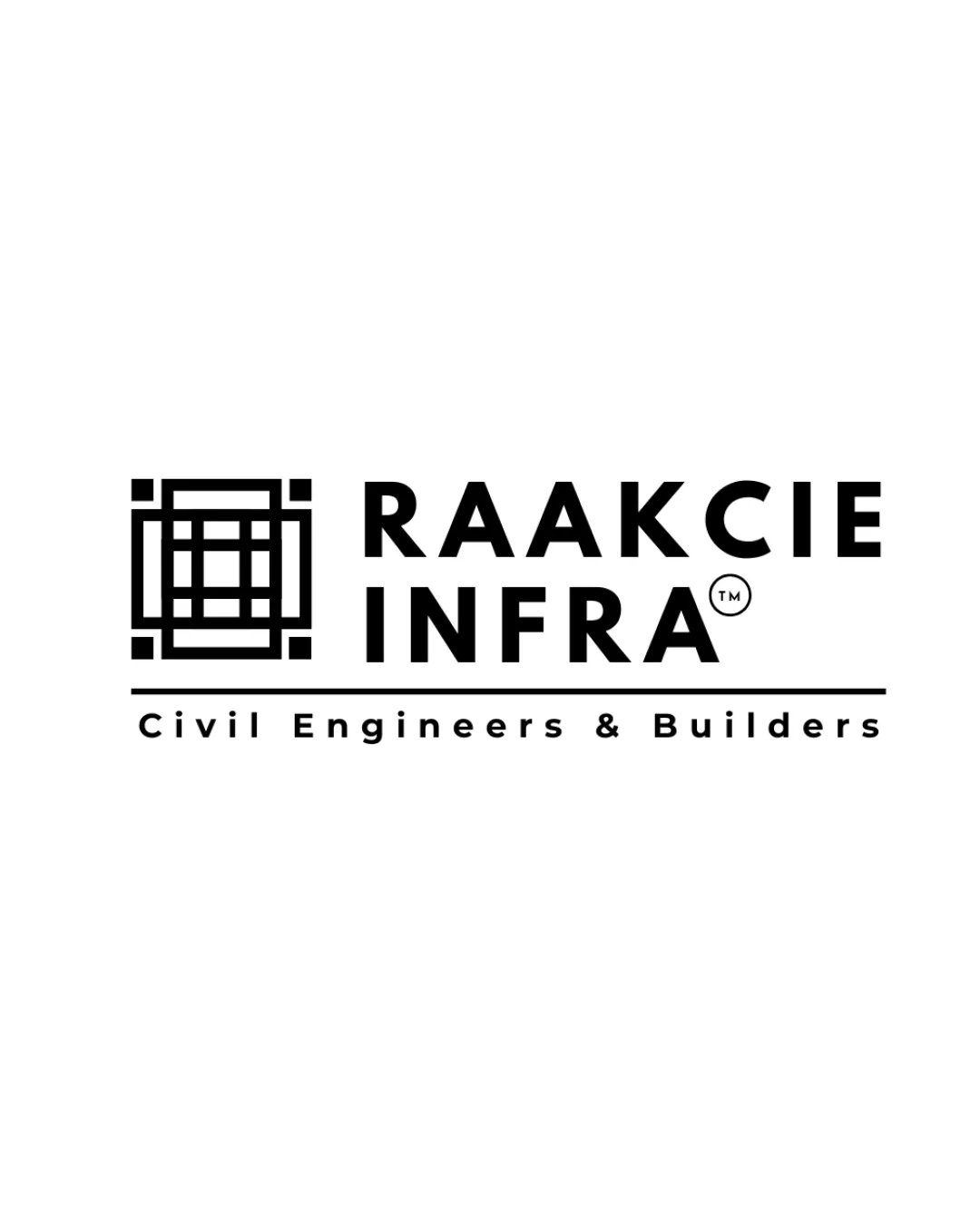
Try it Now!Logo review of RAAKCIE INFRA Civil Engineers & Builders
 Logo analysis by AI
Logo type:
Style:
Detected symbol:
Detected text:
Business industry:
Review requested by Raakcie
**If AI can recognize or misinterpret it, so can people.
Structured logo review
Legibility
![]() Text is clear, highly legible with ample spacing.
Text is clear, highly legible with ample spacing.![]() Contrasting black-on-white enhances readability.
Contrasting black-on-white enhances readability.
Scalability versatility
![]() Bold lines and sans-serif typography maintain clarity at most sizes.
Bold lines and sans-serif typography maintain clarity at most sizes.![]() Simple forms work well on signage, stationery, and digital platforms.
Simple forms work well on signage, stationery, and digital platforms.
![]() Geometric symbol's inner details may lose definition at very small scales (e.g., on favicons, embroidery).
Geometric symbol's inner details may lose definition at very small scales (e.g., on favicons, embroidery).
200x250 px
100×125 px
50×62 px
Balance alignment
![]() Well-balanced left-aligned lockup.
Well-balanced left-aligned lockup.![]() Vertical and horizontal spacing is even.
Vertical and horizontal spacing is even.![]() Logo uses alignment to create a professional and stable look.
Logo uses alignment to create a professional and stable look.

Originality
![]() Geometric symbol references construction/engineering, fitting the industry.
Geometric symbol references construction/engineering, fitting the industry.![]() Modern typographic pairing adds some uniqueness.
Modern typographic pairing adds some uniqueness.
![]() Grid/blueprint motif and geometric monograms are common in construction branding.
Grid/blueprint motif and geometric monograms are common in construction branding.![]() Symbol does not provide a distinctive or highly memorable twist.
Symbol does not provide a distinctive or highly memorable twist.
Logomark wordmark fit
![]() Logomark and wordmark share consistent line thickness and geometric styling.
Logomark and wordmark share consistent line thickness and geometric styling.![]() Visual weight feels balanced, and the symbolic meaning complements the brand name.
Visual weight feels balanced, and the symbolic meaning complements the brand name.
Aesthetic look
![]() Clean, professional, minimalistic—suitable for an engineering firm.
Clean, professional, minimalistic—suitable for an engineering firm.![]() Uncluttered use of space and type.
Uncluttered use of space and type.
![]() Aesthetic leans on generic geometric forms, lacking a distinctive creative edge.
Aesthetic leans on generic geometric forms, lacking a distinctive creative edge.
Dual meaning and misinterpretations
![]() No inappropriate shapes or unintentional imagery detected.
No inappropriate shapes or unintentional imagery detected.
Color harmony
![]() Strong, timeless monochrome palette ensures high contrast and professionalism.
Strong, timeless monochrome palette ensures high contrast and professionalism.![]() Appropriate color choice for corporate/technical industries.
Appropriate color choice for corporate/technical industries.
Black
#000000
White
#FFFFFF


