Wondering how your logo performs? 🧐
Get professional logo reviews in seconds and catch design issues in time.
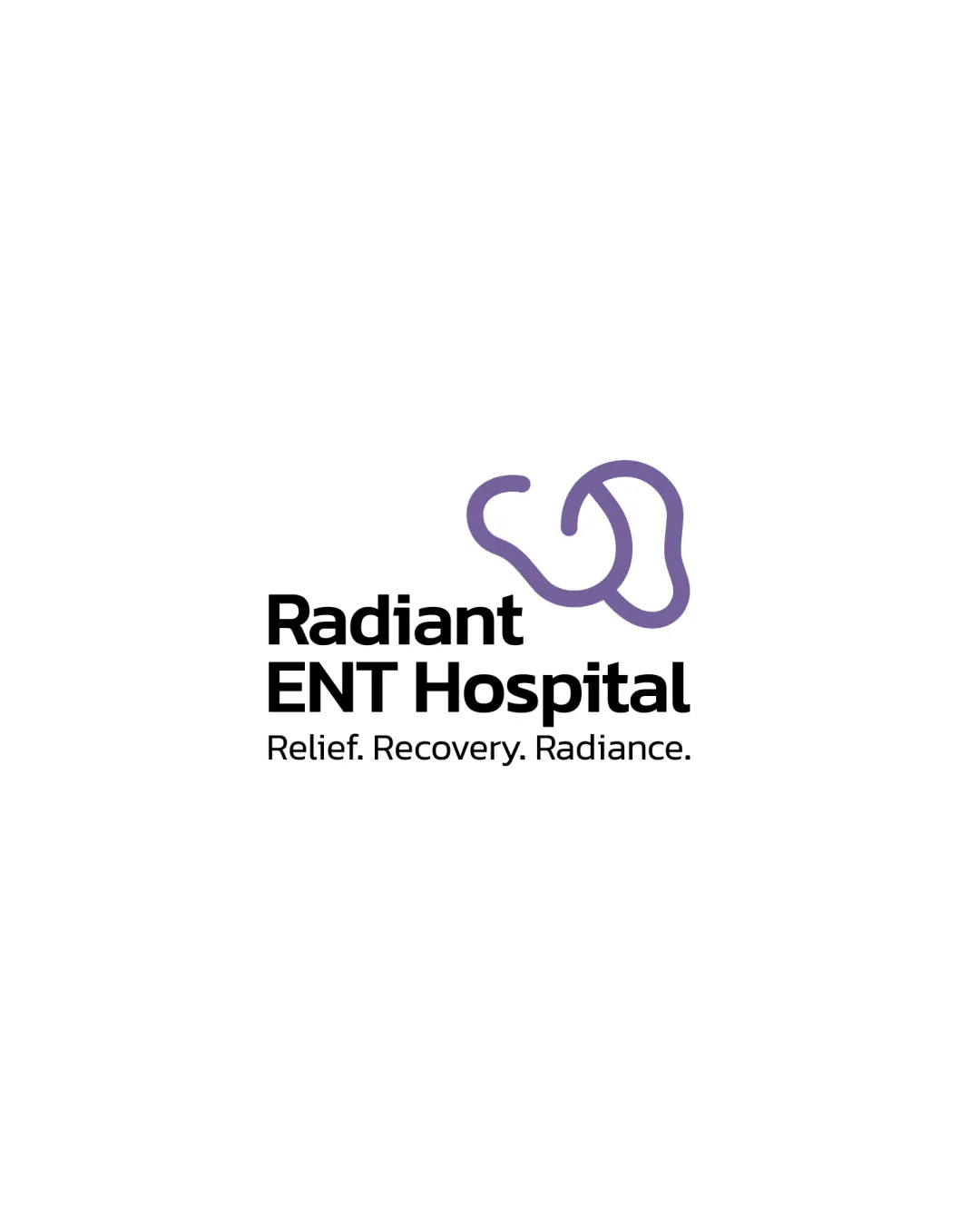
Try it Now!Logo review of Radiant ENT Hospital
 Logo analysis by AI
Logo type:
Style:
Detected symbol:
Detected text:
Business industry:
Review requested by Aneespk
**If AI can recognize or misinterpret it, so can people.
Structured logo review
Legibility
![]() Clear and readable text
Clear and readable text![]() Good font choice for healthcare industry
Good font choice for healthcare industry
Scalability versatility
![]() Minimalist design scales well
Minimalist design scales well![]() Works on business cards and large signage
Works on business cards and large signage
![]() Might lose some detail on very small scales due to thin lines
Might lose some detail on very small scales due to thin lines
200x250 px
100×125 px
50×62 px
Balance alignment
![]() Good alignment of text and symbol
Good alignment of text and symbol
![]() Slight imbalance in weight between symbol and text
Slight imbalance in weight between symbol and text

Originality
![]() Unique symbol relevant to ENT
Unique symbol relevant to ENT
![]() Somewhat literal representation of ear and nose
Somewhat literal representation of ear and nose
Aesthetic look
![]() Clean and professional look
Clean and professional look![]() Appropriate color choice for healthcare
Appropriate color choice for healthcare
Dual meaning and misinterpretations
![]() Symbol is clear and appropriate for the intended industry
Symbol is clear and appropriate for the intended industry
Color harmony
![]() Effective use of two colors
Effective use of two colors![]() High contrast between text and symbol
High contrast between text and symbol


