Wondering how your logo performs? 🧐
Get professional logo reviews in seconds and catch design issues in time.
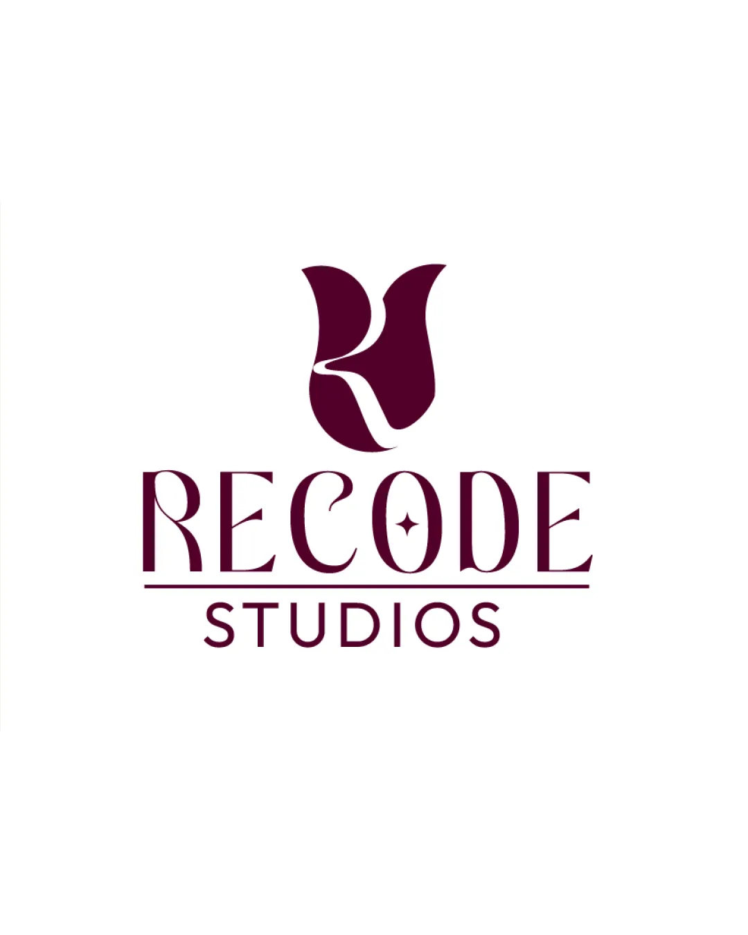
Try it Now!Logo review of RECODE STUDIOS
 Logo analysis by AI
Logo type:
Style:
Detected symbol:
Negative space:
Detected text:
Business industry:
Review requested by Nupurmahajan
**If AI can recognize or misinterpret it, so can people.
Structured logo review
Legibility
![]() Main text 'RECODE STUDIOS' is readable at medium and large sizes.
Main text 'RECODE STUDIOS' is readable at medium and large sizes.![]() Consistent letter spacing enhances word recognition.
Consistent letter spacing enhances word recognition.
![]() Decorative elements, like the star in the 'O' and some extended serifs, may reduce clarity at small sizes.
Decorative elements, like the star in the 'O' and some extended serifs, may reduce clarity at small sizes.![]() Unique font style may hinder quick legibility for those unfamiliar.
Unique font style may hinder quick legibility for those unfamiliar.
Scalability versatility
![]() Logo is clear and recognizable at larger and medium scales such as signage or posters.
Logo is clear and recognizable at larger and medium scales such as signage or posters.![]() Single color palette promotes easier adaptability.
Single color palette promotes easier adaptability.
![]() Thin lines in the font and details in the symbol/star are likely to get lost in small sizes like business cards, favicons, or app icons.
Thin lines in the font and details in the symbol/star are likely to get lost in small sizes like business cards, favicons, or app icons.![]() Complexity of the 'R' symbol reduces legibility in embroidery or very small applications.
Complexity of the 'R' symbol reduces legibility in embroidery or very small applications.
200x250 px
100×125 px
50×62 px
Balance alignment
![]() Reasonable vertical hierarchy between logomark and wordmark.
Reasonable vertical hierarchy between logomark and wordmark.![]() Good horizontal alignment—elements centered well relative to each other.
Good horizontal alignment—elements centered well relative to each other.
![]() Weight of the 'R' symbol is slightly heavier than the typeface, causing a mild imbalance.
Weight of the 'R' symbol is slightly heavier than the typeface, causing a mild imbalance.![]() Thin font and heavy logomark contrast slightly disrupts unity.
Thin font and heavy logomark contrast slightly disrupts unity.

Originality
![]() Original approach to combining a letterform with a symbolic tulip/flame shape.
Original approach to combining a letterform with a symbolic tulip/flame shape.![]() Decorative star in the 'O' adds a custom touch.
Decorative star in the 'O' adds a custom touch.
![]() Abstract tulip/flame is creative but could be mistaken for similarly styled marks in fashion, beauty, or wellness industries.
Abstract tulip/flame is creative but could be mistaken for similarly styled marks in fashion, beauty, or wellness industries.![]() Some elements (like stars in letters) trend toward generic decoration.
Some elements (like stars in letters) trend toward generic decoration.
Logomark wordmark fit
![]() Modern styling in both logomark and wordmark creates a unified visual identity.
Modern styling in both logomark and wordmark creates a unified visual identity.![]() Color usage ties both components together cohesively.
Color usage ties both components together cohesively.
![]() Logomark is visually denser and heavier than the airy wordmark, creating slight disharmony.
Logomark is visually denser and heavier than the airy wordmark, creating slight disharmony.![]() Could improve sizing ratio between symbol and text for optimal balance.
Could improve sizing ratio between symbol and text for optimal balance.
Aesthetic look
![]() Modern, stylish visual presence.
Modern, stylish visual presence.![]() Combines elegance with a dynamic, artistic flair.
Combines elegance with a dynamic, artistic flair.
![]() Multiple flourishes and the bespoke star create mild visual busyness.
Multiple flourishes and the bespoke star create mild visual busyness.![]() Potential overdecoration in type and symbol for minimalist tastes.
Potential overdecoration in type and symbol for minimalist tastes.
Dual meaning and misinterpretations
![]() No inappropriate or misleading symbols identified.
No inappropriate or misleading symbols identified.
Color harmony
![]() Consistent, limited palette ensuring harmony and professionalism.
Consistent, limited palette ensuring harmony and professionalism.![]() Excellent contrast for most backgrounds.
Excellent contrast for most backgrounds.
Claret
#671632
White
#FFFFFF


