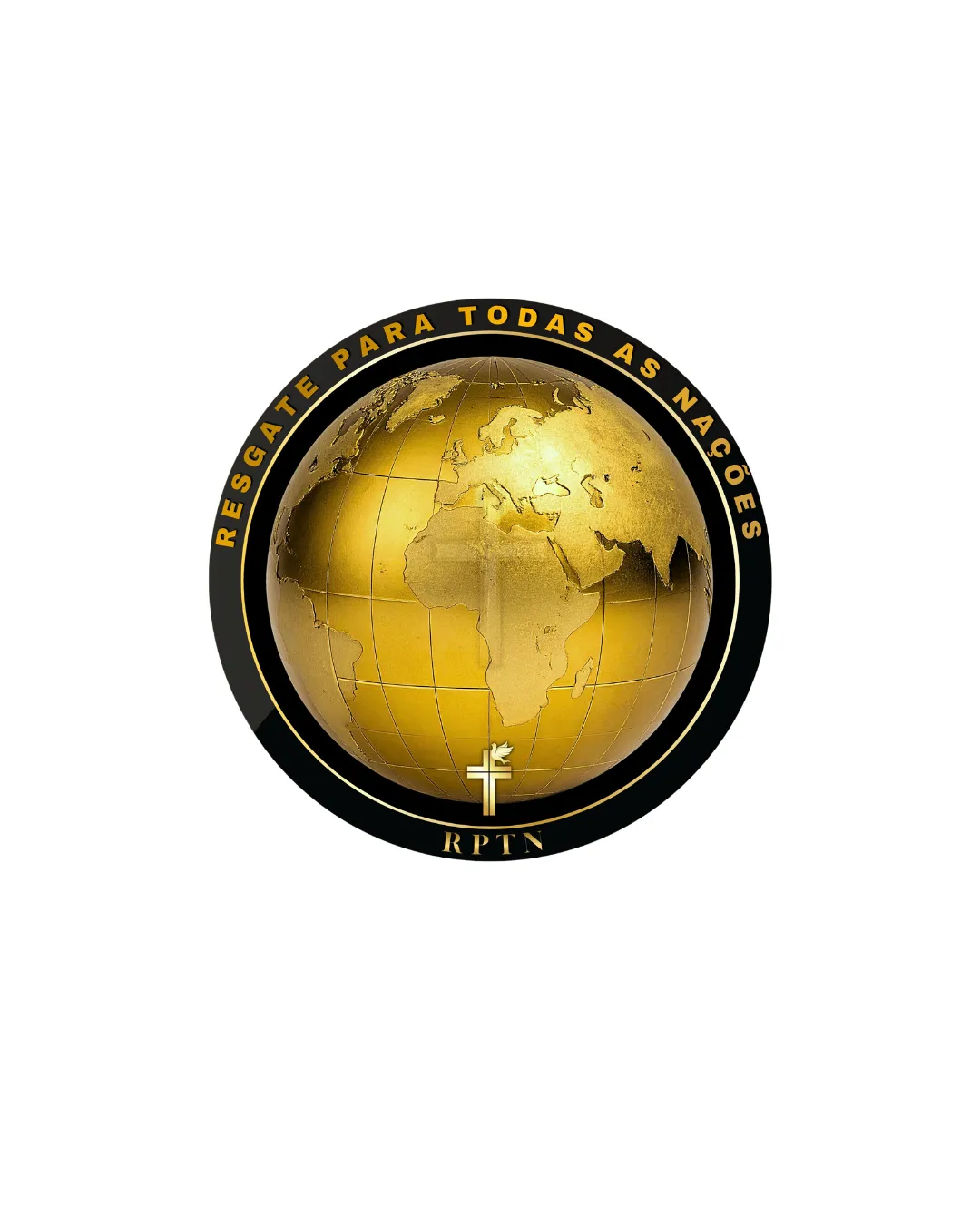
RESGATE PARA TODAS AS NAÇÕES, RPTN logo review
3.0 / 5
Logo score
Logo review of

Resgate Para Todas As Nações, Rptn

A functional, recognizable emblem that communicates its theme well but suffers from generic iconography and reproduction limits. Needs simplification and fresh elements for true distinction.

Objective AI feedback. Your creative decision.

Emblem Realistic Globe With Metallic Effect, Formal Type Religious/faith-based
4/5
Legibility
2.5/5
Originality
4.5/5
Misread
4/5
Balance
2.5/5
Scale
Action plan

What to fix first

The most important fixes to handle before polishing the full presentation.

1

Simplify globe and metallic effects for smaller-size usability and print clarity

High priority

Current complexity sharply reduces small-format legibility.

Impact: Ensures Logo Is Versatile And Effective In All Applications · Effort: Medium

2

Explore a more distinctive symbol or letterform within globe context

Medium priority

A more unique element can boost memorability and ownability.

Impact: Enhances Originality To Differentiate From Generic Christian Globe Logos · Effort: Medium

Detailed review

Logo performance breakdown

4/5

Legibility

Checkmark icon Main wordmark is clear and legible in the ring
Checkmark icon Acronym (RPTN) is distinguishable

Warning icon Smaller text at the bottom could be less readable at small sizes

2.5/5

Originality

Checkmark icon Realistic globe and Christian symbols connect to global ministry

Warning icon Globe-with-cross imagery is common in faith-based design; lacks unique twist

3/5

Color harmony

Checkmark icon Consistent gold and black palette aligns with prestige, faith context

Warning icon Metallic gradients may not reproduce well in all media; flat alternative would help

Gold
#FFD700

Black
#000000

White
#FFFFFF

Color may be holding this logo back. Build a stronger strategic palette before updating the logo.

Build brand colors
4/5

Balance alignment

Checkmark icon Centralized symmetrical composition
Checkmark icon Good visual alignment between globe, ring, and text

Warning icon Acronym at the bottom is slightly cramped under the emblem

logo 200x250 pixels scalability test alignment grid overlay
2.5/5

Scalability

Checkmark icon Strong circular emblem shape helps with clear boundaries

Warning icon Highly detailed globe and metallic effects will lose clarity at small sizes
Warning icon Shading and gradients complicate reproduction in simple formats

logo 200x250 pixels scalability test

200x250 px

logo 100x125 pixels scalability test

100×125 px

logo 50x62 pixels scalability test

50×62 px

4.5/5

Misinterpretations

Checkmark icon No obvious dual meanings or negative interpretations

3 / 5

Logo structure & brief match

Checkmark icon Text and central emblem are visually linked

Warning icon Relationship between acronym and main text could be improved for unity

Checkmark icon Religious/mission Identity: Visually communicates global Christian mission with faith symbols and global reach
Checkmark icon All-nations/rescue Message: World globe and inclusive wording support the outreach theme

Try your own review

Wondering how your logo performs?

Get a clear logo score, key risks, and priority fix ideas before your client or audience sees it.

Review my logo