Wondering how your logo performs? 🧐
Get professional logo reviews in seconds and catch design issues in time.
Try it Now!Logo review of RockPrime
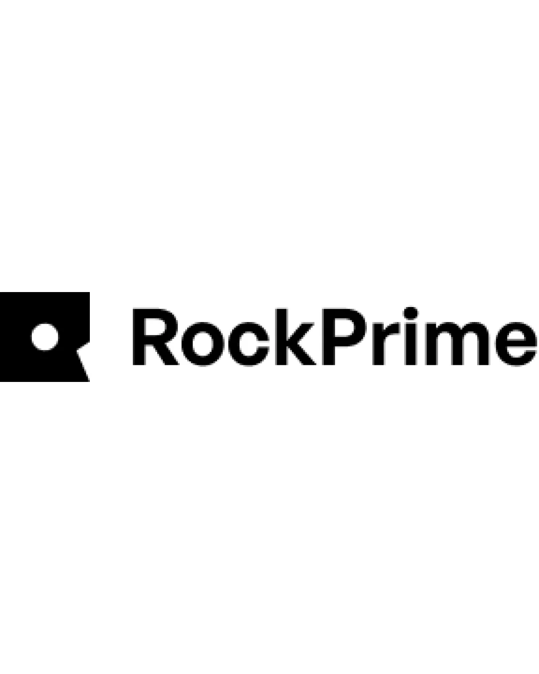
 Logo analysis by AI
Logo type:
Style:
Detected symbol:
Detected text:
Business industry:
Review requested by Hrvoje
**If AI can recognize or misinterpret it, so can people.
Structured logo review
Legibility
Clear sans-serif font
High contrast with background
Scalability versatility
Simple design allows for clear scaling
Effective in monochrome formats
Symbol details might lose clarity at very small sizes

200x250 px

100×125 px

50×62 px
Balance alignment
Good alignment between symbol and text
Well-proportioned elements
Symbol might feel slightly heavy compared to text


Originality
Unique abstract interpretation of a rock
Geometric shapes could be perceived as generic
Logomark wordmark fit
Cohesive stylistic match
Proportional sizing
Minor imbalance due to boldness difference
Aesthetic look
Modern and sleek
Minimalist approach is visually appealing
Simplicity may border on generic
Dual meaning and misinterpretations
No inappropriate symbolism detected
Color harmony
Effective use of single color for focus


