Wondering how your logo performs? 🧐
Get professional logo reviews in seconds and catch design issues in time.
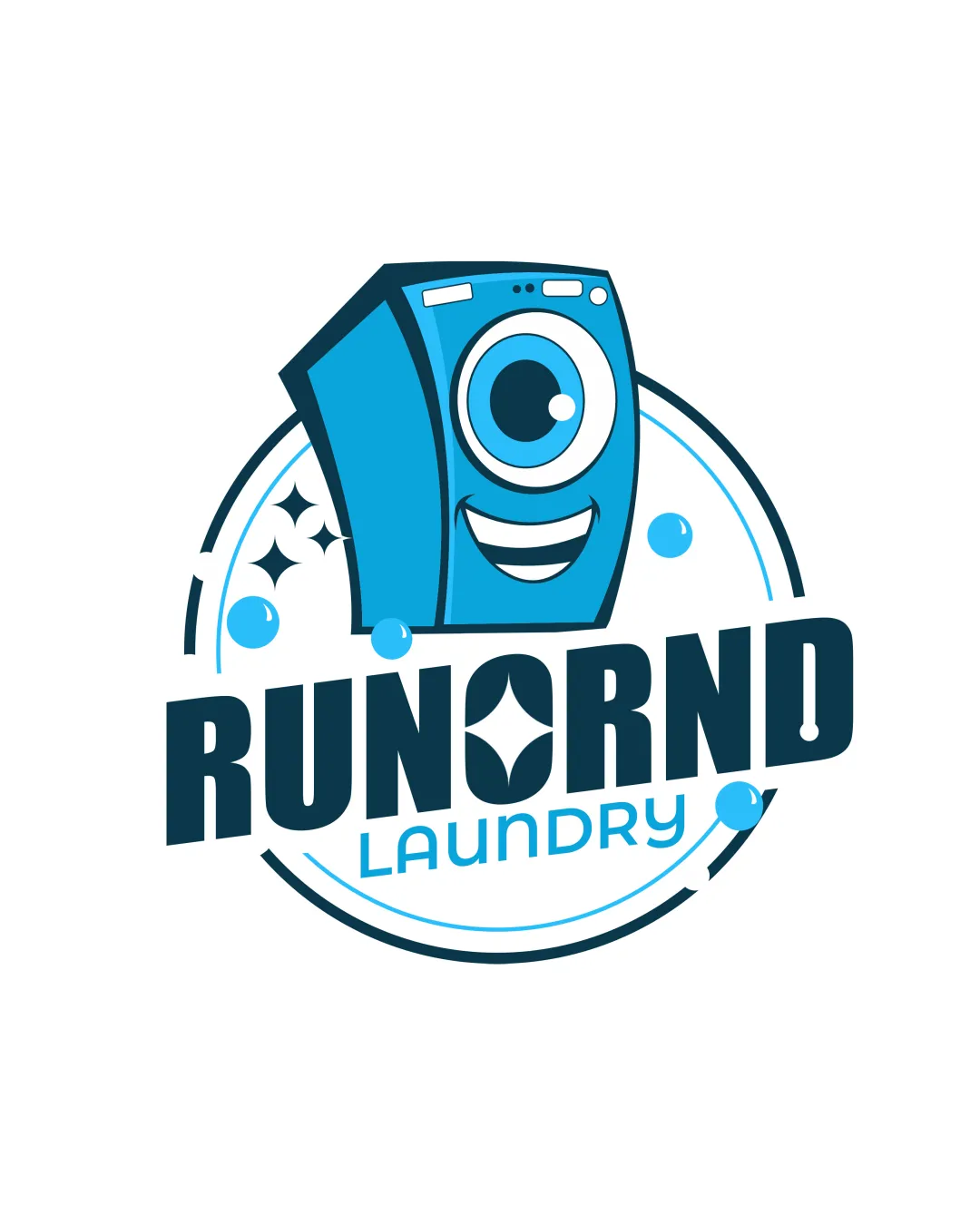
Try it Now!Logo review of RUNNRND LAUNDRY
 Logo analysis by AI
Logo type:
Style:
Detected symbol:
Detected text:
Business industry:
Review requested by Roddyblack
**If AI can recognize or misinterpret it, so can people.
Structured logo review
Legibility
![]() Bold text enhances readability
Bold text enhances readability![]() High contrast between text and background
High contrast between text and background
![]() The 'A' in 'LAUNDRY' may be slightly less legible due to color contrast
The 'A' in 'LAUNDRY' may be slightly less legible due to color contrast
Scalability versatility
![]() Simple shapes ensure clarity at smaller sizes
Simple shapes ensure clarity at smaller sizes![]() Distinct color scheme works in monochrome
Distinct color scheme works in monochrome
![]() Complexity in the washing machine character may reduce clarity at very small sizes
Complexity in the washing machine character may reduce clarity at very small sizes
200x250 px
100×125 px
50×62 px
Balance alignment
![]() Elements are well-aligned and balanced
Elements are well-aligned and balanced![]() Circular layout provides symmetry
Circular layout provides symmetry

Originality
![]() Creative use of a washing machine character
Creative use of a washing machine character![]() Unique integration of laundry elements
Unique integration of laundry elements
![]() Character design is somewhat common in cartoon styles
Character design is somewhat common in cartoon styles
Logomark wordmark fit
![]() Washing machine character complements the text
Washing machine character complements the text![]() Both elements share a cohesive style
Both elements share a cohesive style
Aesthetic look
![]() Playful and inviting aesthetic
Playful and inviting aesthetic![]() Clean and modern appearance
Clean and modern appearance
![]() Might seem overly playful for more serious business contexts
Might seem overly playful for more serious business contexts
Dual meaning and misinterpretations
![]() No inappropriate symbols detected
No inappropriate symbols detected
Color harmony
![]() Consistent color palette
Consistent color palette![]() Colors are visually appealing and harmonious
Colors are visually appealing and harmonious
Blue
#1A9BCF
Black
#000000
White
#FFFFFF


