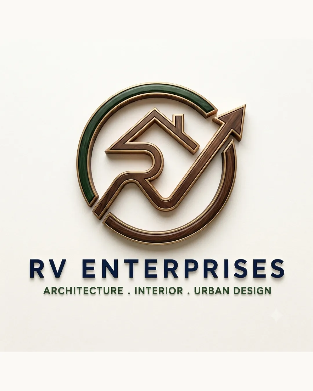
RV ENTERPRISES ARCHITECTURE . INTERIOR . URBAN DES.. logo review
4.3/5
Logo score
Logo review of

Rv Enterprises Architecture . Interior . Urban Des..

Distinctive, well-fitted logo for architecture/design sector with polished execution and strong conceptual connection. Minor simplifications recommended to optimize scalability and tagline legibility.

Combination Mark Contemporary 3D, Geometric Architecture
4.5/5
Legibility
4/5
Originality
5/5
Misread
4.5/5
Balance
4/5
Scale
Action plan

What to fix first

The most important fixes to handle before polishing the full presentation.

1

Simplify 3D effects for easier scaling and reproduction

High priority

Current detail level could present challenges in low-res or print.

Impact: Improves Clarity At All Sizes And Adaptability Across Media · Effort: Medium

2

Slightly increase tagline weight or adjust spacing

Medium priority

Supports instant recognition without overpowering main name.

Impact: Enhances Readability Of Supporting Service Description · Effort: Low

Detailed review

Logo performance breakdown

4.5/5

Legibility

Checkmark icon Primary text is bold and highly readable
Checkmark icon Clear tagline enhances clarity

Warning icon Mark 'RV' integration slightly compromises instant letter recognition

4/5

Originality

Checkmark icon 'RV' and arrow integrations are unique in execution
Checkmark icon House/roof visual is relevant yet distinctive

Warning icon Upward arrow motif is somewhat common in real estate/architecture

4.5/5

Color harmony

Checkmark icon Deep green, navy, and bronze evoke stability and growth, fitting for the sector

Warning icon 3D bronze may not match all brand applications as a flat tone

Navy
#2E323D

Olive Green
#72865F

Bronze
#B08C58

White
#FFFFFF

Your palette is close. Refine the color roles and combinations before updating the logo.

Build brand colors
4.5/5

Balance alignment

Checkmark icon Mark and wordmark sit in strong proportion
Checkmark icon Good vertical and horizontal centering

Warning icon Tagline could be optically lighter compared to primary name

logo 200x250 pixels scalability test alignment grid overlay
4/5

Scalability

Checkmark icon Circle and geometric structure aid reproduction at small sizes

Warning icon 3D shading and intricate detail could lose clarity when scaled down

logo 200x250 pixels scalability test

200x250 px

logo 100x125 pixels scalability test

100×125 px

logo 50x62 pixels scalability test

50×62 px

5/5

Misinterpretations

Checkmark icon No negative or confusing misreadings present

4.5/5

Logo structure & brief match

Checkmark icon Mark and wordmark match stylistically and in weight

Checkmark icon Industry Relevance: Clear focus on architecture, interior, and urban design indicated in both mark and text.
Checkmark icon Professional Perception: Logo feels trustworthy and forward-thinking, suitable for a design/architecture firm.

Try your own review

Wondering how your logo performs?

Get a clear logo score, key risks, and priority fix ideas before your client or audience sees it.

Review my logo