Wondering how your logo performs? 🧐
Get professional logo reviews in seconds and catch design issues in time.
Try it Now!Logo review of S
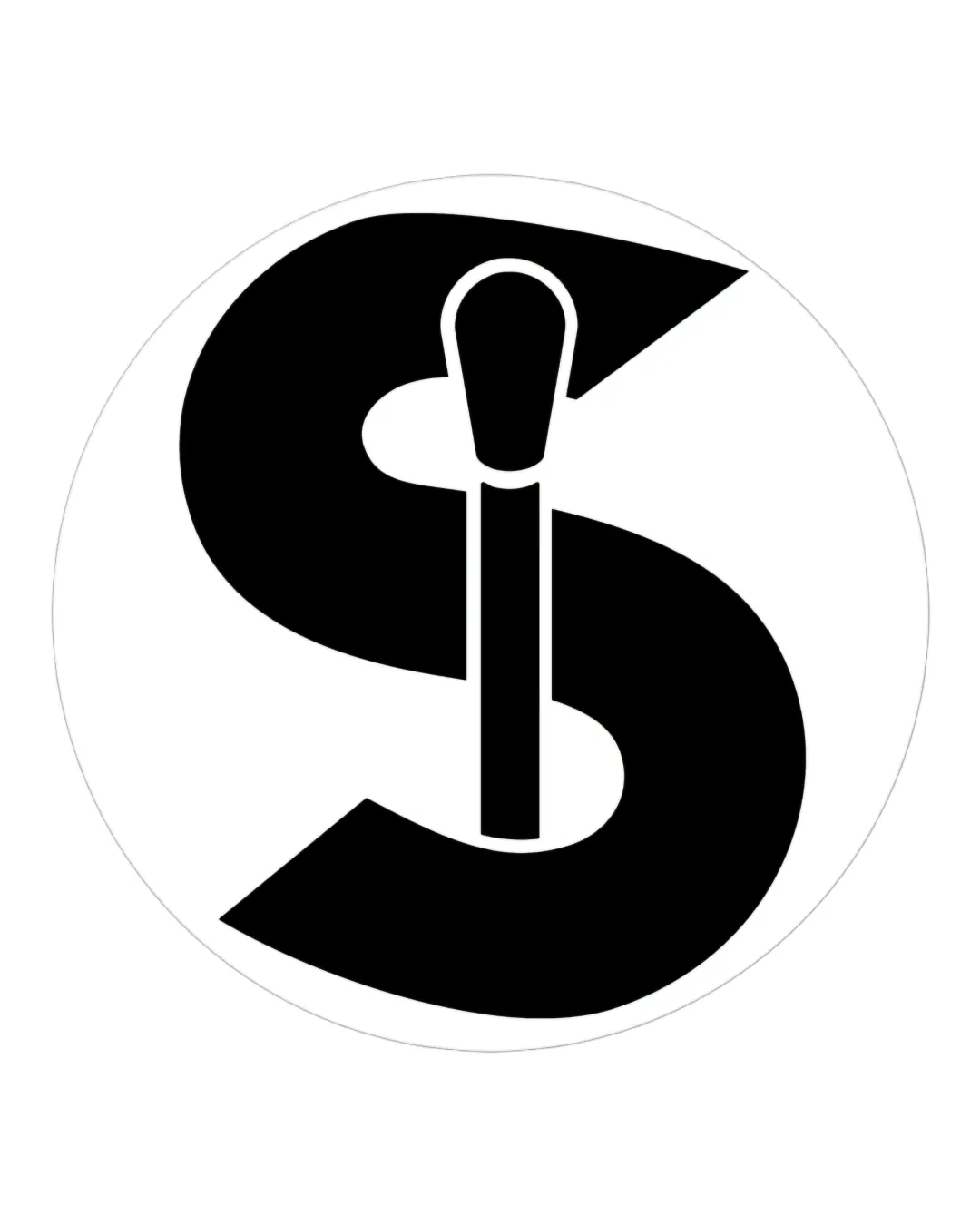
 Logo analysis by AI
Logo type:
Style:
Detected symbol:
Negative space:
Detected text:
Business industry:
Review requested by Fincham552
**If AI can recognize or misinterpret it, so can people.
Structured logo review
Legibility
The 'S' is bold and highly recognizable.
Contrast between the black 'S' and the white background ensures maximum readability.
Scalability versatility
Simple, bold forms ensure clarity in both large (billboard, signage) and small (business card, social media icon) applications.
Monochrome palette increases print and embroidery compatibility.
Fine details of the brush's handle and contour may lose definition at extremely small sizes (e.g., favicons or very small promotional items).

200x250 px

100×125 px

50×62 px
Balance alignment
The 'S' is centrally placed and the internal brush is well-integrated.
Slight visual imbalance as the brush disrupts the natural flow of the 'S', making the top section feel heavier than the bottom.


Originality
Creative integration of a makeup tool with the letterform.
Negative space is used purposefully to merge both concepts.
Lettermarks incorporating industry tools are common in the beauty field, though this execution avoids feeling overly generic.
Aesthetic look
Bold, simple, and modern aesthetic with professional appeal.
Balanced contrast and shapes lend it a clean visual impression.
Visually simple, which may limit emotional resonance or high-impact uniqueness.
Dual meaning and misinterpretations
Explicitly references makeup and beauty with no inappropriate or ambiguous meanings.
Color harmony
Monochrome scheme is timeless and ensures strong visual unity.
Color simplicity aids in practical reproduction and consistent branding.
Black
#000000
White
#FFFFFF

