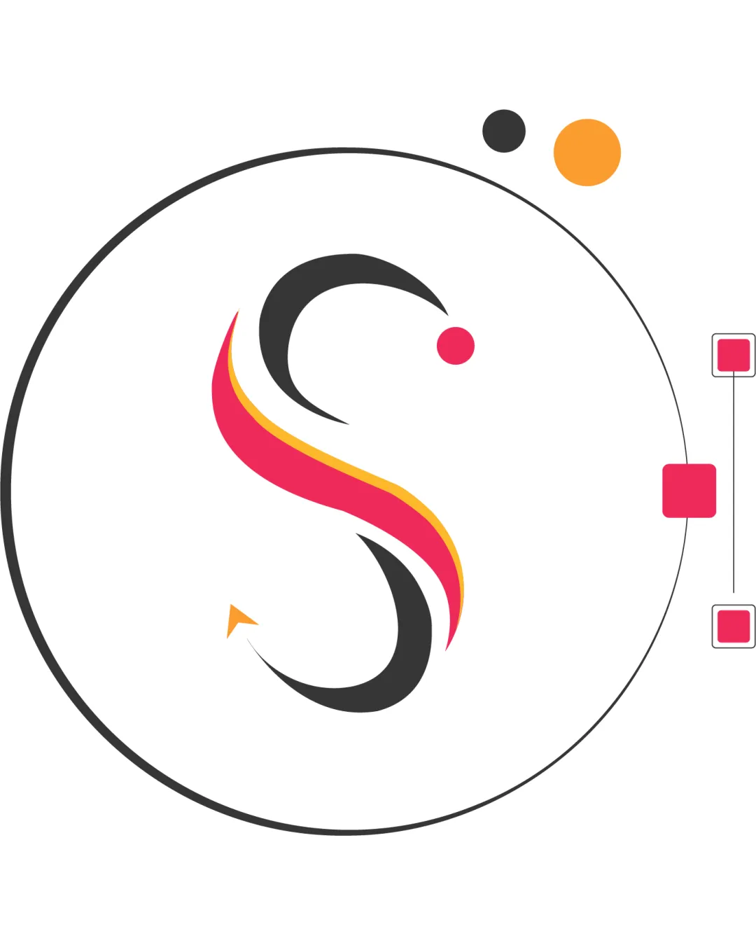
S logo review
3.5 / 5
Logo score
Logo review of

S

Energetic and creative lettermark suited to the field, but polish and rebalance accents for a professional finish.

Lettermark Modern Abstract Graphic Design
5/5
Legibility
4/5
Originality
5/5
Misread
3/5
Balance
4/5
Scale
Action plan

What to fix first

The most important fixes to handle before polishing the full presentation.

1

Adjust the placement of accent dots and geometric forms for better visual balance and polished symmetry.

High priority

Current layout feels slightly uneven, weakening its professional presence.

Impact: The Logo Will Feel More Professional And Harmonious, Avoiding A Sense Of Clutter Or Drift. · Effort: Medium

2

Explore stroke consistency and possible simplification of accents for improved small-size clarity and one-color use.

Medium priority

Thin and colorful accents may be problematic in practical media like embossing or fax.

Impact: This Will Enhance Usability In Strict Application Environments And Improve Scalability Without Losing Recognition. · Effort: Medium

Detailed review

Logo performance breakdown

5/5

Legibility

Checkmark icon Letter 'S' is clear and distinguishable.

4/5

Originality

Checkmark icon Creative use of color and fluid shapes in monogram.

Warning icon Some geometric accents are decorative but not highly unique.

4/5

Color harmony

Checkmark icon Color palette is modern, energetic, and visually appealing.

Warning icon Multiple accent colors may complicate one-color adaptation.

Black
#232323

Cerise
#E6335B

Orange
#F9AB28

White
#FFFFFF

Your palette is close. Refine the color roles and combinations before updating the logo.

Build brand colors
3/5

Balance alignment

Checkmark icon Central composition has optical focus.

Warning icon Element placement feels visually unbalanced due to off-center dots and side accents.

logo 200x250 pixels scalability test alignment grid overlay
4/5

Scalability

Checkmark icon Simple forms allow for good reproduction at smaller sizes.

Warning icon Thin details in accent shapes may be lost at very small scale.

logo 200x250 pixels scalability test

200x250 px

logo 100x125 pixels scalability test

100×125 px

logo 50x62 pixels scalability test

50×62 px

5/5

Misinterpretations

Checkmark icon No inappropriate or confusing dual meanings.

Beta

No AI design signals found

Likely designed by a human

No evident generative-AI artifacts; construction feels deliberate and controlled.

  • Smooth, logical curves in 'S' and clean geometric forms appear human-designed.

Visual assessment; not definitive proof of authorship.

Brief match

Checkmark icon Brand Personality: Modern lettermark reflects creativity and approachability.
Checkmark icon Industry: Abstract, colorful mark fits graphic design and creative services.

Try your own review

Wondering how your logo performs?

Get a clear logo score, key risks, and priority fix ideas before your client or audience sees it.

Review my logo