Wondering how your logo performs? 🧐
Get professional logo reviews in seconds and catch design issues in time.
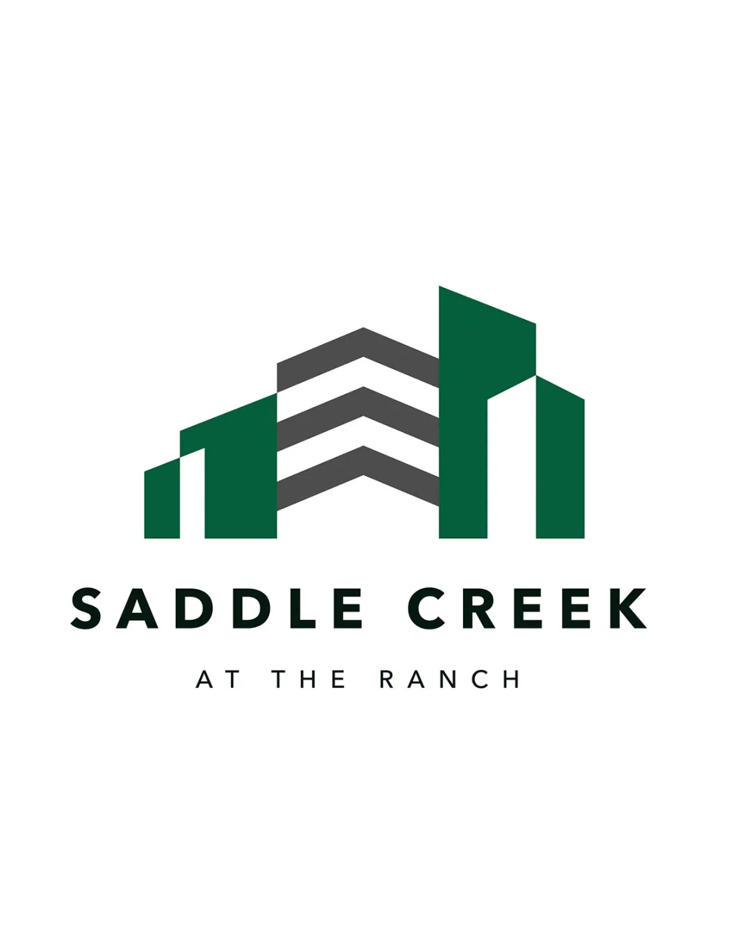
Try it Now!Logo review of SADDLE CREEK AT THE RANCH
 Logo analysis by AI
Recognized style:
Logo type:
Detected symbol:
Detected text:
Business industry:
Review requested by Motiongb
**If AI can recognize or misinterpret it, so can people.
Structured logo review
Legibility
![]() The text is clear and highly legible against the background.
The text is clear and highly legible against the background.
Scalability versatility
![]() The design has clear shapes, making it versatile across applications.
The design has clear shapes, making it versatile across applications.
![]() Some thin lines might lose detail when significantly scaled down.
Some thin lines might lose detail when significantly scaled down.
200x250 px
100×125 px
50×62 px
Balance alignment
![]() The logo is well-balanced with centered text and symbols.
The logo is well-balanced with centered text and symbols.

Originality
![]() The use of building imagery is fitting for the industry.
The use of building imagery is fitting for the industry.
![]() The symbol resembles common architectural designs, reducing uniqueness.
The symbol resembles common architectural designs, reducing uniqueness.
Logomark wordmark fit
![]() The symbol and text complement each other well in style and size.
The symbol and text complement each other well in style and size.
Aesthetic look
![]() The logo presents a clean and professional appearance.
The logo presents a clean and professional appearance.
Cultural sensitivity dual meaning
![]() No cultural sensitivity issues detected.
No cultural sensitivity issues detected.
Color harmony
![]() The green and gray colors work well together, conveying a sense of stability.
The green and gray colors work well together, conveying a sense of stability.


