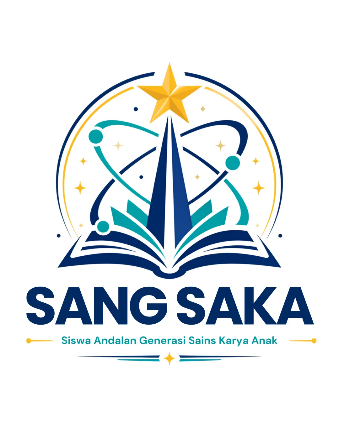
SANG SAKA Siswa Andalan Generasi Sains Karya Anak logo review
4.5 / 5
Logo score
Logo review of

Sang Saka Siswa Andalan Generasi Sains Karya Anak

Distinctive, balanced, and thematically clear educational logo suitable for diverse uses.

Combination Mark Modern Educational Emblem Education
5/5
Legibility
4/5
Originality
5/5
Misread
5/5
Balance
4/5
Scale
Action plan

What to fix first

The most important fixes to handle before polishing the full presentation.

1

Slightly darken the tagline or improve contrast for stronger legibility at small sizes.

Medium priority

Tagline visibility could suffer on non-white backgrounds or scaled-down formats.

Impact: Enhances Practical Usage Across All Media. · Effort: Low

Detailed review

Logo performance breakdown

5/5

Legibility

Checkmark icon Main wordmark is bold and highly readable.
Checkmark icon Tagline is clear with good contrast on white.

4/5

Originality

Checkmark icon Book, orbit, and star combination is distinctive and relevant for education/science.
Checkmark icon Stylized geometry adds uniqueness.

Warning icon Orbit/star elements are relatively common in educational logos.

4/5

Color harmony

Checkmark icon Cohesive palette; blue suggests trust, gold inspires achievement.
Checkmark icon Teal accent adds modern feel.

Warning icon Contrast between gold tagline and white background is slightly lighter than optimal.

Navy
#10295A

Gold
#FDB913

Teal
#30B6B1

LightTeal
#59C3BB

Your palette is close. Refine the color roles and combinations before updating the logo.

Build brand colors
5/5

Balance alignment

Checkmark icon Centralized, symmetrical design.
Checkmark icon Clear visual hierarchy and strong alignment of elements.

logo 200x250 pixels scalability test alignment grid overlay
4/5

Scalability

Checkmark icon Icon and text scale down reasonably well due to solid forms.
Checkmark icon Minimal fine detail aids reproduction.

Warning icon Tagline and fine star details may be less readable at very small sizes.

logo 200x250 pixels scalability test

200x250 px

logo 100x125 pixels scalability test

100×125 px

logo 50x62 pixels scalability test

50×62 px

5/5

Misinterpretations

Checkmark icon No unintended or confusing secondary interpretations observed.

Beta

No obvious AI design signals

No visible generative artifacts detected

No obvious visual artifacts associated with AI generation were detected.

Visual assessment; not definitive proof of authorship.

5 / 5

Logo structure & brief match

Checkmark icon Mark and wordmark are unified stylistically and conceptually.

Checkmark icon Concept: Education And Science Aspiration: Clearly communicates academic values and upward ambition.
Checkmark icon Audience: Students And Educational Community: Friendly and trustworthy visual style suitable for young learners and institutional use.

Try your own review

Wondering how your logo performs?

Get a clear logo score, key risks, and priority fix ideas before your client or audience sees it.

Review my logo