SECOND FORM
MATERIALS DESERVE ANOTHER USE logo review
4/5
Logo score
Logo review of

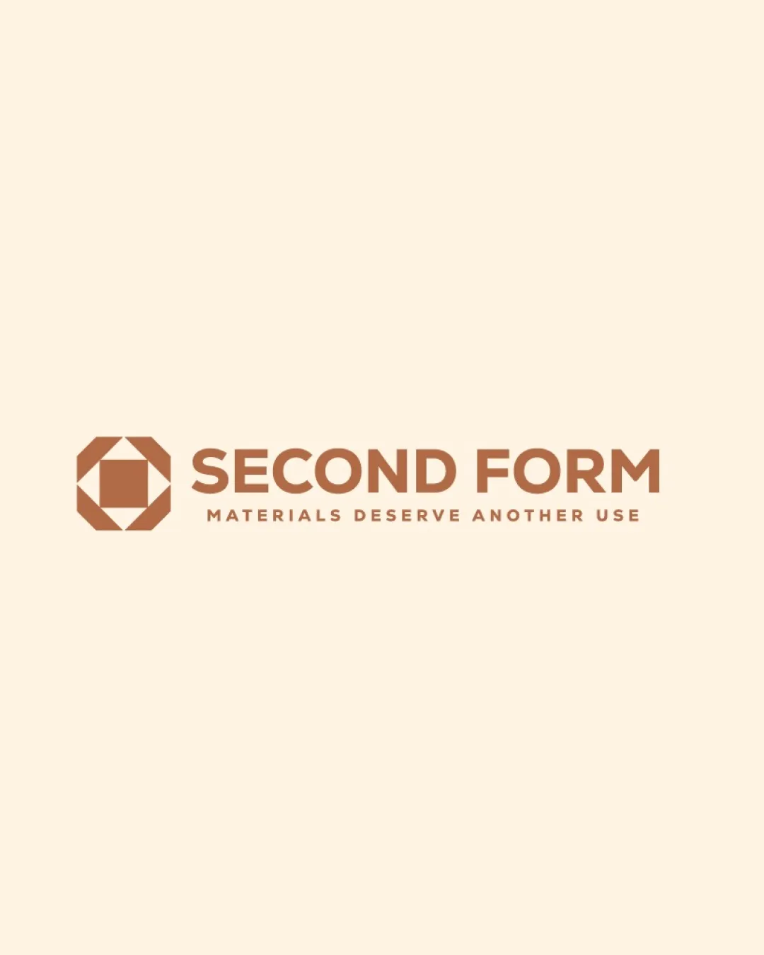
Second Form Materials Deserve Another Use

A distinctive, versatile logo with strong symbolic meaning and minor refinement needs for small-scale use.

Combination Mark Geometric Modern Sustainability/materials Reuse
4/5
Legibility
4/5
Originality
5/5
Misread
4/5
Balance
3/5
Scale
Your next steps

What to fix first

Focus on the changes that matter. Keep what makes the logo work.

1

tagline

Test tagline legibility at reduced sizes and consider a logo lockup without the tagline for micro/app use.

Worth testing High priority Low effort
Area to inspectApproximate location

The tagline's smaller font size may become unreadable at small logo sizes.

How to check

Render the logo at small dimensions (e.g., <2cm tall) to check tagline clarity.

See the category review
2

logomark and text alignment

Fine-tune vertical and horizontal alignment to ensure optimal centering and spacing in the lockup.

Optional refinement Medium priority Low effort
Area to inspectApproximate location

The geometric mark and wordmark are balanced but could be optically realigned for maximum harmony between icon and typography.

How to check

Overlay alignment guides and compare negative space between icon and text.

See the category review
Detailed review

Logo performance breakdown

4/5

Brief & logo match

Based on an inferred industry
Compared with

No explicit brief provided; name, tagline, and style infer a sustainability or material reuse brand.

The logo aligns with sustainability and reuse values using geometric clarity and straightforward messaging.

  • Geometric Sustainability Concept

    The abstract geometric mark suggests transformation or reuse, matching the likely sustainable focus of the name and tagline.

  • Clarity Of Communication

    All text is readable at normal sizes, and the tagline reinforces the brand mission.

4/5

Legibility

  • Main wordmark is clear and readable.
  • Tagline is concise and well-spaced.
4/5

Originality

  • Unique geometric symbol supports brand theme.
  • Distinct from generic recycling cues.
4/5

Balance alignment

  • Overall good hierarchy and proportion.
  • Clear division between mark, name, and tagline.
  • The geometric mark and wordmark are balanced but could be optically realigned for maximum harmony between icon and typography.

    Optional refinement logomark and text alignment

    Try: Fine-tune vertical and horizontal alignment to ensure optimal centering and spacing in the lockup.

    Check: Overlay alignment guides and compare negative space between icon and text.

    Area to inspectApproximate location
Uploaded logoAlignment guide overlay

Inspect spacing with the guide. Optical balance may differ from geometric centering.

3/5

Scalability

  • Icon is simple and should scale well.
  • The tagline's smaller font size may become unreadable at small logo sizes.

    Worth testing tagline

    Try: Test tagline legibility at reduced sizes and consider a logo lockup without the tagline for micro/app use.

    Check: Render the logo at small dimensions (e.g., <2cm tall) to check tagline clarity.
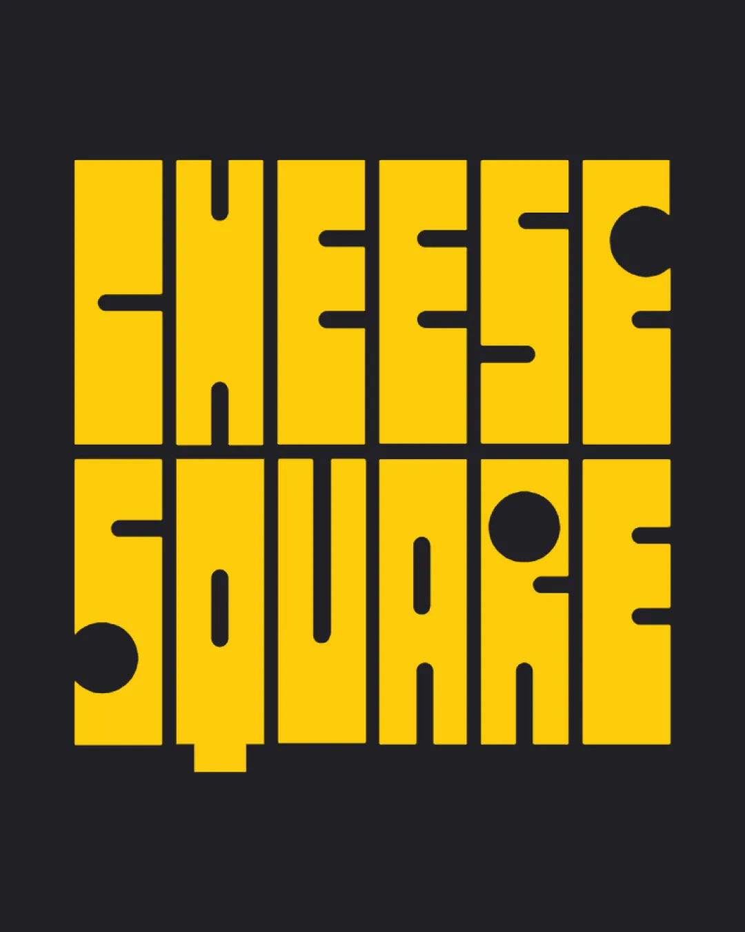
    Area to inspectApproximate location
Uploaded logo at 200 pixels wide
200 × 250 px
Uploaded logo at 100 pixels wide
100 × 125 px
Uploaded logo at 50 pixels wide
50 × 63 px

Compare the detail at different sizes. Labels show the full image dimensions.

5/5

Misinterpretations

  • No plausible unintended readings detected.
4/5

Symbol & text fit

  • Symbol pairs well with wordmark geometry.
  • Both elements share visual weight.

Black & white

Does the shape still work without color?

These tests are available only for logos uploaded in vector (SVG) format.

Background contrast

Find the surfaces where your logo stays clear.

These tests are available only for logos uploaded in vector (SVG) format.

Blur & silhouette

A 3px blur softens fine details so you can check whether the overall shape stays recognizable. If key gaps close or elements merge, the logo may rely too heavily on detail.

These tests are available only for logos uploaded in vector (SVG) format.

Try your own review

Wondering how your logo performs?

Get a clear logo score, key risks, and priority fix ideas before your client or audience sees it.

Review my logo