Wondering how your logo performs? 🧐
Get professional logo reviews in seconds and catch design issues in time.
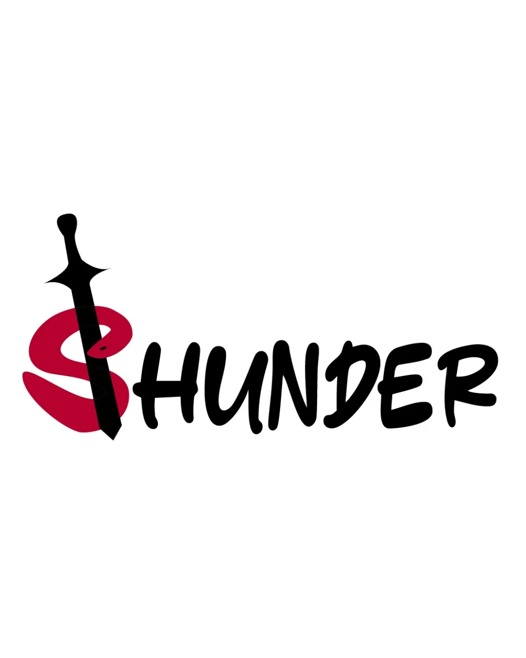
Try it Now!Logo review of SHUNDER
 Logo analysis by AI
Logo type:
Style:
Detected symbol:
Detected text:
Business industry:
Review requested by Junenzan
**If AI can recognize or misinterpret it, so can people.
Structured logo review
Legibility
![]() Text is clear and readable.
Text is clear and readable.![]() Bold typography enhances visibility.
Bold typography enhances visibility.
![]() Sword integration may slightly distract from the 'S' letter.
Sword integration may slightly distract from the 'S' letter.
Scalability versatility
![]() Simple elements enhance scalability.
Simple elements enhance scalability.![]() Clear contrast suitable for various sizes.
Clear contrast suitable for various sizes.
![]() Thin sword detail may lose clarity at smaller sizes, such as business cards or favicons.
Thin sword detail may lose clarity at smaller sizes, such as business cards or favicons.
200x250 px
100×125 px
50×62 px
Balance alignment
![]() Balanced composition with central alignment.
Balanced composition with central alignment.
![]() Sword disrupts symmetry slightly, potentially affecting visual balance.
Sword disrupts symmetry slightly, potentially affecting visual balance.

Originality
![]() Creative integration of sword with 'S'.
Creative integration of sword with 'S'.![]() Unique approach with relevant industry touch.
Unique approach with relevant industry touch.
![]() Concept of sword integration is somewhat common in the industry.
Concept of sword integration is somewhat common in the industry.
Aesthetic look
![]() Bold aesthetic with appealing contrast.
Bold aesthetic with appealing contrast.![]() Modern and engaging look.
Modern and engaging look.
Dual meaning and misinterpretations
![]() No inappropriate dual meanings detected.
No inappropriate dual meanings detected.
Color harmony
![]() Effective use of black and red for impact.
Effective use of black and red for impact.![]() Limited color palette maintains harmony.
Limited color palette maintains harmony.


