 View review
Logo score
Logo review of
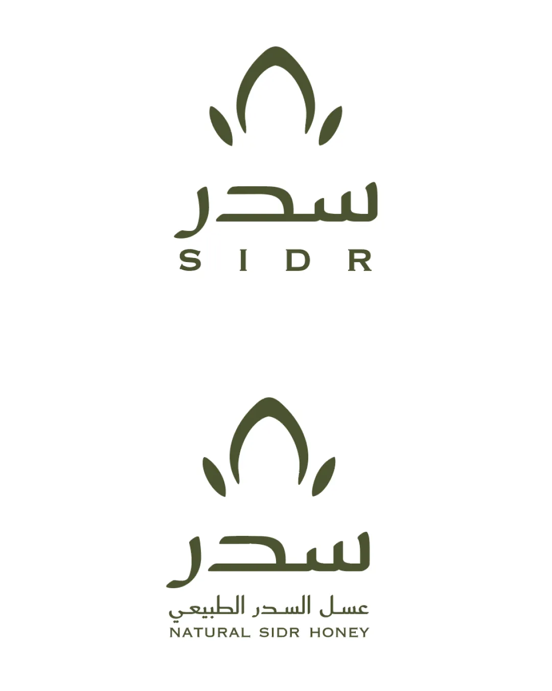
Sidr, عسل السدر الطبيعي, Natural Si..
Strong, well-composed logo well suited for launch; next-level crafting needed for market distinction.
Legibility
Originality
Misread
Balance
Scale
Action plan
What to fix first
The most important fixes to handle before polishing the full presentation.
1
Refine symbol detail for best clarity at very small scales (optically thicken spaces if needed)
Medium prioritySymbol could lose definition at reduced sizes due to thin gaps.
Impact: Improves Versatility For Packaging And Digital Use · Effort: Low
2
Explore more distinctive or unique petal/leaf mark variations
Medium priorityCurrent symbol, while relevant, is somewhat generic for the space.
Impact: Boosts Originality And Memorability In A Crowded Natural Product Category · Effort: Medium
Detailed review
Logo performance breakdown
Legibility
 English and Arabic text are clear and readable Strong contrast against background
Originality
Petal and leaf motif is relevant to the natural product
 Petal/leaf configuration is somewhat generic and seen in natural product logos
Color harmony
Single earth-tone suits natural/premium positioning Consistent palette reinforces authenticity
Olive
#4F563D
Balance alignment
Symmetrical layout feels balanced Even vertical centering of text and symbol

Scalability
Symbol and text retain integrity at reduced size Minimal detail supports scalability
Thin spaces in the petal symbol could risk closing up at very small sizes
200x250 px
100×125 px
50×62 px
Misinterpretations
No inappropriate or confusing visual resemblance detected
Beta
No AI design signals found
Likely designed by a human
Design displays deliberate geometric construction and logical, clean letterforms.
- Consistent curves and strokes throughout mark and typography
- No evident artifacts or incoherent joinery
Visual assessment; not definitive proof of authorship.
Logo structure & brief match
Mark and wordmark visually harmonize, supporting brand message
Luxurious, Reliable, Natural Brand Identity: Minimalism, symmetry, and organic shapes support a premium and authentic perception.
Target: Those Seeking Natural/luxury Honey: Petal and earthy tone are appropriate for both naturalness and gifting intent.
Sidr Flower Inspiration—100% Natural: Petal mark and natural color directly reference Sidr flower theme.
Try your own review
Review my logo
Wondering how your logo performs?
Get a clear logo score, key risks, and priority fix ideas before your client or audience sees it.
Keep exploring