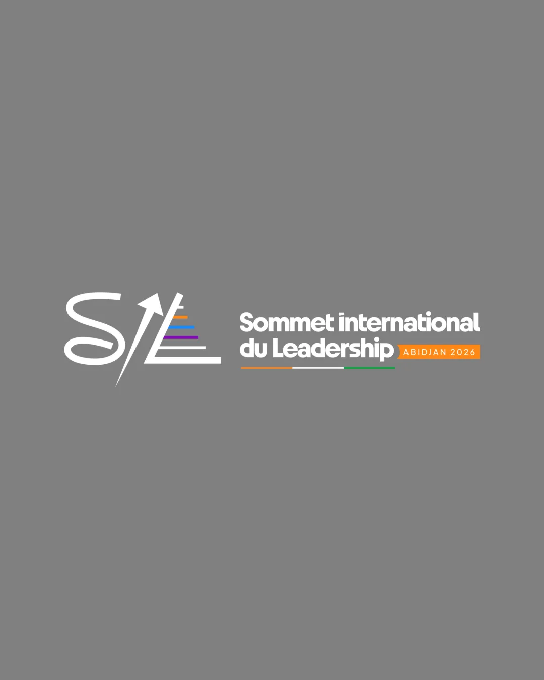
SIL Sommet international du Leadership ABIDJAN 202.. logo review
4/5
Logo score
Logo review of

Sil Sommet International Du Leadership Abidjan 202..

A dynamic, relevant event logo with strong symbolism and minor scalability risks.

Combination Modern Conference Branding Nonprofit/leadership Event
5/5
Legibility
4/5
Originality
5/5
Misread
4/5
Balance
3/5
Scale
Your next steps

What to fix first

Focus on the changes that matter. Keep what makes the logo work.

1

colored triangle and fine arrow

Simplify or thicken fine elements; verify readability at small scales.

Worth testing High priority Medium effort
Area to inspectApproximate location

Thin lines and small color bars may lose clarity or blend at reduced sizes, impacting visibility.

How to check

Test the logo at small sizes for clarity of colored bars and arrow.

See the category review
2

main lockup

Reduce gap between monogram and wordmark for tighter cohesion.

Optional refinement Medium priority Low effort

The space between the monogram and text is slightly wide, potentially disrupting visual flow.

How to check

Assess optical balance between monogram and type.

See the category review
Detailed review

Logo performance breakdown

5/5

Brief & logo match

Based on your brief
Compared with

Leadership conference from an NGO

The logo convincingly communicates leadership for a conference setting and aligns with an NGO brand.

  • Leadership Symbolism

    Upward arrow and stepped lines effectively connote growth and leadership.

  • Event And NGO Context

    Wordmark and tagline directly express international leadership summit identity.

5/5

Legibility

  • Wordmark and conference details are clear.
  • Lettermark is readable despite stylization.
4/5

Originality

  • Distinctive monogram construction with symbolic arrow and color bars.
4/5

Color harmony

  • Bright color accents add energy and are well-coordinated.
White#FFFFFF
Orange#E67E22
Green#27AE60
Blue#2980B9
Purple#8E44AD
Red#E74C3C
Grey#808080

Estimated colors. Use the original design file for exact values.

Create a full color palette using these colors

Create new palette
4/5

Balance alignment

  • Strong horizontal lockup; modern, crisp alignment.
  • The space between the monogram and text is slightly wide, potentially disrupting visual flow.

    Optional refinement main lockup

    Try: Reduce gap between monogram and wordmark for tighter cohesion.

    Check: Assess optical balance between monogram and type.

Uploaded logoAlignment guide overlay

Inspect spacing with the guide. Optical balance may differ from geometric centering.

3/5

Scalability

  • Core forms are simple and identifiable.
  • Thin lines and small color bars may lose clarity or blend at reduced sizes, impacting visibility.

    Worth testing colored triangle and fine arrow

    Try: Simplify or thicken fine elements; verify readability at small scales.

    Check: Test the logo at small sizes for clarity of colored bars and arrow.
    Area to inspectApproximate location
Uploaded logo at 200 pixels wide
200 × 250 px
Uploaded logo at 100 pixels wide
100 × 125 px
Uploaded logo at 50 pixels wide
50 × 63 px

Compare the detail at different sizes. Labels show the full image dimensions.

5/5

Misinterpretations

  • No unintended or confusing readings supported.
4/5

Symbol & text fit

  • Mark and wordmark share a coherent style and hierarchy.

Black & white

Does the shape still work without color?

These tests are available only for logos uploaded in vector (SVG) format.

Background contrast

Find the surfaces where your logo stays clear.

These tests are available only for logos uploaded in vector (SVG) format.

Blur & silhouette

A 3px blur softens fine details so you can check whether the overall shape stays recognizable. If key gaps close or elements merge, the logo may rely too heavily on detail.

These tests are available only for logos uploaded in vector (SVG) format.

Try your own review

Wondering how your logo performs?

Get a clear logo score, key risks, and priority fix ideas before your client or audience sees it.

Review my logo