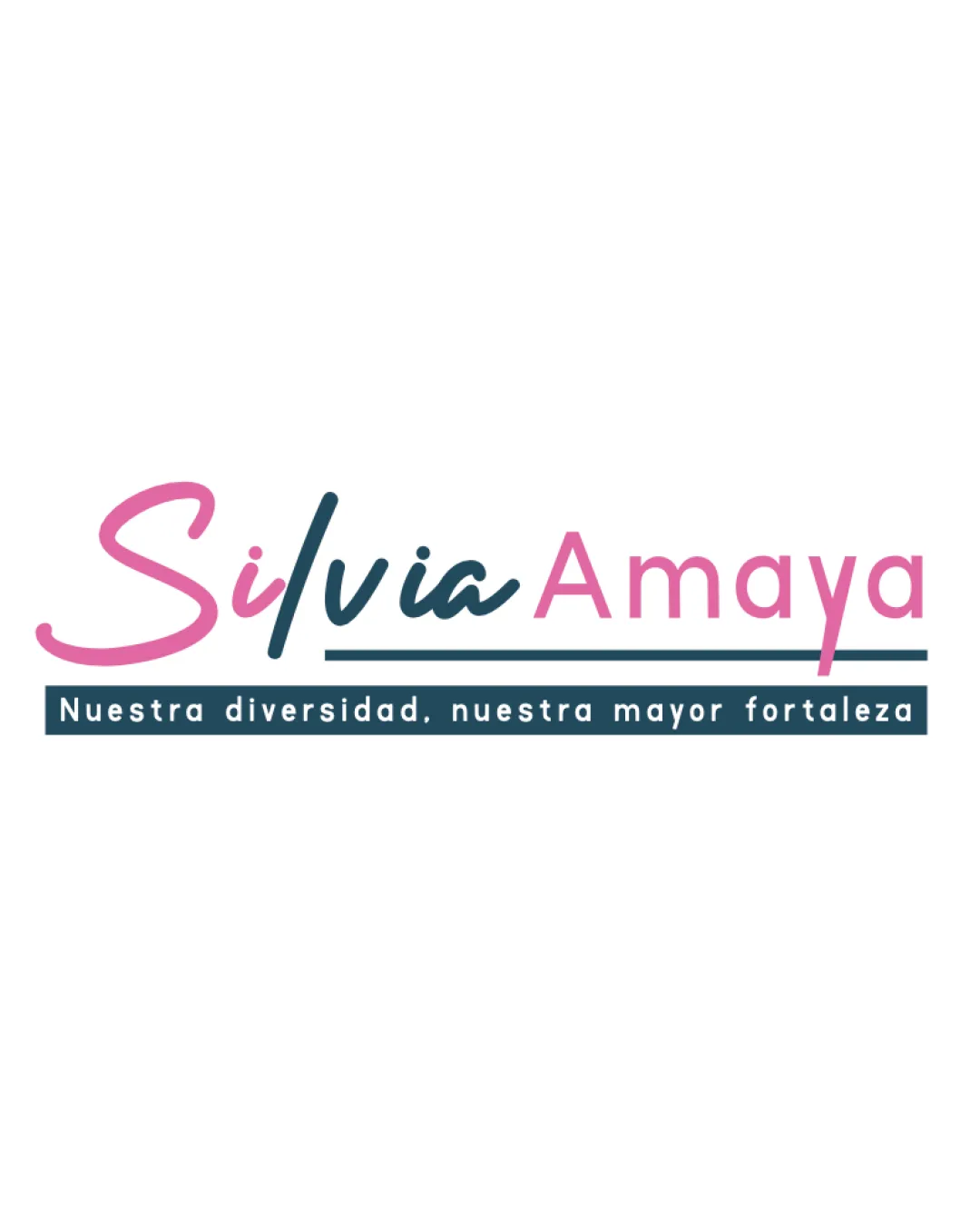
Silvia Amaya Nuestra diversidad, nuestra mayor for.. logo review
3.3 / 5
Logo score
Logo review of

Silvia Amaya Nuestra Diversidad, Nuestra Mayor For..

Serviceable for a university campaign; needs stronger distinctiveness and scalability.

Wordmark Modern Script And Sans-serif Mix Education
4/5
Legibility
3/5
Originality
5/5
Misread
4/5
Balance
3/5
Scale
Action plan

What to fix first

The most important fixes to handle before polishing the full presentation.

1

Strengthen brand distinctiveness by refining or customizing the script and sans-serif combination.

High priority

Current style feels generic; a more unique treatment would boost differentiation.

Impact: Clarifies Candidate Identity And Improves Memorability. · Effort: Medium

2

Increase tagline legibility at small sizes, potentially by adjusting size or simplifying.

Medium priority

Tagline and underline are at risk of disappearing at small scale.

Impact: Ensures Clear Communication In All Applications. · Effort: Low

Detailed review

Logo performance breakdown

4/5

Legibility

Checkmark icon Primary text is readable with clear color contrast.
Checkmark icon Tagline in uppercase is easy to read.

Warning icon Handwritten script and differing weights create minor legibility challenges between sections.

3/5

Originality

Checkmark icon Script and clean sans-serif mix creates moderate distinction.

Warning icon Style and combination are somewhat templated and not highly unique.

4/5

Color harmony

Checkmark icon Two-tone main palette is harmonious and consistent.

Warning icon Palette is pleasant but not striking; could use a stronger accent.

Orchid
#E27BA3

Balanced Blue
#264654

White
#FFFFFF

Your palette is close. Refine the color roles and combinations before updating the logo.

Build brand colors
4/5

Balance alignment

Checkmark icon Clean horizontal alignment between wordmark and tagline.
Checkmark icon Consistent baseline for main elements.

Warning icon Balance slightly affected by mixing very different script and geometric sans-serif.

logo 200x250 pixels scalability test alignment grid overlay
3/5

Scalability

Checkmark icon Simple color scheme and clear wordmark.

Warning icon Tagline text and underline may become unreadable at small sizes.
Warning icon Thin script strokes could be lost when reduced.

logo 200x250 pixels scalability test

200x250 px

logo 100x125 pixels scalability test

100×125 px

logo 50x62 pixels scalability test

50×62 px

5/5

Misinterpretations

Checkmark icon No inappropriate or confusing dual meanings detected.

Beta

No AI design signals found

Likely designed by a human

Deliberate font selection and composed layout suggest human design.

  • Script and sans-serif contrast is purposeful and visually coherent.
  • No structural or geometric AI artifacts detected.

Visual assessment; not definitive proof of authorship.

Brief match

Checkmark icon University Rector Campaign: Appropriate level of professionalism and inclusivity, but could show more gravitas or uniqueness to stand out in institutional context.

Try your own review

Wondering how your logo performs?

Get a clear logo score, key risks, and priority fix ideas before your client or audience sees it.

Review my logo