Wondering how your logo performs? 🧐
Get professional logo reviews in seconds and catch design issues in time.
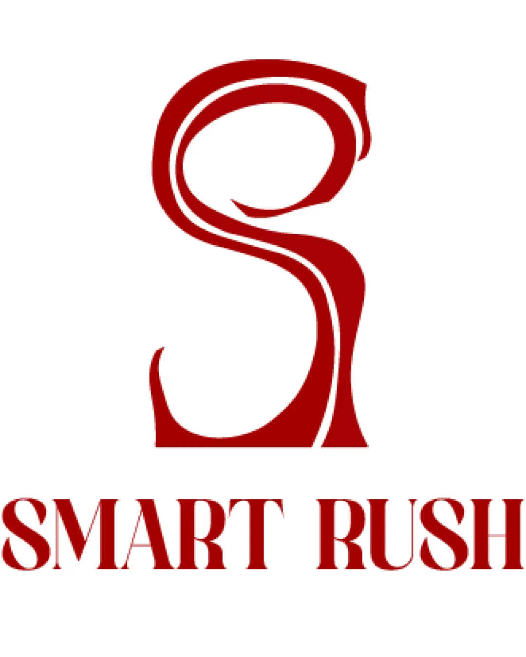
Try it Now!Logo review of SMART RUSH
 Logo analysis by AI
Logo type:
Style:
Detected symbol:
Detected text:
Business industry:
Review requested by Yusrosee
**If AI can recognize or misinterpret it, so can people.
Structured logo review
Legibility
![]() Text 'SMART RUSH' is in uppercase, creating strong presence.
Text 'SMART RUSH' is in uppercase, creating strong presence.![]() Serif typeface has sharp edges that aid distinction of each letter.
Serif typeface has sharp edges that aid distinction of each letter.
![]() Ornate serif font could reduce quick readability at small sizes or from a distance.
Ornate serif font could reduce quick readability at small sizes or from a distance.
Scalability versatility
![]() Bold lines of the monogram and strong typeface create some visual impact on medium-large print like posters or packaging.
Bold lines of the monogram and strong typeface create some visual impact on medium-large print like posters or packaging.
![]() The intricate curves in the S symbol may cause clarity loss at favicon or app icon sizes.
The intricate curves in the S symbol may cause clarity loss at favicon or app icon sizes.![]() Thin internal negative spaces could blur in embroidery or very small print materials.
Thin internal negative spaces could blur in embroidery or very small print materials.
200x250 px
100×125 px
50×62 px
Balance alignment
![]() Central vertical alignment of the symbol and wordmark provides basic structural balance.
Central vertical alignment of the symbol and wordmark provides basic structural balance.
![]() The stylized S is much bolder and more visually complex compared to the clean sharpness of the wordmark, creating a sense of visual imbalance.
The stylized S is much bolder and more visually complex compared to the clean sharpness of the wordmark, creating a sense of visual imbalance.![]() Weight of the symbol overpowers the wordmark, making the bottom feel lighter in comparison.
Weight of the symbol overpowers the wordmark, making the bottom feel lighter in comparison.

Originality
![]() Unique abstract S monogram stands out from generic typographic solutions.
Unique abstract S monogram stands out from generic typographic solutions.![]() Custom curves and flourishes distinguish it from ordinary S marks.
Custom curves and flourishes distinguish it from ordinary S marks.
![]() Despite the custom approach, abstract monogram S logos are common; further distinction could be explored.
Despite the custom approach, abstract monogram S logos are common; further distinction could be explored.
Logomark wordmark fit
![]() Color and stylistic motif are consistent across both elements.
Color and stylistic motif are consistent across both elements.
![]() Decorative, flowing monogram style does not fully harmonize with the rigid, geometric serif in the wordmark; the pairing feels forced rather than seamless.
Decorative, flowing monogram style does not fully harmonize with the rigid, geometric serif in the wordmark; the pairing feels forced rather than seamless.
Aesthetic look
![]() Single-color scheme gives a strong, memorable presence.
Single-color scheme gives a strong, memorable presence.
![]() The composition feels slightly top-heavy and visually cluttered due to the monogram complexity.
The composition feels slightly top-heavy and visually cluttered due to the monogram complexity.![]() Overall elegance is offset by the mismatch between symbol dynamism and wordmark rigidity.
Overall elegance is offset by the mismatch between symbol dynamism and wordmark rigidity.
Dual meaning and misinterpretations
![]() No inappropriate or confusing connotations appear in the symbol.
No inappropriate or confusing connotations appear in the symbol.
Color harmony
![]() Cohesive single-color scheme is bold and professional.
Cohesive single-color scheme is bold and professional.![]() Good contrast with white background ensures visibility.
Good contrast with white background ensures visibility.
Fire Red
#A10000
White
#FFFFFF


