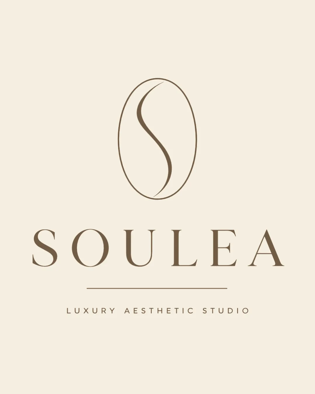
SOULEA
LUXURY AESTHETIC STUDIO logo review
4/5
Logo score

SOULEA LUXURY AESTHETIC STUDIO

Essential logo review

A sophisticated and suitable logo for a luxury aesthetic skincare brand, though more mark originality could safeguard distinctiveness.

Combination Mark Minimalist, Refined, Luxury, Medical Aesthetic Aesthetics/skincare
5/5
Legibility
3/5
Originality
4/5
Balance
3/5
Scale
@creative855903
Your next steps

What to fix first

Focus on the changes that matter. Keep what makes the logo work.

1

Standalone mark

Explore refining the mark or adding a subtle twist for distinctiveness.

High priority Visible issue Medium effort

The monoline S-in-oval is elegant but a very common trope for luxe or wellness industries, risking genericness.

How to check

Test with sample audiences for distinct recognition.

See the category review
2

Standalone mark

Test various print/web scale reductions for legibility and stroke visibility.

Medium priority Worth testing Low effort

Thin stroke of the S may lose clarity or disappear at small sizes, especially in print or on certain backgrounds.

See the category review
Detailed review

Logo performance breakdown

5/5

Brief & logo match

Logo convincingly expresses medical luxury aesthetics as intended.

5/5

Legibility

  • All text is crisp, clear, and highly readable.
3/5

Originality

  • Elegant execution; monoline S pairs nicely with serif wordmark.
  • The monoline S-in-oval is elegant but a very common trope for luxe or wellness industries, risking genericness.

    Visible issue Standalone mark

    Try: Explore refining the mark or adding a subtle twist for distinctiveness.

    Check: Test with sample audiences for distinct recognition.
4/5

Balance alignment

  • Good vertical hierarchy and generous letter spacing.
Uploaded logoAlignment guide overlay

Inspect spacing with the guide. Optical balance may differ from geometric centering.

3/5

Scalability

  • Simple forms help clarity at many scales.
  • Thin stroke of the S may lose clarity or disappear at small sizes, especially in print or on certain backgrounds.

    Worth testing Standalone mark

    Try: Test various print/web scale reductions for legibility and stroke visibility.

5/5

Misinterpretations

  • No plausible distracting misreadings.
5/5

Symbol & text fit

  • Stylized S mark harmonizes well with wordmark style and theme.
Try your own review

Wondering how your logo performs?

Get a clear logo score, key risks, and priority fix ideas before your client or audience sees it.

Review my logo