Wondering how your logo performs? 🧐
Get professional logo reviews in seconds and catch design issues in time.
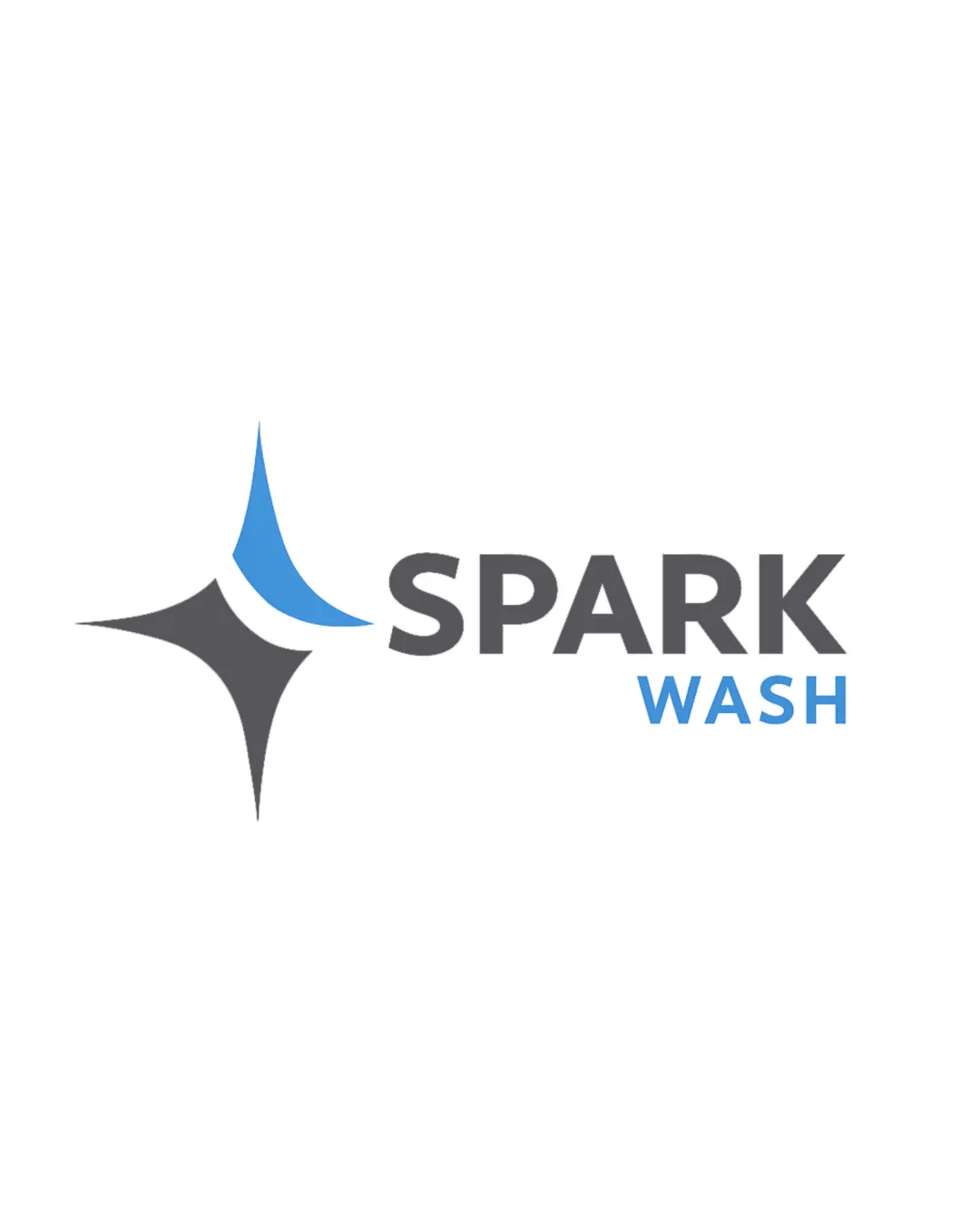
Try it Now!Logo review of SPARK WASH
 Logo analysis by AI
Logo type:
Style:
Detected symbol:
Negative space:
Detected text:
Business industry:
Review requested by Mail.brandegree
**If AI can recognize or misinterpret it, so can people.
Structured logo review
Legibility
Font is clean, bold, and highly readable at all sizes.
High contrast between text and background ensures clarity.
Scalability versatility
Simple, bold shapes and minimal details scale well for digital and print.
Logo is likely effective on business cards, vehicle wraps, and product labels.
Thin tail of the blue element may lose clarity at extremely small sizes, such as a mobile app favicon.
The gradient or color overlap could appear less effective in monochrome applications.

200x250 px

100×125 px

50×62 px
Balance alignment
Text and symbol are well-aligned horizontally for a compact and professional feel.
Consistent spacing and proportional sizing.
The weight of the logomark is slightly imbalanced compared to the bold ‘SPARK’ wordmark, leading to a subtle visual tension.


Originality
Sparkle motif and water element make the intent clear and relevant.
Uses relatively generic cleaning symbols (sparkle/star, water droplet shape without unique reinterpretation).
Design does not introduce unexpected negative space tricks or bespoke visual devices.
Logomark wordmark fit
Modern sans-serif matches the geometric nature of the logomark.
Color palette is consistent between icon and wordmark for brand coherence.
Icon could be more creatively integrated with the text—currently feels a bit placed alongside, rather than blended.
Aesthetic look
Minimal color scheme and geometric forms convey a clean, contemporary look.
Logo feels visually appealing for a cleaning or washing service.
Abstract symbol lacks stand-out distinctiveness, blending in with other industry competitors.
Dual meaning and misinterpretations
No inappropriate or ambiguous shapes detected.
Color harmony
Blue and gray are a harmonious, industry-appropriate palette.
Contrast is clear between symbol, wordmark, and ‘WASH’ subword.
Cod Gray
#48494B
Picton Blue
#43A5E7
White
#FFFFFF

