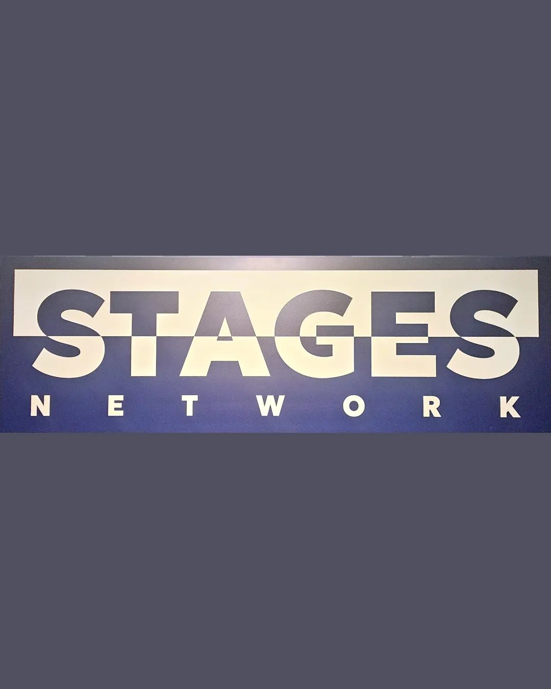
STAGES NETWORK logo review
3/5
Logo score
Logo review of

Stages Network

Effective and contemporary when large, the logo’s divided style compromises readability in compact uses and could benefit from a more integrated execution.

Wordmark Bold Geometric Sans-serif With Cut Horizontal Division Media/entertainment
3/5
Legibility
3/5
Originality
4/5
Misread
3/5
Balance
2/5
Scale
Your next steps

What to fix first

Focus on the changes that matter. Keep what makes the logo work.

1

wordmark (entire logo)

Test legibility at reduced sizes and in digital/print applications; consider a simplified alternate for small-scale use.

Visible issue High priority Medium effort
Area to inspectApproximate location

The horizontal split effect may make the logo difficult to read at small sizes or from a distance, as the break divides key parts of the letterforms.

How to check

Print the logo and observe readability below 2 cm tall or in a favicon-sized version.

See the category review
2

wordmark

Experiment with less stark division or integrating the split more fluidly into the wordmark design.

Optional refinement Medium priority Low effort

The horizontal split creates a strong emphasis but also a potentially harsh separation across the entire wordmark, slightly reducing unity.

How to check

Survey typical layouts and seek feedback on perceived unity of the mark.

See the category review
Detailed review

Logo performance breakdown

3/5

Brief & logo match

Based on an inferred industry
Compared with

No supplied context; media or entertainment is likely based on 'NETWORK' and bold style.

The logo is visually bold and aligns with typical media/entertainment branding, but the stylistic split may soon impair recognition in some contexts.

  • Entertainment/media Signal

    Bold, assertive style is appropriate for a media entity, and use of a splitting line could evoke the idea of different 'stages' or layers.

  • Readability At Distance

    High-contrast typography aids impact, but the split can hinder fast recognition, especially at small scale.

3/5

Legibility

  • Large, bold letterforms enhance clarity when used at ample size.
  • Strong geometric sans-serif aids direct communication.
3/5

Originality

  • The split effect gives a distinctive appearance.
4/5

Color harmony

  • Blue and white palette is professional and versatile.
White#FAFAFA
Dark Blue#2B3151
Medium Blue#4C5082

Estimated colors. Use the original design file for exact values.

Create a full color palette using these colors

Create new palette
3/5

Balance alignment

  • Even spacing between letters maintains a clean look.
  • The horizontal split creates a strong emphasis but also a potentially harsh separation across the entire wordmark, slightly reducing unity.

    Optional refinement wordmark

    Try: Experiment with less stark division or integrating the split more fluidly into the wordmark design.

    Check: Survey typical layouts and seek feedback on perceived unity of the mark.

Uploaded logoAlignment guide overlay

Inspect spacing with the guide. Optical balance may differ from geometric centering.

2/5

Scalability

  • Simple color scheme aids reproduction.
  • The horizontal split effect may make the logo difficult to read at small sizes or from a distance, as the break divides key parts of the letterforms.

    Visible issue wordmark (entire logo)

    Try: Test legibility at reduced sizes and in digital/print applications; consider a simplified alternate for small-scale use.

    Check: Print the logo and observe readability below 2 cm tall or in a favicon-sized version.
    Area to inspectApproximate location
Uploaded logo at 200 pixels wide
200 × 250 px
Uploaded logo at 100 pixels wide
100 × 125 px
Uploaded logo at 50 pixels wide
50 × 63 px

Compare the detail at different sizes. Labels show the full image dimensions.

4/5

Misinterpretations

  • No evident misinterpretation risk beyond reduced readability.

Black & white

Does the shape still work without color?

These tests are available only for logos uploaded in vector (SVG) format.

Background contrast

Find the surfaces where your logo stays clear.

These tests are available only for logos uploaded in vector (SVG) format.

Blur & silhouette

A 3px blur softens fine details so you can check whether the overall shape stays recognizable. If key gaps close or elements merge, the logo may rely too heavily on detail.

These tests are available only for logos uploaded in vector (SVG) format.

Try your own review

Wondering how your logo performs?

Get a clear logo score, key risks, and priority fix ideas before your client or audience sees it.

Review my logo