Wondering how your logo performs? 🧐
Get professional logo reviews in seconds and catch design issues in time.
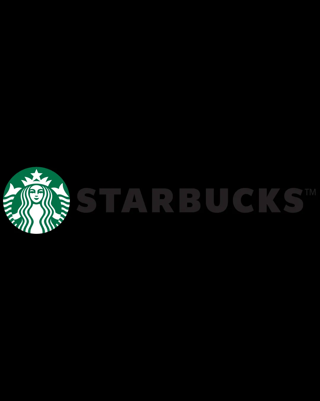
Try it Now!Logo review of STARBUCKS
 Logo analysis by AI
Logo type:
Style:
Detected symbol:
Negative space:
Detected text:
Business industry:
Review requested by Jo.mr.gdf
**If AI can recognize or misinterpret it, so can people.
Structured logo review
Legibility
![]() Clear, bold sans-serif lettering enhances instant brand recognition.
Clear, bold sans-serif lettering enhances instant brand recognition.![]() High contrast between the black text and background aids readability.
High contrast between the black text and background aids readability.
Scalability versatility
![]() Siren icon is detailed yet readable even at small scales.
Siren icon is detailed yet readable even at small scales.![]() Distinctive elements remain identifiable on product packaging, signage, and digital applications.
Distinctive elements remain identifiable on product packaging, signage, and digital applications.
![]() Fine facial and hair lines may blur slightly at micro sizes such as app icons or cup lids with poor printing quality.
Fine facial and hair lines may blur slightly at micro sizes such as app icons or cup lids with poor printing quality.![]() Heavy detail makes embroidery for apparel challenging without simplifying.
Heavy detail makes embroidery for apparel challenging without simplifying.
200x250 px
100×125 px
50×62 px
Balance alignment
![]() Excellent spatial arrangement between the icon and wordmark.
Excellent spatial arrangement between the icon and wordmark.![]() Both elements are visually weighted, neither outshining the other.
Both elements are visually weighted, neither outshining the other.

Originality
![]() Highly distinctive siren symbol unique to the brand.
Highly distinctive siren symbol unique to the brand.![]() Creative use of mythology, not found in competitors' graphics.
Creative use of mythology, not found in competitors' graphics.
Logomark wordmark fit
![]() Icon and wordmark harmonize in scale and style.
Icon and wordmark harmonize in scale and style.![]() Minimalist, bold typeface echoes the bold simplicity of the icon.
Minimalist, bold typeface echoes the bold simplicity of the icon.
Aesthetic look
![]() Clean, modern, and color consistent.
Clean, modern, and color consistent.![]() Appealing both in monochrome and color variants.
Appealing both in monochrome and color variants.
Dual meaning and misinterpretations
![]() Mermaid imagery is universally recognizable and inoffensive.
Mermaid imagery is universally recognizable and inoffensive.![]() No visual ambiguity or inappropriate associations.
No visual ambiguity or inappropriate associations.
Color harmony
![]() Consistent use of green adds immediate brand recognition.
Consistent use of green adds immediate brand recognition.![]() Monochrome palette avoids visual clutter while communicating freshness.
Monochrome palette avoids visual clutter while communicating freshness.
Green
#00704A
White
#FFFFFF
Black
#000000