Wondering how your logo performs? 🧐
Get professional logo reviews in seconds and catch design issues in time.
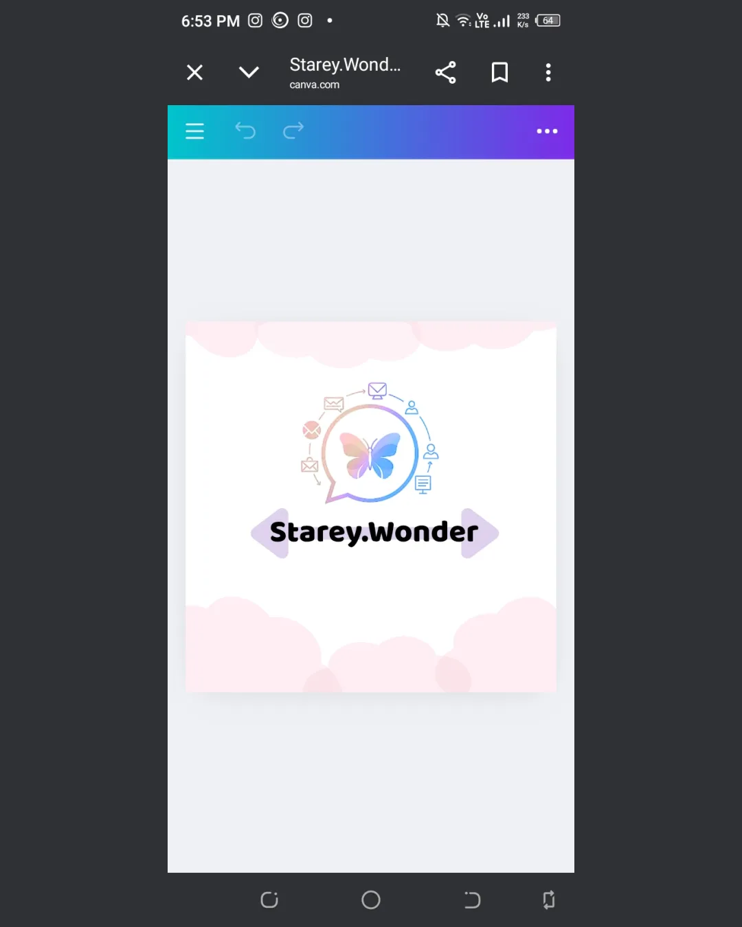
Try it Now!Logo review of Starey.Wonder
 Logo analysis by AI
Logo type:
Style:
Detected symbol:
Detected text:
Business industry:
Review requested by Wonder.starey.wonder
**If AI can recognize or misinterpret it, so can people.
Structured logo review
Legibility
![]() Text is of a sufficient size and bold style.
Text is of a sufficient size and bold style.![]() Simple rounded typeface aids readability.
Simple rounded typeface aids readability.
![]() The period between Starey and Wonder could be confused for a design element or separator.
The period between Starey and Wonder could be confused for a design element or separator.![]() Contrast with background is only average since the lavender shapes distract from clarity.
Contrast with background is only average since the lavender shapes distract from clarity.![]() Text is not strongly differentiated from the illustrative background, making it less clear in a busy environment.
Text is not strongly differentiated from the illustrative background, making it less clear in a busy environment.
Scalability versatility
![]() Central butterfly icon is recognizable at mid to large sizes.
Central butterfly icon is recognizable at mid to large sizes.![]() Works for things like web banners and posters.
Works for things like web banners and posters.
![]() Thin, detailed icons around the butterfly will become illegible at small sizes such as favicons or embroidery.
Thin, detailed icons around the butterfly will become illegible at small sizes such as favicons or embroidery.![]() Pastel gradients and fine lines aren’t suitable for single-color printing or embossing.
Pastel gradients and fine lines aren’t suitable for single-color printing or embossing.![]() Not ideal for small product labels, application icons, or merchandise.
Not ideal for small product labels, application icons, or merchandise.
200x250 px
100×125 px
50×62 px
Balance alignment
![]() Overall central alignment is maintained.
Overall central alignment is maintained.![]() Visual weight of central icon and text is balanced vertically.
Visual weight of central icon and text is balanced vertically.
![]() Peripheral icons make the composition busy and slightly top-heavy.
Peripheral icons make the composition busy and slightly top-heavy.![]() Background clouds add extra visual clutter, which disrupts overall alignment clarity.
Background clouds add extra visual clutter, which disrupts overall alignment clarity.![]() Text is not perfectly centered in relation to the butterfly and speech bubble, leading to minor imbalance.
Text is not perfectly centered in relation to the butterfly and speech bubble, leading to minor imbalance.

Originality
![]() Butterfly inside a speech bubble is a unique, whimsical combination.
Butterfly inside a speech bubble is a unique, whimsical combination.![]() Circular ring of icons adds originality but is overdone.
Circular ring of icons adds originality but is overdone.
![]() Butterfly and speech bubble are both common motifs when used separately.
Butterfly and speech bubble are both common motifs when used separately.![]() Peripheral communication icons are generic and feel redundant.
Peripheral communication icons are generic and feel redundant.![]() Overall design risks looking like a Canva template—insufficiently ownable.
Overall design risks looking like a Canva template—insufficiently ownable.
Logomark wordmark fit
![]() The playful, rounded font pairs reasonably well with the soft, pastel illustrative feel of the logomark.
The playful, rounded font pairs reasonably well with the soft, pastel illustrative feel of the logomark.![]() Both logomark and wordmark have a friendly, approachable energy.
Both logomark and wordmark have a friendly, approachable energy.
![]() Slight disconnect between high complexity of symbol arrangement and simple, bold wordmark.
Slight disconnect between high complexity of symbol arrangement and simple, bold wordmark.![]() The overall pastel color palette of the mark isn’t echoed in the solid black wordmark which may be jarring.
The overall pastel color palette of the mark isn’t echoed in the solid black wordmark which may be jarring.
Aesthetic look
![]() Soft pastel colors create a gentle, welcoming, child-friendly vibe.
Soft pastel colors create a gentle, welcoming, child-friendly vibe.![]() Icon and butterfly arrangement is visually pleasant and not harsh.
Icon and butterfly arrangement is visually pleasant and not harsh.
![]() Design feels overcrowded especially at smaller sizes.
Design feels overcrowded especially at smaller sizes.![]() Use of many icons in a tight space creates a cluttered look.
Use of many icons in a tight space creates a cluttered look.![]() Background clouds further add to an already busy design.
Background clouds further add to an already busy design.
Dual meaning and misinterpretations
![]() No inappropriate or confusing symbols detected. Composition is friendly and safe.
No inappropriate or confusing symbols detected. Composition is friendly and safe.
Color harmony
![]() Colors are all within the pastel range and do not clash.
Colors are all within the pastel range and do not clash.![]() Background and symbols blend softly.
Background and symbols blend softly.
![]() Logo relies on a gradient palette with at least four colors, risking confusion against varied backgrounds.
Logo relies on a gradient palette with at least four colors, risking confusion against varied backgrounds.![]() Pastel colors may wash out intensely when printed or reduced in size.
Pastel colors may wash out intensely when printed or reduced in size.![]() Black text feels mismatched with pastel logo colors. Gradient complexity hurts adaptability.
Black text feels mismatched with pastel logo colors. Gradient complexity hurts adaptability.
Pale Sky Blue
#A4E2FE
Lavender Pink
#EDD6F3
Pale Pink
#FFF1F9
Black
#000000


