Wondering how your logo performs? 🧐
Get professional logo reviews in seconds and catch design issues in time.
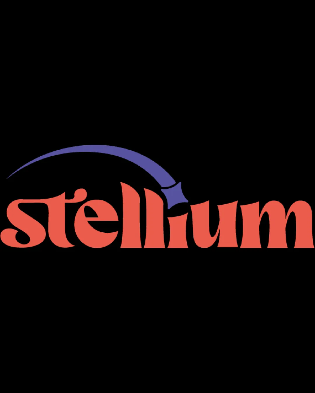
Try it Now!Logo review of stellium
 Logo analysis by AI
Logo type:
Style:
Detected symbol:
Detected text:
Business industry:
Review requested by Gab
**If AI can recognize or misinterpret it, so can people.
Structured logo review
Legibility
![]() Text is clear and easy to read.
Text is clear and easy to read.![]() Font style matches the theme.
Font style matches the theme.
![]() Swoosh may slightly distract from legibility in smaller sizes.
Swoosh may slightly distract from legibility in smaller sizes.
Scalability versatility
![]() Simple design aids scalability.
Simple design aids scalability.![]() Suitable for digital use.
Suitable for digital use.
![]() Curved element may lose detail in small applications.
Curved element may lose detail in small applications.![]() Might not reproduce well in embroidery.
Might not reproduce well in embroidery.
200x250 px
100×125 px
50×62 px
Balance alignment
![]() General balance maintained with text and symbol.
General balance maintained with text and symbol.
![]() Symbol alignment feels slightly off with text.
Symbol alignment feels slightly off with text.

Originality
![]() Unique font and symbol combination.
Unique font and symbol combination.![]() Overall composition feels distinct.
Overall composition feels distinct.
![]() Symbol could be a common shape used in similar industries.
Symbol could be a common shape used in similar industries.
Aesthetic look
![]() Cohesive color scheme.
Cohesive color scheme.![]() Modern and thematic style.
Modern and thematic style.
Dual meaning and misinterpretations
![]() No inappropriate or misleading symbols.
No inappropriate or misleading symbols.
Color harmony
![]() Effective use of complementary colors.
Effective use of complementary colors.![]() Strong visual appeal.
Strong visual appeal.
![]() Could be challenging to match universally in print.
Could be challenging to match universally in print.