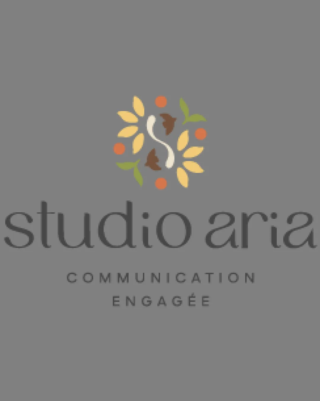
studio aria
COMMUNICATION ENGAGÉE logo review
4/5
Logo score
Logo review of

Studio Aria Communication Engagée

A distinctive, elegant identity that effectively expresses the studio's eco-minimalist positioning; ensure technical performance in practical use.

Combination Mark Organic, Elegant, Eco-friendly Design/eco/creative Services
4/5
Legibility
4/5
Originality
5/5
Misread
5/5
Balance
3/5
Scale
Your next steps

What to fix first

Focus on the changes that matter. Keep what makes the logo work.

1

standalone mark (top artwork)

Test the mark's line clarity and detail controls at reduced print and digital sizes.

Worth testing High priority Medium effort
Area to inspectApproximate location

The emblem contains fine leaf stems and thin 'S' lines that may not reproduce well at small sizes.

How to check

Export and print at 1.5cm height to verify all shapes remain clear and distinct.

See the category review
2

standalone mark (color palette)

Develop a strict color palette with defined values for consistent reproduction across media.

Optional refinement Medium priority Medium effort
Area to inspectApproximate location

The various yellow, green, orange, and brown hues are harmonious but could be checked for print and screen consistency given their subtle value differences.

How to check

Confirm all CMYK, RGB, and Pantone equivalents are consistent and visibly aligned in test outputs.

See the category review
Detailed review

Logo performance breakdown

5/5

Brief & logo match

Based on your brief
Compared with

Graphic studio specializing in eco-design and ethical, minimal creative work.

Logo's refined organic emblem and reserved typography strongly embody the eco-focused and 'less but better' ethos.

  • Eco-design Resonance

    Leaf, bird, and fruit motifs clearly signal nature and sustainability.

  • Minimalism & Refinement

    Clean emblem and serif wordmark balance artistry with restraint, echoing 'less but better.'

4/5

Legibility

  • Wordmark is readable and elegant.
  • Tagline is clear and well spaced.
4/5

Originality

  • Leaf, bird, and fruit motif is well-integrated and distinct.
  • Stylized 'S' is smoothly combined with organic elements.
4/5

Color harmony

  • Color palette expresses organic values.
  • Tones are lively but understated.
  • The various yellow, green, orange, and brown hues are harmonious but could be checked for print and screen consistency given their subtle value differences.

    Optional refinement standalone mark (color palette)

    Try: Develop a strict color palette with defined values for consistent reproduction across media.

    Check: Confirm all CMYK, RGB, and Pantone equivalents are consistent and visibly aligned in test outputs.

    Area to inspectApproximate location
Yellow#F4D36B
Brown#7D4E24
Orange#F89C29
Green#8DB252
Grey#605E5E

Estimated colors. Use the original design file for exact values.

Create a full color palette using these colors

Create new palette
5/5

Balance alignment

  • Artwork and wordmark are well centered and proportioned.
  • Logo components have strong visual hierarchy.
Uploaded logoAlignment guide overlay

Inspect spacing with the guide. Optical balance may differ from geometric centering.

3/5

Scalability

  • Emblem is detailed and appealing at moderate sizes.
  • The emblem contains fine leaf stems and thin 'S' lines that may not reproduce well at small sizes.

    Worth testing standalone mark (top artwork)

    Try: Test the mark's line clarity and detail controls at reduced print and digital sizes.

    Check: Export and print at 1.5cm height to verify all shapes remain clear and distinct.
    Area to inspectApproximate location
Uploaded logo at 200 pixels wide
200 × 250 px
Uploaded logo at 100 pixels wide
100 × 125 px
Uploaded logo at 50 pixels wide
50 × 63 px

Compare the detail at different sizes. Labels show the full image dimensions.

5/5

Misinterpretations

  • No distracting secondary readings.
  • Natural/eco motif is immediately recognizable.
5/5

Symbol & text fit

  • Emblem and wordmark blend seamlessly in style and mood.

Black & white

Does the shape still work without color?

These tests are available only for logos uploaded in vector (SVG) format.

Background contrast

Find the surfaces where your logo stays clear.

These tests are available only for logos uploaded in vector (SVG) format.

Blur & silhouette

A 3px blur softens fine details so you can check whether the overall shape stays recognizable. If key gaps close or elements merge, the logo may rely too heavily on detail.

These tests are available only for logos uploaded in vector (SVG) format.

Try your own review

Wondering how your logo performs?

Get a clear logo score, key risks, and priority fix ideas before your client or audience sees it.

Review my logo