Wondering how your logo performs? 🧐
Get professional logo reviews in seconds and catch design issues in time.
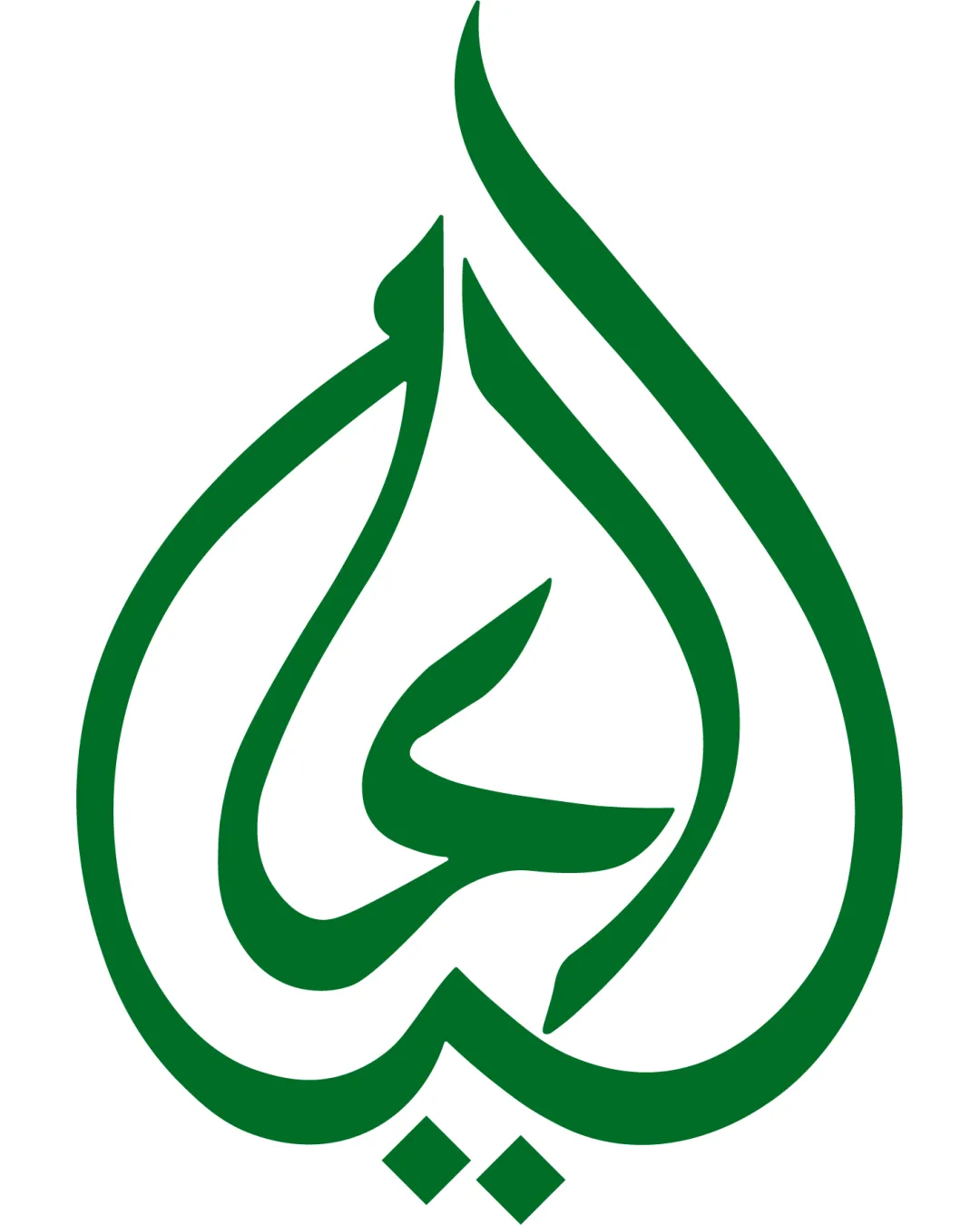
Try it Now!Logo review of Stylized Arabic calligraphy forming a teardrop/fla..
 Logo analysis by AI
Logo type:
Style:
Detected symbol:
Business industry:
Review requested by Abducontentcreator
**If AI can recognize or misinterpret it, so can people.
Structured logo review
Scalability versatility
![]() Bold, clean lines ensure the logo is highly scalable for applications from business cards to billboards.
Bold, clean lines ensure the logo is highly scalable for applications from business cards to billboards.![]() Simple, iconic mark works well as an app icon, signage, or print.
Simple, iconic mark works well as an app icon, signage, or print.![]() Absence of complex detail ensures clarity at small sizes.
Absence of complex detail ensures clarity at small sizes.
200x250 px
100×125 px
50×62 px
Balance alignment
![]() Symmetrical teardrop structure provides strong visual balance.
Symmetrical teardrop structure provides strong visual balance.![]() Well-controlled internal geometry generates visual harmony.
Well-controlled internal geometry generates visual harmony.

Originality
![]() Distinctive calligraphic identity with a unique teardrop/flame silhouette.
Distinctive calligraphic identity with a unique teardrop/flame silhouette.![]() Cultural authenticity adds depth to the abstraction.
Cultural authenticity adds depth to the abstraction.
![]() Shape—while stylized—is somewhat reminiscent of commonly used Arabic calligraphic forms.
Shape—while stylized—is somewhat reminiscent of commonly used Arabic calligraphic forms.
Aesthetic look
![]() Minimal, elegant linework delivers a contemporary, polished appearance.
Minimal, elegant linework delivers a contemporary, polished appearance.![]() No visual clutter or excessive decoration.
No visual clutter or excessive decoration.
![]() May appear overly simple or generic to those unfamiliar with calligraphic traditions.
May appear overly simple or generic to those unfamiliar with calligraphic traditions.
Dual meaning and misinterpretations
![]() Abstract form is likely to be interpreted positively as a teardrop or flame.
Abstract form is likely to be interpreted positively as a teardrop or flame.![]() Calligraphic nature avoids any inappropriate shapes or double meanings.
Calligraphic nature avoids any inappropriate shapes or double meanings.
Color harmony
![]() Single, strong green color creates clear brand recognition.
Single, strong green color creates clear brand recognition.![]() Excellent contrast with white background enhances legibility and visual impact.
Excellent contrast with white background enhances legibility and visual impact.
Green
#137333
White
#FFFFFF


