Wondering how your logo performs? 🧐
Get professional logo reviews in seconds and catch design issues in time.
Try it Now!Logo review of Surfcron VPN
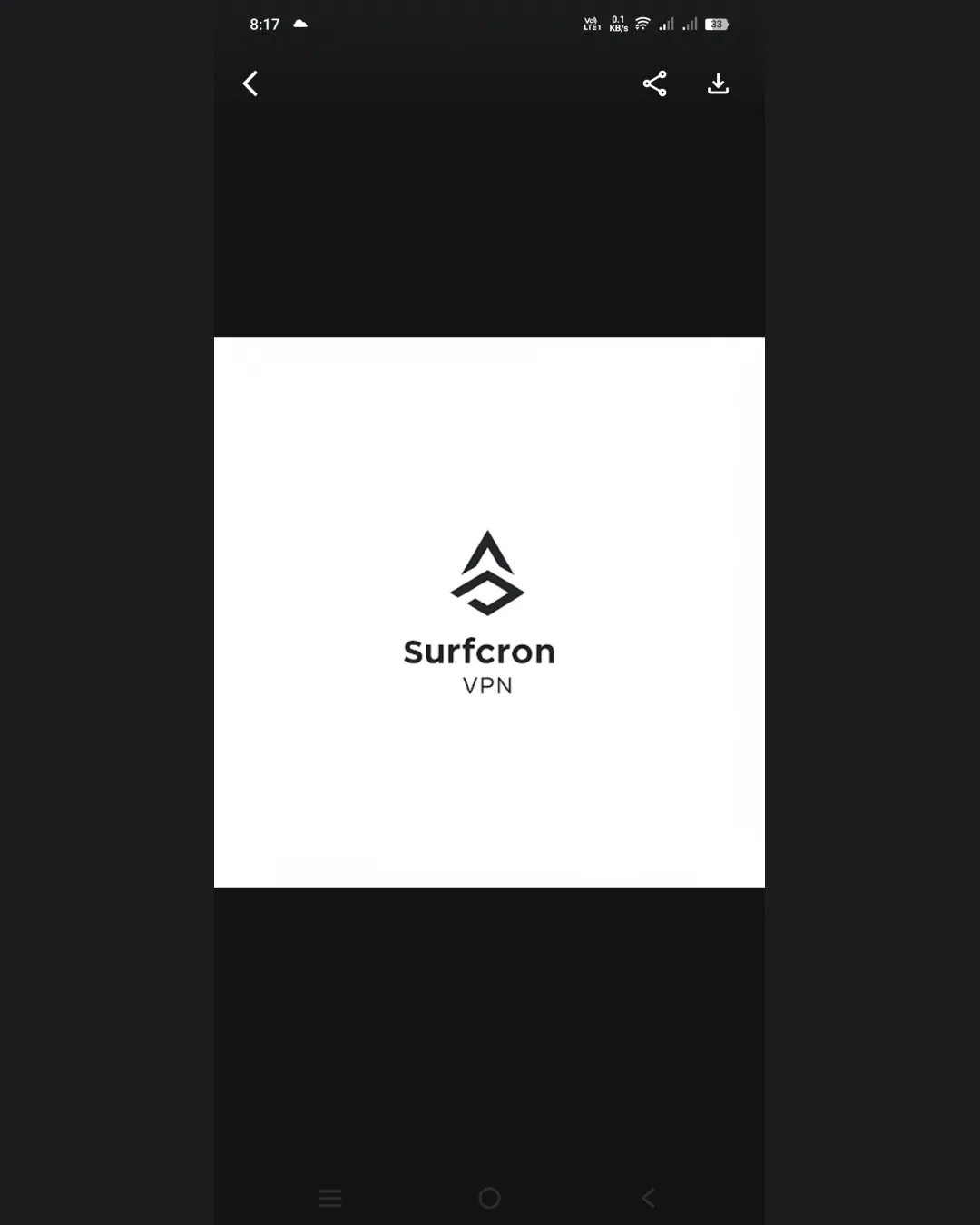
 Logo analysis by AI
Logo type:
Style:
Detected symbol:
Negative space:
Detected text:
Business industry:
Review requested by Gefefe2056
**If AI can recognize or misinterpret it, so can people.
Structured logo review
Legibility
![]() The text 'Surfcron VPN' is clear, straightforward, and highly readable.
The text 'Surfcron VPN' is clear, straightforward, and highly readable.![]() Good contrast between black text and white background enhances legibility.
Good contrast between black text and white background enhances legibility.
Scalability versatility
![]() Simple geometric mark will scale well to small sizes and can be used as a favicon or app icon.
Simple geometric mark will scale well to small sizes and can be used as a favicon or app icon.![]() Minimalistic style works in both large and small formats.
Minimalistic style works in both large and small formats.
![]() Thin lines in the symbol may lose clarity at very small scales, such as embroidery or very small print.
Thin lines in the symbol may lose clarity at very small scales, such as embroidery or very small print.
200x250 px
100×125 px
50×62 px
Balance alignment
![]() Excellent alignment between logomark and wordmark.
Excellent alignment between logomark and wordmark.![]() Well-centered, with balanced whitespace.
Well-centered, with balanced whitespace.

Originality
![]() Abstract symbol adds a unique touch and alludes to VPN concepts like security (shield) and waves (surf).
Abstract symbol adds a unique touch and alludes to VPN concepts like security (shield) and waves (surf).
![]() Geometric shapes and shield-wave motifs are somewhat common in tech/cybersecurity branding, limiting overall originality.
Geometric shapes and shield-wave motifs are somewhat common in tech/cybersecurity branding, limiting overall originality.
Logomark wordmark fit
![]() The geometric symbol fits stylistically with the modern, clean wordmark.
The geometric symbol fits stylistically with the modern, clean wordmark.![]() Sizing between logomark and text feels proportionate.
Sizing between logomark and text feels proportionate.
Aesthetic look
![]() Minimalist approach is visually appealing and on-trend.
Minimalist approach is visually appealing and on-trend.![]() Monochrome palette creates a professional appearance.
Monochrome palette creates a professional appearance.
![]() Could feel plain or generic compared to bolder, more distinctive competitors in the space.
Could feel plain or generic compared to bolder, more distinctive competitors in the space.
Dual meaning and misinterpretations
![]() No inappropriate or confusing symbolism detected.
No inappropriate or confusing symbolism detected.
Color harmony
![]() Monochrome palette ensures maximum harmony, contrast, and adaptability on various backgrounds.
Monochrome palette ensures maximum harmony, contrast, and adaptability on various backgrounds.
Black
#000000
White
#FFFFFF


