Wondering how your logo performs? 🧐
Get professional logo reviews in seconds and catch design issues in time.
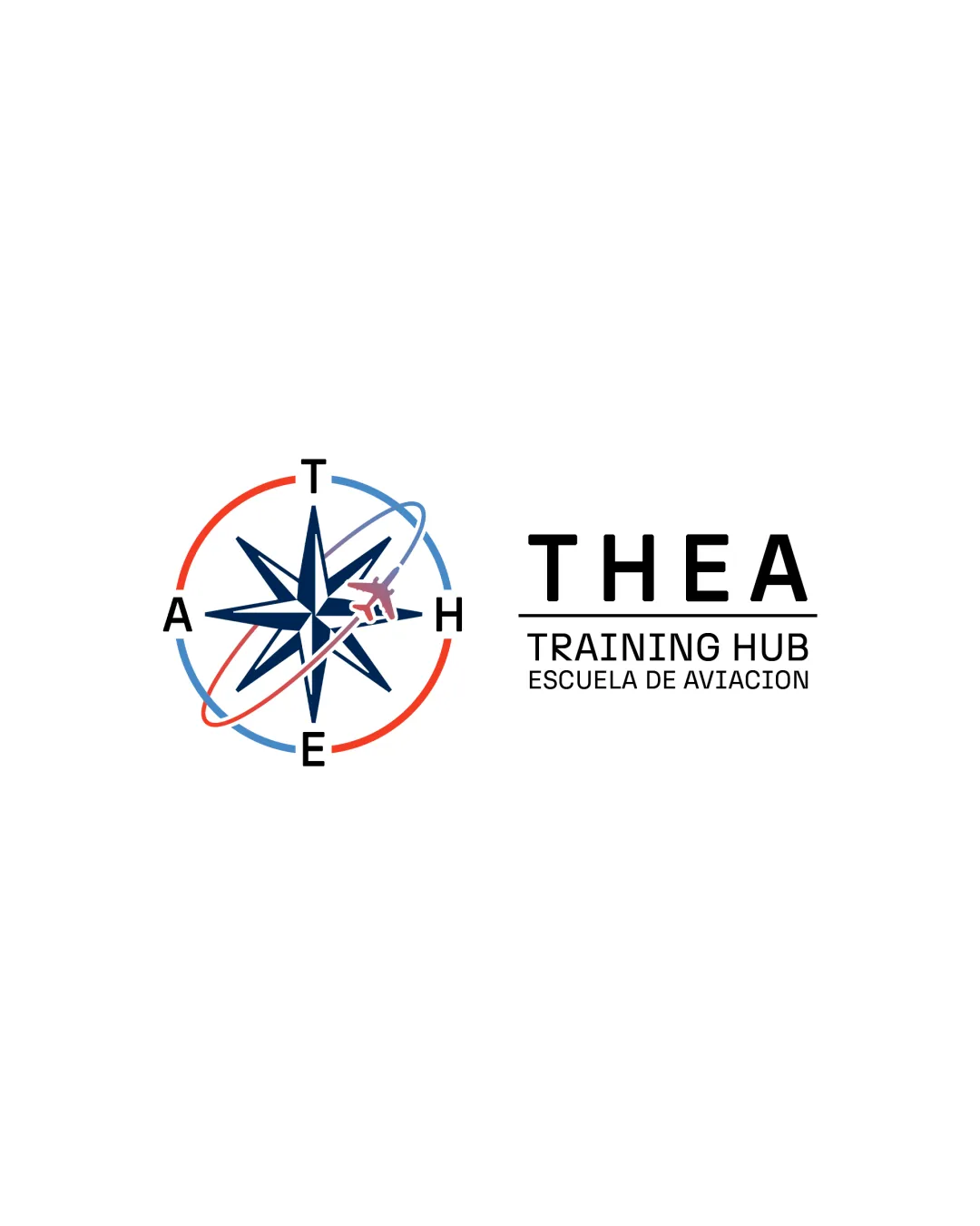
Try it Now!Logo review of THEA TRAINING HUB ESCUELA DE AVIACION
 Logo analysis by AI
Logo type:
Style:
Detected symbol:
Detected text:
Business industry:
Review requested by NachoSilva
**If AI can recognize or misinterpret it, so can people.
Structured logo review
Legibility
![]() Text is clear and easy to read.
Text is clear and easy to read.![]() Uses high contrast colors.
Uses high contrast colors.
![]() Slight complication with overlapping elements may affect readability at smaller sizes.
Slight complication with overlapping elements may affect readability at smaller sizes.
Scalability versatility
![]() Works well on screens and large formats.
Works well on screens and large formats.
![]() Complex details in compass and airplane may lose clarity when scaled down.
Complex details in compass and airplane may lose clarity when scaled down.
200x250 px
100×125 px
50×62 px
Balance alignment
![]() Well-balanced between symbol and text.
Well-balanced between symbol and text.![]() Good alignment overall.
Good alignment overall.

Originality
![]() Integrates aviation theme creatively.
Integrates aviation theme creatively.
![]() Use of compass is somewhat common in navigation-related logos.
Use of compass is somewhat common in navigation-related logos.
Aesthetic look
![]() Modern and professional appearance.
Modern and professional appearance.![]() Color scheme is visually appealing.
Color scheme is visually appealing.
Dual meaning and misinterpretations
Color harmony
![]() Limited color palette maintains focus.
Limited color palette maintains focus.![]() Colors are harmonious.
Colors are harmonious.
![]() Might become less effective in monochrome.
Might become less effective in monochrome.


