Wondering how your logo performs? 🧐
Get professional logo reviews in seconds and catch design issues in time.
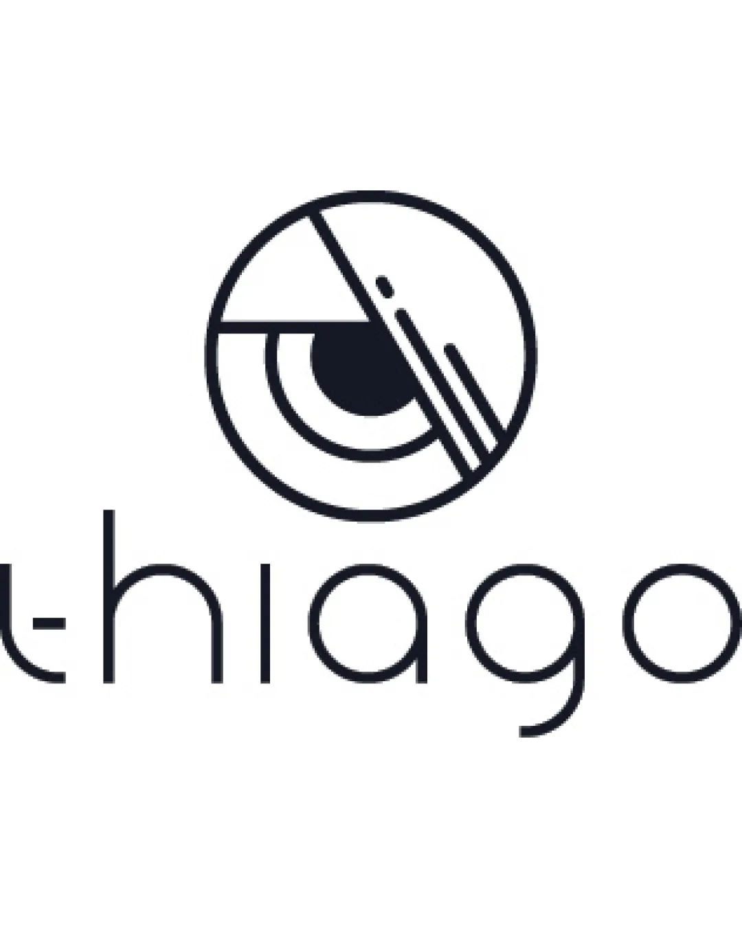
Try it Now!Logo review of thiago
 Logo analysis by AI
Logo type:
Style:
Detected symbol:
Negative space:
Detected text:
Business industry:
Review requested by Titeefelix
**If AI can recognize or misinterpret it, so can people.
Structured logo review
Legibility
![]() The wordmark 'thiago' is perfectly readable with a clean, modern sans-serif typeface.
The wordmark 'thiago' is perfectly readable with a clean, modern sans-serif typeface.![]() Good spacing ensures each letter stands apart.
Good spacing ensures each letter stands apart.
Scalability versatility
![]() Simple line work and monoweight design ensures clarity at a variety of sizes.
Simple line work and monoweight design ensures clarity at a variety of sizes.![]() Logo will translate well to print and digital applications such as business cards, websites, or app icons.
Logo will translate well to print and digital applications such as business cards, websites, or app icons.
![]() Very thin lines may disappear at extremely small scales or on textured embroidery, potentially losing detail on items like jersey stitching.
Very thin lines may disappear at extremely small scales or on textured embroidery, potentially losing detail on items like jersey stitching.
200x250 px
100×125 px
50×62 px
Balance alignment
![]() Good visual harmony between the wordmark and logomark.
Good visual harmony between the wordmark and logomark.![]() Centrally aligned composition feels deliberate and visually unified.
Centrally aligned composition feels deliberate and visually unified.
![]() Slight weight difference between the monoline type and the bolder logomark could create a subtle imbalance in some uses.
Slight weight difference between the monoline type and the bolder logomark could create a subtle imbalance in some uses.

Originality
![]() Abstract, geometric eye is a creative and uncommon approach.
Abstract, geometric eye is a creative and uncommon approach.![]() Clean symbolism with a modern twist makes it memorable.
Clean symbolism with a modern twist makes it memorable.
Logomark wordmark fit
![]() Geometric style of both elements match perfectly.
Geometric style of both elements match perfectly.![]() Symmetry and proportionality create a seamless connection between the logomark and wordmark.
Symmetry and proportionality create a seamless connection between the logomark and wordmark.
Aesthetic look
![]() Visually appealing with modern minimalist cues.
Visually appealing with modern minimalist cues.![]() Balanced negative space and clean shapes.
Balanced negative space and clean shapes.
Dual meaning and misinterpretations
![]() No inappropriate or misleading visual interpretations detected.
No inappropriate or misleading visual interpretations detected.![]() Abstracted eye motif is universally understandable and inoffensive.
Abstracted eye motif is universally understandable and inoffensive.
Color harmony
![]() Monochrome palette ensures universal application and high adaptability.
Monochrome palette ensures universal application and high adaptability.![]() High contrast aids both legibility and brand recognition.
High contrast aids both legibility and brand recognition.
Ebony
#14151B
White
#FFFFFF


