Wondering how your logo performs? 🧐
Get professional logo reviews in seconds and catch design issues in time.
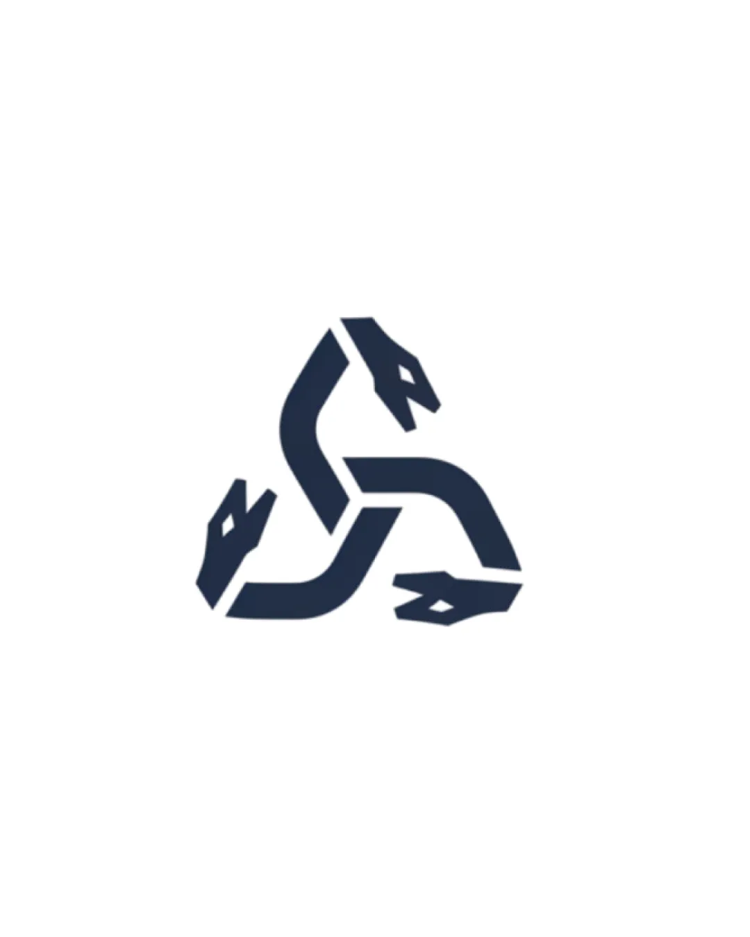
Try it Now!Logo review of three-headed serpent forming a triangular knot
 Logo analysis by AI
Logo type:
Style:
Detected symbol:
Business industry:
Review requested by Liwa
**If AI can recognize or misinterpret it, so can people.
Structured logo review
Scalability versatility
![]() Simple geometric form is highly scalable and recognizable at various sizes.
Simple geometric form is highly scalable and recognizable at various sizes.![]() Would work well in digital contexts, social media icons, or on merchandise such as T-shirts.
Would work well in digital contexts, social media icons, or on merchandise such as T-shirts.
![]() Small details in snake heads may lose clarity at micro sizes (e.g., favicons, embroidery).
Small details in snake heads may lose clarity at micro sizes (e.g., favicons, embroidery).
200x250 px
100×125 px
50×62 px
Balance alignment
![]() Triangular arrangement creates visual stability and symmetry.
Triangular arrangement creates visual stability and symmetry.![]() Balanced negative space contributes to a cohesive form.
Balanced negative space contributes to a cohesive form.

Originality
![]() The interlocking three-serpent design is a strong, unique take on the mythological triskelion motif.
The interlocking three-serpent design is a strong, unique take on the mythological triskelion motif.![]() Distinctive visual identity uncommon in corporate logo design.
Distinctive visual identity uncommon in corporate logo design.
![]() Visual similarity to some mythological or fantasy logos may reduce originality in closely related fields.
Visual similarity to some mythological or fantasy logos may reduce originality in closely related fields.
Aesthetic look
![]() Minimal color palette supports a modern aesthetic.
Minimal color palette supports a modern aesthetic.![]() Strong geometric lines create a bold and memorable appearance.
Strong geometric lines create a bold and memorable appearance.
![]() Some viewers may find the serpent heads visually harsh or aggressive depending on target market.
Some viewers may find the serpent heads visually harsh or aggressive depending on target market.
Dual meaning and misinterpretations
![]() No apparent inappropriate or unintended forms.
No apparent inappropriate or unintended forms.
Color harmony
![]() Single color on white ensures high contrast and versatility.
Single color on white ensures high contrast and versatility.![]() Dark blue/black is neutral and widely applicable.
Dark blue/black is neutral and widely applicable.
Mirage
#232F3E
White
#FFFFFF


