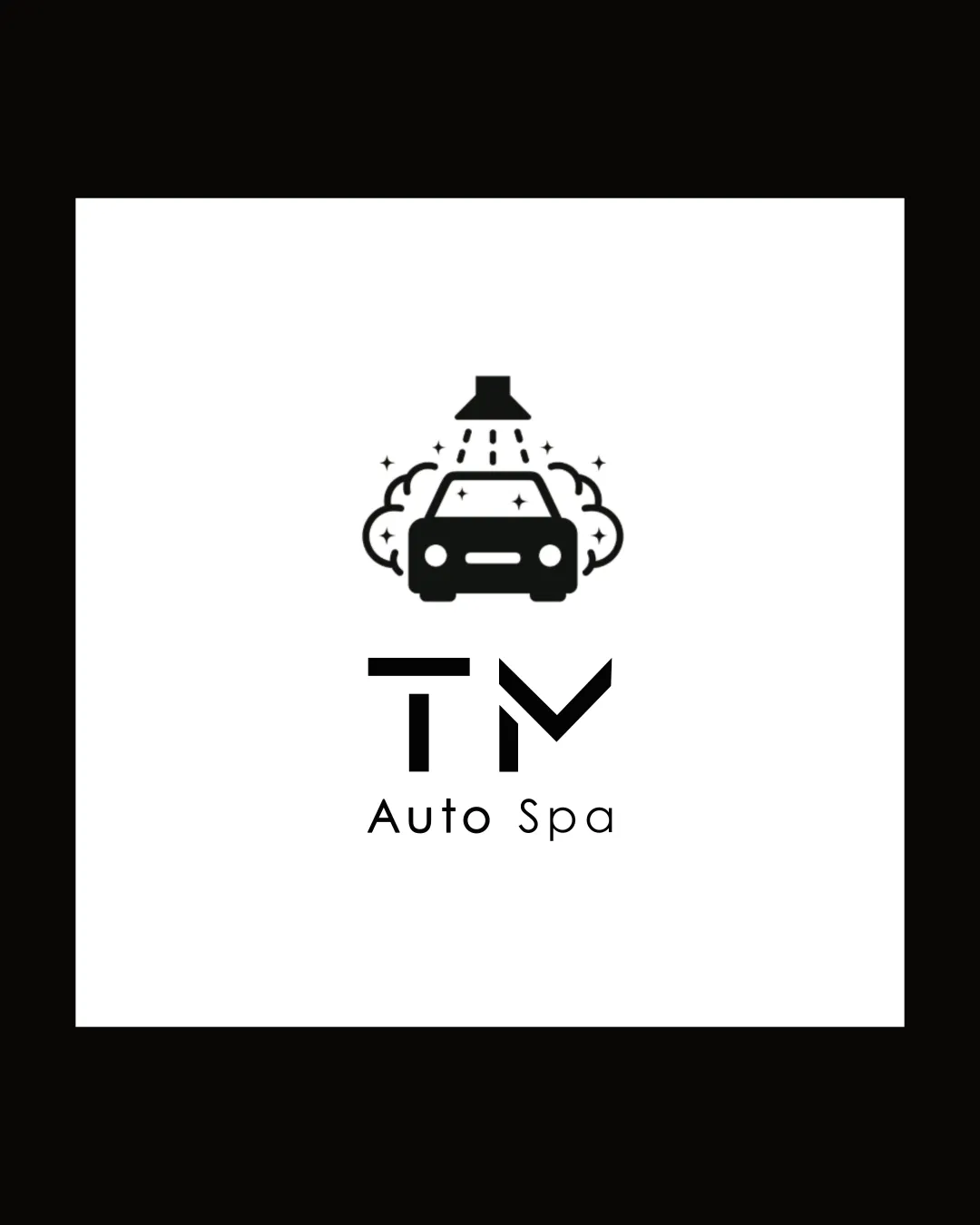
TM Auto Spa logo review
3.3/5
Logo score
Logo review of

Tm Auto Spa

A clear and appropriate logo that communicates its industry well, but needs refinement in originality and style cohesion to stand out.

Combination Mark Modern Minimalistic Car Wash Or Auto Detailing
4/5
Legibility
3/5
Originality
4/5
Misread
3.5/5
Balance
4/5
Scale
Action plan

What to fix first

The most important fixes to handle before polishing the full presentation.

1

Refine 'TM' monogram style or tune letter spacing.

Medium priority

The current geometric approach feels slightly disjointed from the pictogram above.

Impact: Improves Overall Professional Finish And Legibility. · Effort: Medium

2

Simplify or clarify small details in the mark for small-scale use.

Low priority

Small sparkles and lines may blur on smaller applications.

Impact: Boosts Scalability And Ensures Mark Remains Legible At All Sizes. · Effort: Low

Detailed review

Logo performance breakdown

4/5

Legibility

Checkmark icon 'TM Auto Spa' is readable and clear.

Warning icon Spacing and size of 'TM' could be slightly improved for clarity.

3/5

Originality

Checkmark icon Literal depiction is clear.

Warning icon Overall pictogram is common in car wash branding; lacks a highly distinctive twist.

3.5/5

Balance alignment

Checkmark icon Central alignment feels stable.
Checkmark icon Mark and type are visually anchored.

Warning icon Slight disconnect between mark and wordmark style.
Warning icon 'TM' wordmark doesn't fully harmonize with the car symbol.

logo 200x250 pixels scalability test alignment grid overlay
4/5

Scalability

Checkmark icon Simple shapes ensure good small-scale clarity.

Warning icon Tiny sparkles and water details may lose definition at very small sizes.

logo 200x250 pixels scalability test

200x250 px

logo 100x125 pixels scalability test

100×125 px

logo 50x62 pixels scalability test

50×62 px

4/5

Misinterpretations

Checkmark icon No plausible negative or confusing readings.

3/5

Logo structure & brief match

Checkmark icon Theme is harmonious.

Warning icon Different visual languages for symbol and type reduce cohesion.

Checkmark icon Industry Relevance: Auto wash concept is directly and recognizably communicated.

Try your own review

Wondering how your logo performs?

Get a clear logo score, key risks, and priority fix ideas before your client or audience sees it.

Review my logo