 View review
Logo score
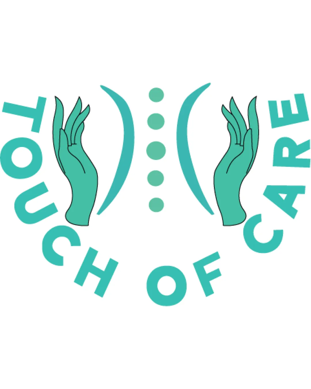
Logo review ofTouch Of Care
Review the detailed scores below to see what is working and what should be refined first.
Legibility
Originality
Misread
Balance
Scale
Action plan
What to fix first
The most important fixes to handle before polishing the full presentation.
1
Fix possible misinterpretation
High priorityCentral symbol unintentionally resembles intimate body parts or buttocks, which risks inappropriate dual interpretation and could damage the brand.
Impact: High · Effort: Medium
Detailed review
Logo performance breakdown
Legibility
![]() Text is bold and clear, easily readable from a distance.
Text is bold and clear, easily readable from a distance.![]() Font choice is simple and modern.
Font choice is simple and modern.
![]() Curved placement makes some letters less immediately readable, particularly at a glance.
Curved placement makes some letters less immediately readable, particularly at a glance.
Originality
![]() Combination of hands and spine/body is relevant and moderately unique for healthcare.
Combination of hands and spine/body is relevant and moderately unique for healthcare.
![]() Hands surrounding a stylized spine/body is a common concept in wellness/healthcare, so lacks strong originality.
Hands surrounding a stylized spine/body is a common concept in wellness/healthcare, so lacks strong originality.![]() No creative use of negative space or bold reinterpretation.
No creative use of negative space or bold reinterpretation.
Color harmony
![]() Very good use of a minimal and harmonious color palette.
Very good use of a minimal and harmonious color palette.![]() Turquoise is clean and gives a trustworthy medical vibe.
Turquoise is clean and gives a trustworthy medical vibe.
Turquoise
#41C6B1
White
#FFFFFF
Balance alignment
![]() Overall layout is symmetrical.
Overall layout is symmetrical.
![]() Text arc is awkward and feels somewhat forced around the symbol, disrupting visual harmony.
Text arc is awkward and feels somewhat forced around the symbol, disrupting visual harmony.![]() Hands are not perfectly aligned with the spine/dot symbol for true central balance.
Hands are not perfectly aligned with the spine/dot symbol for true central balance.

Scalability
![]() Simple color scheme improves scalability.
Simple color scheme improves scalability.![]() Works on white backgrounds and standard signage.
Works on white backgrounds and standard signage.
![]() Hand illustration contains thin lines that may lose clarity at small sizes.
Hand illustration contains thin lines that may lose clarity at small sizes.![]() Dot and curve elements may become indistinct when scaled down.
Dot and curve elements may become indistinct when scaled down.![]() Logo could be difficult to reproduce in single-color or embroidery formats.
Logo could be difficult to reproduce in single-color or embroidery formats.
200x250 px
100×125 px
50×62 px
Misinterpretations
![]() Central symbol unintentionally resembles intimate body parts or buttocks, which risks inappropriate dual interpretation and could damage the brand.
Central symbol unintentionally resembles intimate body parts or buttocks, which risks inappropriate dual interpretation and could damage the brand.
Symbol & text fit
![]() Color and style of illustration and text are mostly consistent.
Color and style of illustration and text are mostly consistent.
![]() Wordmark arc does not integrate seamlessly with the logomark, feeling somewhat separate.
Wordmark arc does not integrate seamlessly with the logomark, feeling somewhat separate.
Try your own review
Review my logo
Wondering how your logo performs?
Get a clear logo score, key risks, and priority fix ideas before your client or audience sees it.
Keep exploring


