Wondering how your logo performs? 🧐
Get professional logo reviews in seconds and catch design issues in time.
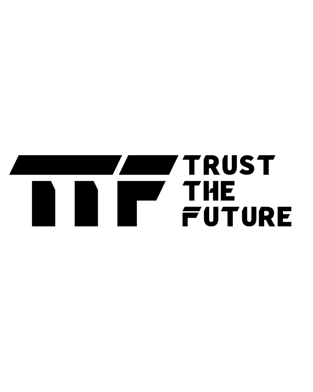
Try it Now!Logo review of TRUST THE FUTURE
 Logo analysis by AI
Logo type:
Style:
Detected symbol:
Detected text:
Business industry:
Review requested by Hexmarketing
**If AI can recognize or misinterpret it, so can people.
Structured logo review
Legibility
![]() The text 'TRUST THE FUTURE' is highly legible with good spacing and contrast.
The text 'TRUST THE FUTURE' is highly legible with good spacing and contrast.![]() Monogram is clear and reads as 'TF' without ambiguity.
Monogram is clear and reads as 'TF' without ambiguity.
Scalability versatility
![]() The thick strokes ensure good readability at small sizes.
The thick strokes ensure good readability at small sizes.![]() The design is simple enough to work on merchandise, packaging, billboards, or digital avatars.
The design is simple enough to work on merchandise, packaging, billboards, or digital avatars.
![]() The logomark's extended horizontal format may lose impact or become awkward in small squares, such as app icons or social favicons.
The logomark's extended horizontal format may lose impact or become awkward in small squares, such as app icons or social favicons.![]() Very thick/bold elements might cause legibility loss in sizes smaller than 16x16px.
Very thick/bold elements might cause legibility loss in sizes smaller than 16x16px.
200x250 px
100×125 px
50×62 px
Balance alignment
![]() Strong geometric alignment in the monogram.
Strong geometric alignment in the monogram.![]() Wordmark stacking is clean and centered vertically to the logomark.
Wordmark stacking is clean and centered vertically to the logomark.
![]() Visual weight of the logomark greatly overpowers the wordmark, making the left side feel heavier.
Visual weight of the logomark greatly overpowers the wordmark, making the left side feel heavier.![]() Gaps between the segments of the 'TF' monogram are inconsistent with wordmark letter spacing.
Gaps between the segments of the 'TF' monogram are inconsistent with wordmark letter spacing.

Originality
![]() Diagonal cuts and bold geometry add some distinctiveness.
Diagonal cuts and bold geometry add some distinctiveness.![]() Combination of monogram and tagline gives it a modern feel.
Combination of monogram and tagline gives it a modern feel.
![]() TF monogram in geometric style is relatively generic and commonly seen.
TF monogram in geometric style is relatively generic and commonly seen.
Logomark wordmark fit
![]() Both logomark and wordmark use geometric shapes creating a partial style link.
Both logomark and wordmark use geometric shapes creating a partial style link.
![]() Stylistic gap between ultra-bold angular monogram and softer, more approachable sans-serif wordmark. The 'FUTURE' section tries to reference the monogram with lines but overall coherence is lacking.
Stylistic gap between ultra-bold angular monogram and softer, more approachable sans-serif wordmark. The 'FUTURE' section tries to reference the monogram with lines but overall coherence is lacking.![]() Size and weight difference creates a disconnect between the logomark and wordmark.
Size and weight difference creates a disconnect between the logomark and wordmark.
Aesthetic look
![]() Modern and visually bold appearance.
Modern and visually bold appearance.![]() Use of negative space is controlled, not excessive.
Use of negative space is controlled, not excessive.
![]() Some may find the monogram too heavy compared to the rest of the identity.
Some may find the monogram too heavy compared to the rest of the identity.
Dual meaning and misinterpretations
![]() No inappropriate shapes or symbols detected in the composition.
No inappropriate shapes or symbols detected in the composition.
Color harmony
![]() Strong high contrast black and white, ensures universal readability.
Strong high contrast black and white, ensures universal readability.![]() Timeless color choice that adapts to many backgrounds.
Timeless color choice that adapts to many backgrounds.
Black
#000000
White
#FFFFFF


