 View review
Logo score
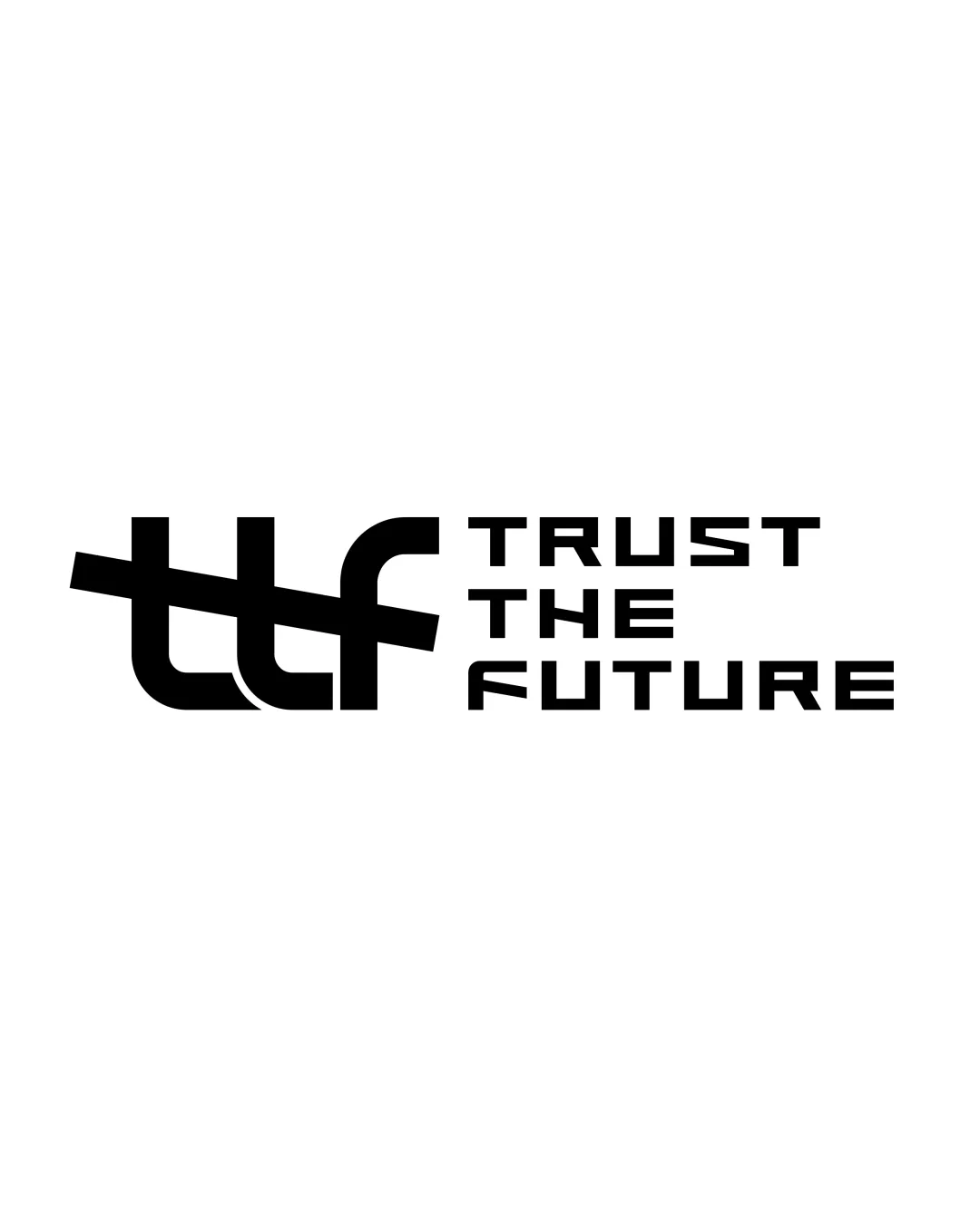
Logo review ofTrust The Future
Review the detailed scores below to see what is working and what should be refined first.
Legibility
Originality
Misread
Balance
Scale
Detailed review
Logo performance breakdown
Legibility
![]() The text 'TRUST THE FUTURE' is clear and easily readable.
The text 'TRUST THE FUTURE' is clear and easily readable.![]() The geometric typeface enhances industrial and futuristic feel.
The geometric typeface enhances industrial and futuristic feel.
![]() The 'ttf' monogram could be confusing at first glance due to the overlap and heavy bar, especially in small sizes.
The 'ttf' monogram could be confusing at first glance due to the overlap and heavy bar, especially in small sizes.
Originality
![]() Distinct combination of monogram and wordmark—avoids clichés.
Distinct combination of monogram and wordmark—avoids clichés.![]() The slightly abstract, industrial tech aesthetic gives a unique feel.
The slightly abstract, industrial tech aesthetic gives a unique feel.
![]() Stacked/overlapped letter forms for initials are not uncommon in technology branding.
Stacked/overlapped letter forms for initials are not uncommon in technology branding.![]() Monogram approach is familiar despite bold execution.
Monogram approach is familiar despite bold execution.
Color harmony
![]() Simple black and white palette ensures maximum versatility.
Simple black and white palette ensures maximum versatility.![]() High contrast between text and background supports visual clarity.
High contrast between text and background supports visual clarity.
Black
#000000
White
#FFFFFF
Balance alignment
![]() Horizontal alignment between the logomark and wordmark creates a visually cohesive unit.
Horizontal alignment between the logomark and wordmark creates a visually cohesive unit.![]() Wordmark block is well aligned to the right of the monogram.
Wordmark block is well aligned to the right of the monogram.
![]() Heavy horizontal bar in the monogram visually outweighs the rest of the elements, causing mild imbalance.
Heavy horizontal bar in the monogram visually outweighs the rest of the elements, causing mild imbalance.![]() The left-heavy monogram disrupts perfect symmetry with the clean right text block.
The left-heavy monogram disrupts perfect symmetry with the clean right text block.

Scalability
![]() Simple color scheme aids scalability.
Simple color scheme aids scalability.![]() Bold shapes stand out well in larger formats like billboards and digital displays.
Bold shapes stand out well in larger formats like billboards and digital displays.
![]() The overlapping bar and close letter spacing in the 'ttf' monogram may become illegible when reduced to small sizes (e.g., app icons, embroidery).
The overlapping bar and close letter spacing in the 'ttf' monogram may become illegible when reduced to small sizes (e.g., app icons, embroidery).![]() Complexity in the monogram may not print clearly on merchandise like pens or small physical labels.
Complexity in the monogram may not print clearly on merchandise like pens or small physical labels.
200x250 px
100×125 px
50×62 px
Misinterpretations
![]() No inappropriate or confusing imagery detected in overall composition.
No inappropriate or confusing imagery detected in overall composition.
Symbol & text fit
![]() Both logomark and wordmark share the same bold visual language and weight.
Both logomark and wordmark share the same bold visual language and weight.
![]() Monogram's playful, almost experimental composition slightly clashes with the stricter geometry of the wordmark.
Monogram's playful, almost experimental composition slightly clashes with the stricter geometry of the wordmark.
Try your own review
Review my logo
Wondering how your logo performs?
Get a clear logo score, key risks, and priority fix ideas before your client or audience sees it.
Keep exploring


