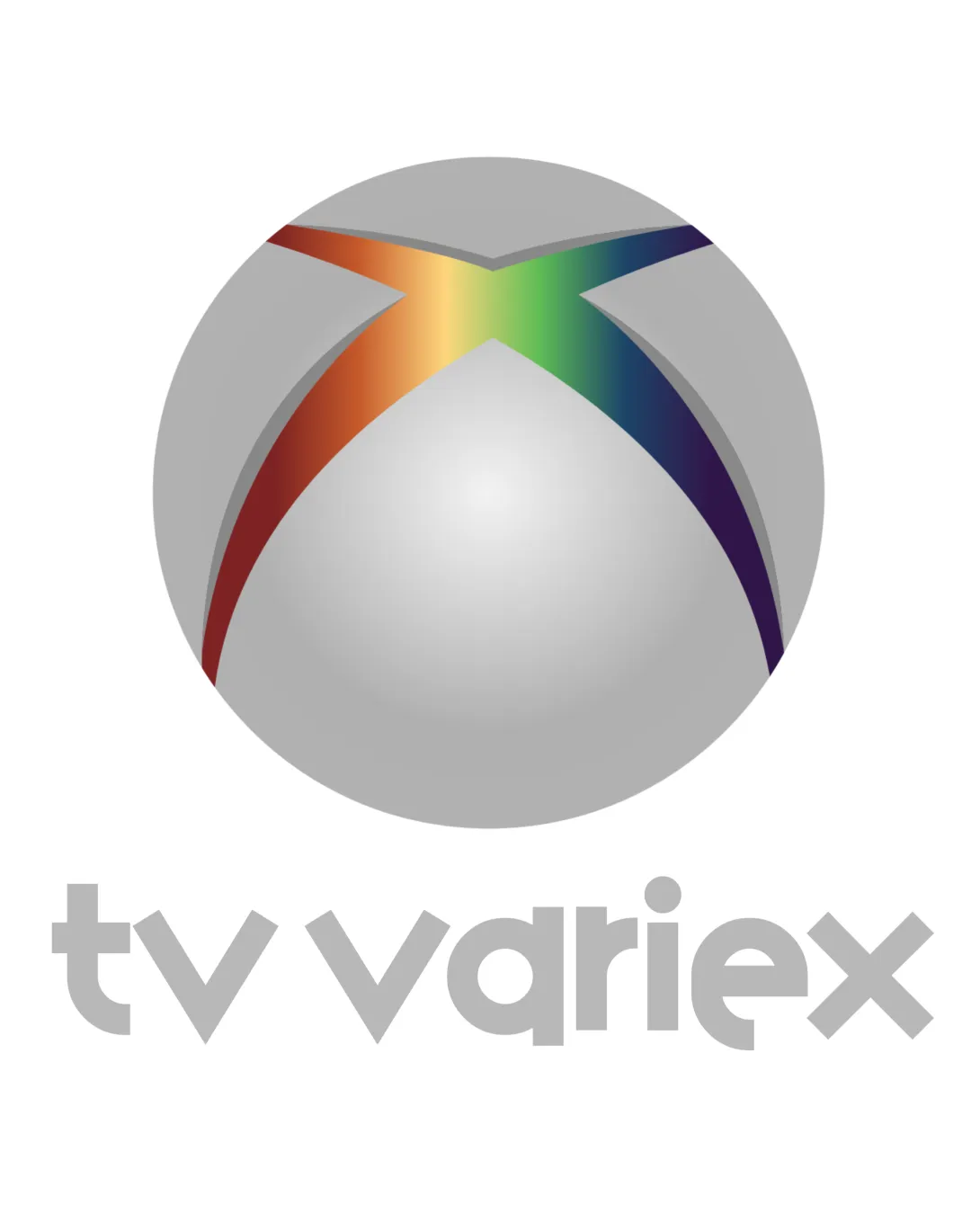
tv variex logo review
2.7 / 5
Logo score
Logo review of

Tv Variex

Functional but generic and visually outdated; requires simplification and more distinctiveness to compete in professional media branding.

Combination Mark 3D Gradient, Geometric Sans-serif Media
4/5
Legibility
2/5
Originality
4/5
Misread
3.5/5
Balance
2.5/5
Scale
Action plan

What to fix first

The most important fixes to handle before polishing the full presentation.

1

Simplify the spherical 'X' symbol and reduce gradient reliance

High priority

Current style limits versatility and feels derivative. A flat, abstracted mark would be more distinctive and easier to reproduce.

Impact: Improves Scalability, Modernity, And Differentiation · Effort: Medium

2

Increase contrast in the wordmark

Medium priority

Current grey-on-white risks poor legibility in many contexts.

Impact: Improves Readability And Accessibility, Especially In Digital And Print Applications · Effort: Low

Detailed review

Logo performance breakdown

4/5

Legibility

Checkmark icon Wordmark is highly readable with geometric typeface

Warning icon Grey color reduces contrast, especially against light backgrounds

2/5

Originality

Checkmark icon Rainbow gradient adds some uniqueness

Warning icon Spherical mark with 'X' is very reminiscent of well-known tech branding
Warning icon 3D ball and generic font feel derivative

3/5

Color harmony

Checkmark icon Rainbow gradient is harmonious and eye-catching

Warning icon Heavy reliance on gradients limits versatility and complicates printing

Silver
#B8B8B8

Red
#CF2A1B

Yellow
#F9E384

Green
#56B168

Blue
#392B93

Black
#000000

Color may be holding this logo back. Build a stronger strategic palette before updating the logo.

Build brand colors
3.5/5

Balance alignment

Checkmark icon Central alignment of mark and wordmark

Warning icon Size relationship between mark and wordmark feels slightly top-heavy

logo 200x250 pixels scalability test alignment grid overlay
2.5/5

Scalability

Checkmark icon Simple geometric shapes within wordmark

Warning icon 3D effects and gradients complicate reproduction at small sizes
Warning icon Sphere with gradients could lose detail when reduced

logo 200x250 pixels scalability test

200x250 px

logo 100x125 pixels scalability test

100×125 px

logo 50x62 pixels scalability test

50×62 px

4/5

Misinterpretations

Checkmark icon No obvious offensive or confusing negative space

3 / 5

Logo structure & brief match

Checkmark icon Both elements are geometric, sharing visual language

Warning icon Styling of 'X' symbol and wordmark visually connect but lack a unified concept

Checkmark icon Conceptual Fit: Reflects diversity with rainbow colors but lacks unique identity; relies on generic forms familiar in tech/media.
Checkmark icon Digital/TV Context: 3D globe and clean sans-serif type are on-brand for a digital or TV entity, but would be stronger with more distinctiveness.

Try your own review

Wondering how your logo performs?

Get a clear logo score, key risks, and priority fix ideas before your client or audience sees it.

Review my logo