Wondering how your logo performs? 🧐
Get professional logo reviews in seconds and catch design issues in time.
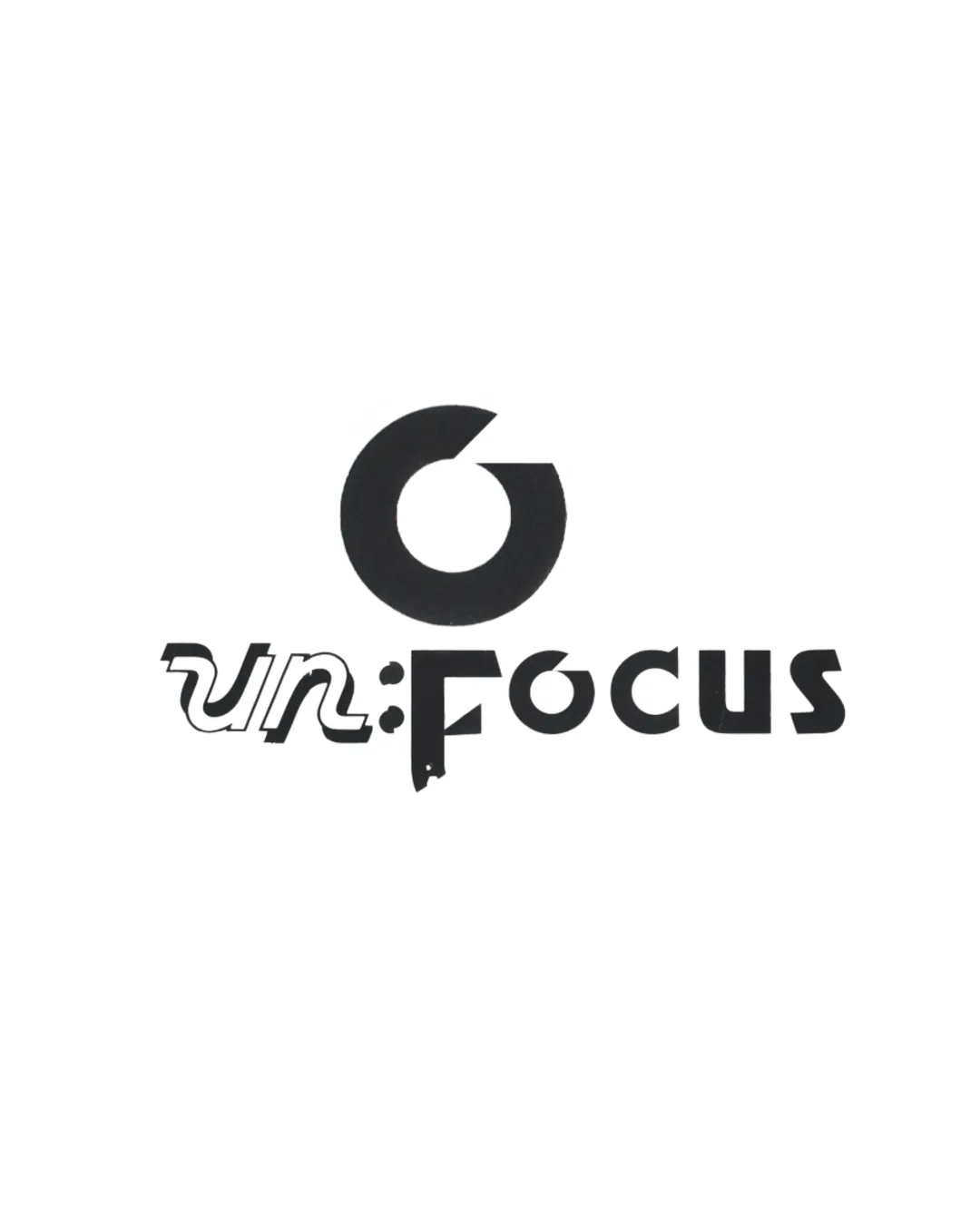
Try it Now!Logo review of un:Focus
 Logo analysis by AI
Logo type:
Style:
Detected symbol:
Detected text:
Business industry:
Review requested by StephenZ
**If AI can recognize or misinterpret it, so can people.
Structured logo review
Legibility
![]() ‘Focus’ portion is more legible and uses a clean geometric sans serif.
‘Focus’ portion is more legible and uses a clean geometric sans serif.
![]() The blending of fonts in ‘un’ and the colon reduces immediate readability.
The blending of fonts in ‘un’ and the colon reduces immediate readability.![]() Inconsistent styling between portions disrupts reading flow.
Inconsistent styling between portions disrupts reading flow.![]() The letter ‘F’ is partly melted into the mark below, which hinders quick recognition.
The letter ‘F’ is partly melted into the mark below, which hinders quick recognition.![]() The creative layering sacrifices clear word recognition.
The creative layering sacrifices clear word recognition.
Scalability versatility
![]() High-contrast, monochrome color scheme benefits most print and digital materials.
High-contrast, monochrome color scheme benefits most print and digital materials.![]() Iconic mark is recognizable even when scaled down, provided it's used standalone.
Iconic mark is recognizable even when scaled down, provided it's used standalone.
![]() Thin experimental treatments in ‘un:’ may become illegible at small sizes.
Thin experimental treatments in ‘un:’ may become illegible at small sizes.![]() Detail loss likely for fine lines on embroidered or small-scale applications.
Detail loss likely for fine lines on embroidered or small-scale applications.![]() Uneven typographic weights complicate scalability to mobile app icons or small packaging.
Uneven typographic weights complicate scalability to mobile app icons or small packaging.
200x250 px
100×125 px
50×62 px
Balance alignment
![]() Central placement of the mark above sets visual hierarchy.
Central placement of the mark above sets visual hierarchy.
![]() ‘un:’ and ‘Focus’ are in drastically different weights and styles, feeling disconnected.
‘un:’ and ‘Focus’ are in drastically different weights and styles, feeling disconnected.![]() Colon and lower part of the ‘F’ lack alignment, creating a jarring break.
Colon and lower part of the ‘F’ lack alignment, creating a jarring break.![]() Negative space under the logomark feels awkward and unused.
Negative space under the logomark feels awkward and unused.

Originality
![]() Inventive integration of out-of-focus visual metaphor with the abstract mark.
Inventive integration of out-of-focus visual metaphor with the abstract mark.![]() Distinct combination of type treatments signals a conceptual, creative approach.
Distinct combination of type treatments signals a conceptual, creative approach.
![]() The mark leans on recognizable aperture/camera iconography, which is common in media niches.
The mark leans on recognizable aperture/camera iconography, which is common in media niches.![]() Typographic distortion is novel but borders on being visually confusing.
Typographic distortion is novel but borders on being visually confusing.
Logomark wordmark fit
![]() Central icon could work as a standalone brand mark.
Central icon could work as a standalone brand mark.
![]() Overly separates from the wordmark in terms of style and visual mass.
Overly separates from the wordmark in terms of style and visual mass.![]() Integration with the ‘F’ feels forced, detracting from unified branding.
Integration with the ‘F’ feels forced, detracting from unified branding.
Aesthetic look
![]() Modern and conceptual attempt; bold black and white create strong contrast.
Modern and conceptual attempt; bold black and white create strong contrast.
![]() Busy and fragmented typographic approach appears chaotic.
Busy and fragmented typographic approach appears chaotic.![]() Disjointed elements overwhelm the eye and detract from polish.
Disjointed elements overwhelm the eye and detract from polish.![]() Overall look lacks cohesion, making it appear experimental rather than professional.
Overall look lacks cohesion, making it appear experimental rather than professional.
Dual meaning and misinterpretations
![]() No inappropriate or ambiguous symbolism detected.
No inappropriate or ambiguous symbolism detected.
Color harmony
![]() Restrained black and white palette is classic and versatile.
Restrained black and white palette is classic and versatile.![]() Strong contrast enhances visibility across mediums.
Strong contrast enhances visibility across mediums.
Black
#000000
White
#FFFFFF


