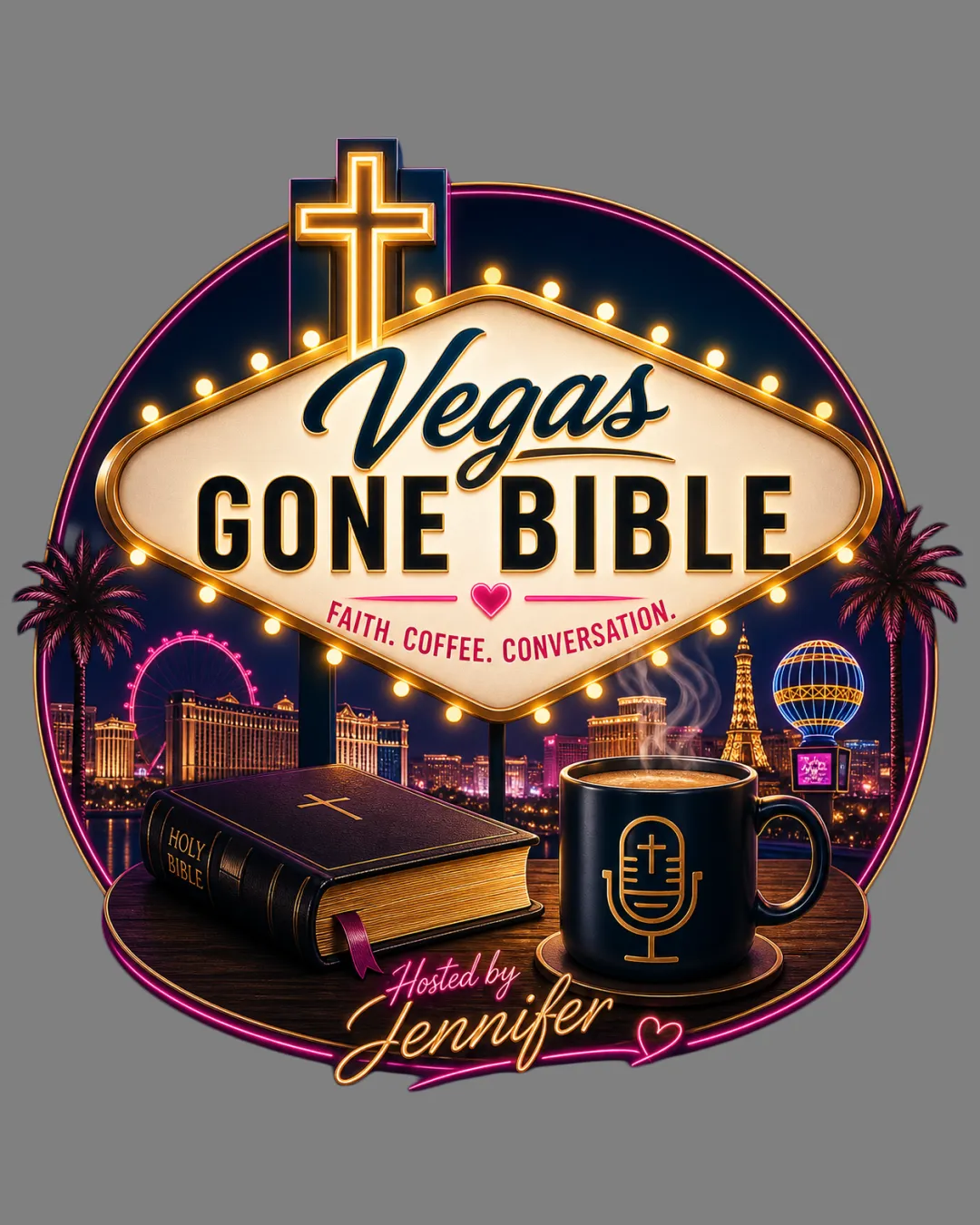
Vegas Gone Bible
FAITH. COFFEE. CONVERSATION.
Holy.. logo review
3.5/5
Logo score
Logo review of

Vegas Gone Bible Faith. Coffee. Conversation. Holy..

Distinctive, audience-aligned concept that needs simplification or a variant for broad utility.

Combination Illustrative, Neon-inspired, Busy Podcasting
4.5/5
Legibility
3.5/5
Originality
5/5
Misread
3.5/5
Balance
2.5/5
Scale
Your next steps

What to fix first

Focus on the changes that matter. Keep what makes the logo work.

1

full logo

Simplify or create a small-size variant emphasizing main sign, cross, and podcast/faith iconography.

Visible issue High priority Medium effort
Area to inspectApproximate location

Dense illustration and small details (cityscape, palm trees, Bible text, coffee cup design) may lose clarity at small sizes or as social media icons.

How to check

Verify clarity and element recognition at reduced sizes.

See the category review
2

upper neon sign area

Slightly adjust vertical spacing or enhance base elements to unify composition.

Optional refinement Medium priority Low effort
Area to inspectApproximate location

Top-heavy sign shape and tall cross slightly outweigh the bottom visual weight, causing mild imbalance.

How to check

Test perceived balance and unity of top and bottom elements.

See the category review
Detailed review

Logo performance breakdown

4/5

Brief & logo match

Based on your brief
Compared with

Podcasting for Christian and faith-based audiences; must look trustworthy, inspirational, and suitable for podcast and channel branding.

Logo creatively blends Vegas flair and Christian themes, but complexity hinders adaptability for all target uses.

  • Faith-based Symbolism

    Cross, Bible, spiritual tagline, and mug with faith/mic icon fit the Christian focus.

  • Las Vegas Connection

    Neon sign style, skyline, and city cues strongly tie to Vegas identity.

4.5/5

Legibility

  • Large, clear text hierarchy.
  • Readable scripting and block typefaces.
3.5/5

Originality

  • Faith-Vegas fusion is memorable.
  • Personal touches like coffee and host signature.
  • Using the familiar Vegas sign is recognizable but not highly original; the faith twist adds distinction but relies on a popular template.

    Optional refinement Vegas sign integration

    Try: Strengthen unique podcast identity by further personalizing or stylizing the Vegas sign elements.

    Check: Reassess distinctiveness among podcasting/Christian Vegas-themed imagery.

4/5

Color harmony

  • Cohesive neon-inspired palette.
  • Warm, inviting tones.
Beige#F6E3B1
Navy#141944
Gold#E1B85E
DarkBrown#231B1D
Pink#DF5089
Black#000000
Brown#83451B

Estimated colors. Use the original design file for exact values.

Create a full color palette using these colors

Create new palette
3.5/5

Balance alignment

  • Main elements are visually centered.
  • Top-heavy sign shape and tall cross slightly outweigh the bottom visual weight, causing mild imbalance.

    Optional refinement upper neon sign area

    Try: Slightly adjust vertical spacing or enhance base elements to unify composition.

    Check: Test perceived balance and unity of top and bottom elements.

    Area to inspectApproximate location
Uploaded logoAlignment guide overlay

Inspect spacing with the guide. Optical balance may differ from geometric centering.

2.5/5

Scalability

  • Strong central mark and concept.
  • Dense illustration and small details (cityscape, palm trees, Bible text, coffee cup design) may lose clarity at small sizes or as social media icons.

    Visible issue full logo

    Try: Simplify or create a small-size variant emphasizing main sign, cross, and podcast/faith iconography.

    Check: Verify clarity and element recognition at reduced sizes.
    Area to inspectApproximate location
Uploaded logo at 200 pixels wide
200 × 250 px
Uploaded logo at 100 pixels wide
100 × 125 px
Uploaded logo at 50 pixels wide
50 × 63 px

Compare the detail at different sizes. Labels show the full image dimensions.

5/5

Misinterpretations

  • No unintended readings.
4/5

Symbol & text fit

  • Integrated sign and supporting emblems.

Black & white

Does the shape still work without color?

These tests are available only for logos uploaded in vector (SVG) format.

Background contrast

Find the surfaces where your logo stays clear.

These tests are available only for logos uploaded in vector (SVG) format.

Blur & silhouette

A 3px blur softens fine details so you can check whether the overall shape stays recognizable. If key gaps close or elements merge, the logo may rely too heavily on detail.

These tests are available only for logos uploaded in vector (SVG) format.

Try your own review

Wondering how your logo performs?

Get a clear logo score, key risks, and priority fix ideas before your client or audience sees it.

Review my logo