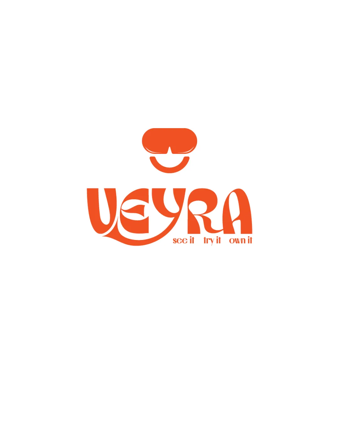
VEYRA see it try it own it logo review
3/5
Logo score
Logo review of

Veyra See It Try It Own It

Creative and memorable, but needs clearer letterforms and a symbol more in line with the brand's refined minimalism.

Combination Modern Geometric Wordmark With Abstract Figure Fashion/lifestyle
2/5
Legibility
4/5
Originality
5/5
Misread
3/5
Balance
4/5
Scale
Your next steps

What to fix first

Focus on the changes that matter. Keep what makes the logo work.

1

wordmark

Simplify or clarify key letter shapes to improve instant recognition.

Visible issue High priority Medium effort
Area to inspectApproximate location

Highly stylized letterforms, especially 'V', 'E', and 'Y', reduce quick readability and may hinder brand recall.

How to check

Ask users to read the name unaided at small and medium sizes.

See the category review
2

Standalone mark and wordmark

Reassess or refine the mark for a closer alignment to the core 'confident, minimal, quality' values.

Visible issue High priority Medium effort
Area to inspectApproximate location

The abstract symbol above the name resembles VR goggles or a stylized face, which can suggest playfulness or digital tech, contrasting with a minimal, premium 'essentials' brand.

How to check

Review intended brand associations with users and refine the mark if needed.

See the category review
Detailed review

Logo performance breakdown

3/5

Brief & logo match

Based on your brief
Compared with

Modern, minimal and confident premium essentials lifestyle brand for young professionals and creatives.

Partially answers the need for individuality and confidence, but lacks the minimal, refined feel requested.

  • Modernity And Minimalism

    The playful face mark and geometric wordmark look modern but risk feeling busy, not minimal.

  • Confidence And Individuality

    Custom typography and unique icon express individuality and confidence.

2/5

Legibility

  • Highly stylized letterforms, especially 'V', 'E', and 'Y', reduce quick readability and may hinder brand recall.

    Visible issue wordmark

    Try: Simplify or clarify key letter shapes to improve instant recognition.

    Check: Ask users to read the name unaided at small and medium sizes.
    Area to inspectApproximate location
4/5

Originality

  • Memorable stylized type; the integrated face mark is unique.
3/5

Balance alignment

  • Distinctive geometric lines.
  • Unconventional letter shaping produces an uneven visual rhythm and a bulky left side, affecting balance.

    Optional refinement wordmark

    Try: Adjust spacing and curves for smoother left-right weight and visual flow.

    Check: Test perception of symmetry and flow at a glance.

Uploaded logoAlignment guide overlay

Inspect spacing with the guide. Optical balance may differ from geometric centering.

4/5

Scalability

  • Simple shapes ensure strong small-scale reproduction.
Uploaded logo at 200 pixels wide
200 × 250 px
Uploaded logo at 100 pixels wide
100 × 125 px
Uploaded logo at 50 pixels wide
50 × 63 px

Compare the detail at different sizes. Labels show the full image dimensions.

5/5

Misinterpretations

  • No unintended dual meaning observed.
2/5

Symbol & text fit

  • The abstract symbol above the name resembles VR goggles or a stylized face, which can suggest playfulness or digital tech, contrasting with a minimal, premium 'essentials' brand.

    Visible issue Standalone mark and wordmark

    Try: Reassess or refine the mark for a closer alignment to the core 'confident, minimal, quality' values.

    Check: Review intended brand associations with users and refine the mark if needed.

    Area to inspectApproximate location

Black & white

Does the shape still work without color?

These tests are available only for logos uploaded in vector (SVG) format.

Background contrast

Find the surfaces where your logo stays clear.

These tests are available only for logos uploaded in vector (SVG) format.

Blur & silhouette

A 3px blur softens fine details so you can check whether the overall shape stays recognizable. If key gaps close or elements merge, the logo may rely too heavily on detail.

These tests are available only for logos uploaded in vector (SVG) format.

Try your own review

Wondering how your logo performs?

Get a clear logo score, key risks, and priority fix ideas before your client or audience sees it.

Review my logo