Wondering how your logo performs? 🧐
Get professional logo reviews in seconds and catch design issues in time.
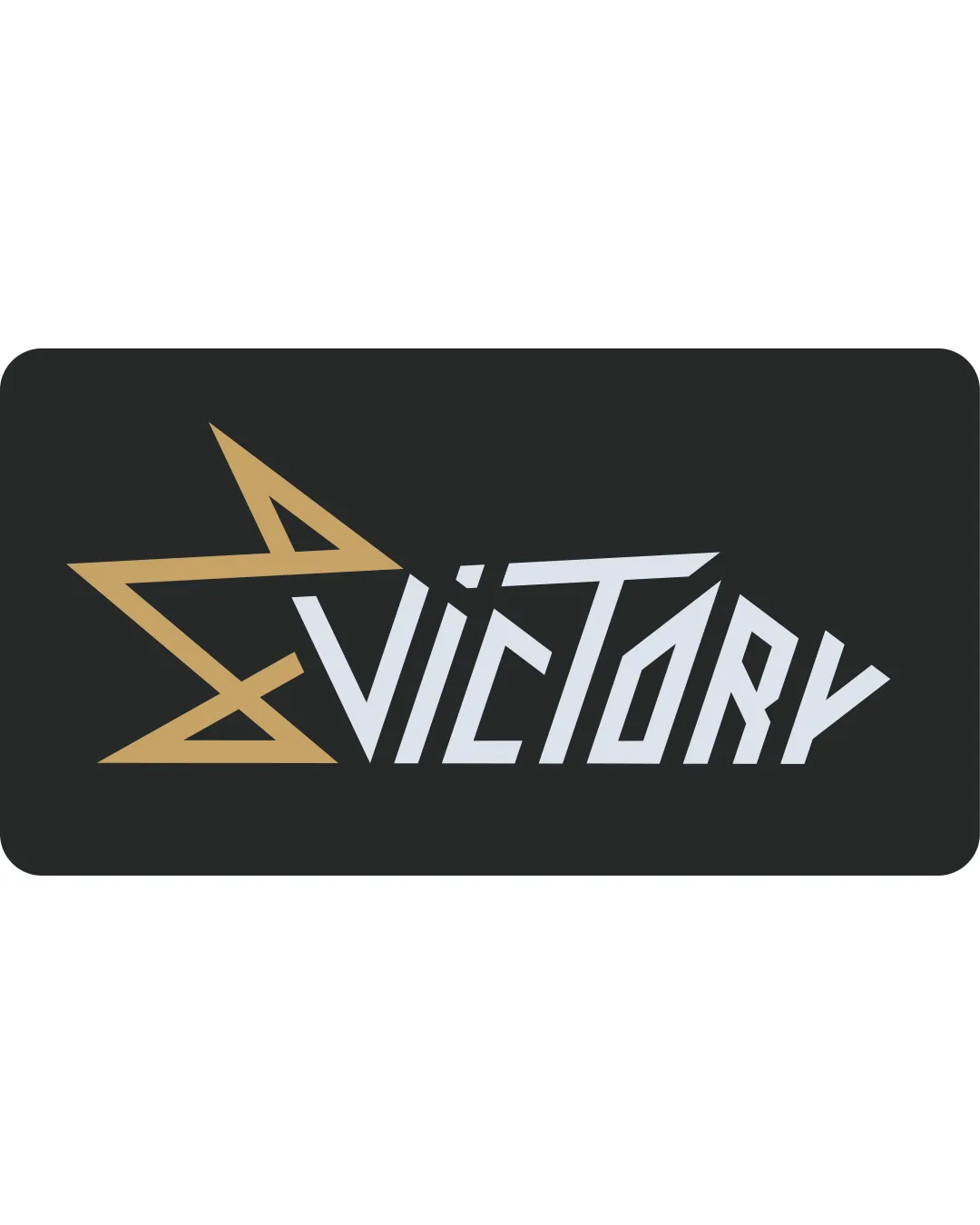
Try it Now!Logo review of VICTORY
 Logo analysis by AI
Logo type:
Style:
Detected symbol:
Detected text:
Business industry:
Review requested by JanPavlic
**If AI can recognize or misinterpret it, so can people.
Structured logo review
Legibility
![]() Contrast between text and background is strong
Contrast between text and background is strong![]() Large text size aids readability
Large text size aids readability
![]() Angular letterforms, especially the 'T', 'O', and 'Y', decrease quick legibility
Angular letterforms, especially the 'T', 'O', and 'Y', decrease quick legibility![]() Star shape connected to the V can cause confusion on first glance
Star shape connected to the V can cause confusion on first glance
Scalability versatility
![]() Bold elements retain some clarity at smaller sizes
Bold elements retain some clarity at smaller sizes![]() Simple color palette aids reproduction
Simple color palette aids reproduction
![]() Thin negative spaces within the star and sharp angles might blur at very small sizes (e.g., business cards, favicons, embroidery)
Thin negative spaces within the star and sharp angles might blur at very small sizes (e.g., business cards, favicons, embroidery)![]() Letter-spacing and dense design may merge when scaled down
Letter-spacing and dense design may merge when scaled down
200x250 px
100×125 px
50×62 px
Balance alignment
![]() Star points visually balance with the long 'V' and extended letter strokes
Star points visually balance with the long 'V' and extended letter strokes
![]() Left-heavy due to dominant star symbol; right side feels visually lighter
Left-heavy due to dominant star symbol; right side feels visually lighter![]() Text alignment varies in stroke width and angle, creating instability
Text alignment varies in stroke width and angle, creating instability

Originality
![]() Unique angular construction of the wordmark
Unique angular construction of the wordmark![]() Star integration with the V adds creativity
Star integration with the V adds creativity
![]() Star shapes are a common symbol for 'victory', reducing overall uniqueness
Star shapes are a common symbol for 'victory', reducing overall uniqueness
Logomark wordmark fit
![]() Star seamlessly forms part of the V, creating a natural visual connection
Star seamlessly forms part of the V, creating a natural visual connection![]() Consistent angular style between logomark and wordmark
Consistent angular style between logomark and wordmark
![]() If disconnected, the star may not be as recognizable apart from the V
If disconnected, the star may not be as recognizable apart from the V
Aesthetic look
![]() Modern and energetic with sharp lines
Modern and energetic with sharp lines![]() Stylized angularity adds impact
Stylized angularity adds impact
![]() Overly sharp and busy lines can feel aggressive or unrefined
Overly sharp and busy lines can feel aggressive or unrefined![]() Shapes feel slightly forced, especially the star merging with V
Shapes feel slightly forced, especially the star merging with V
Dual meaning and misinterpretations
![]() No inappropriate or problematic shapes detected
No inappropriate or problematic shapes detected![]() Symbolism is straightforward
Symbolism is straightforward
Color harmony
![]() Gold and white on black create elegant visual contrast
Gold and white on black create elegant visual contrast![]() Palette is clean and focused
Palette is clean and focused
![]() Color distinction of star and text may limit cohesion compared to single-color variations
Color distinction of star and text may limit cohesion compared to single-color variations
Teak
#B7996E
Ghost
#E0E4E7
Ebony
#232323