Wondering how your logo performs? 🧐
Get professional logo reviews in seconds and catch design issues in time.
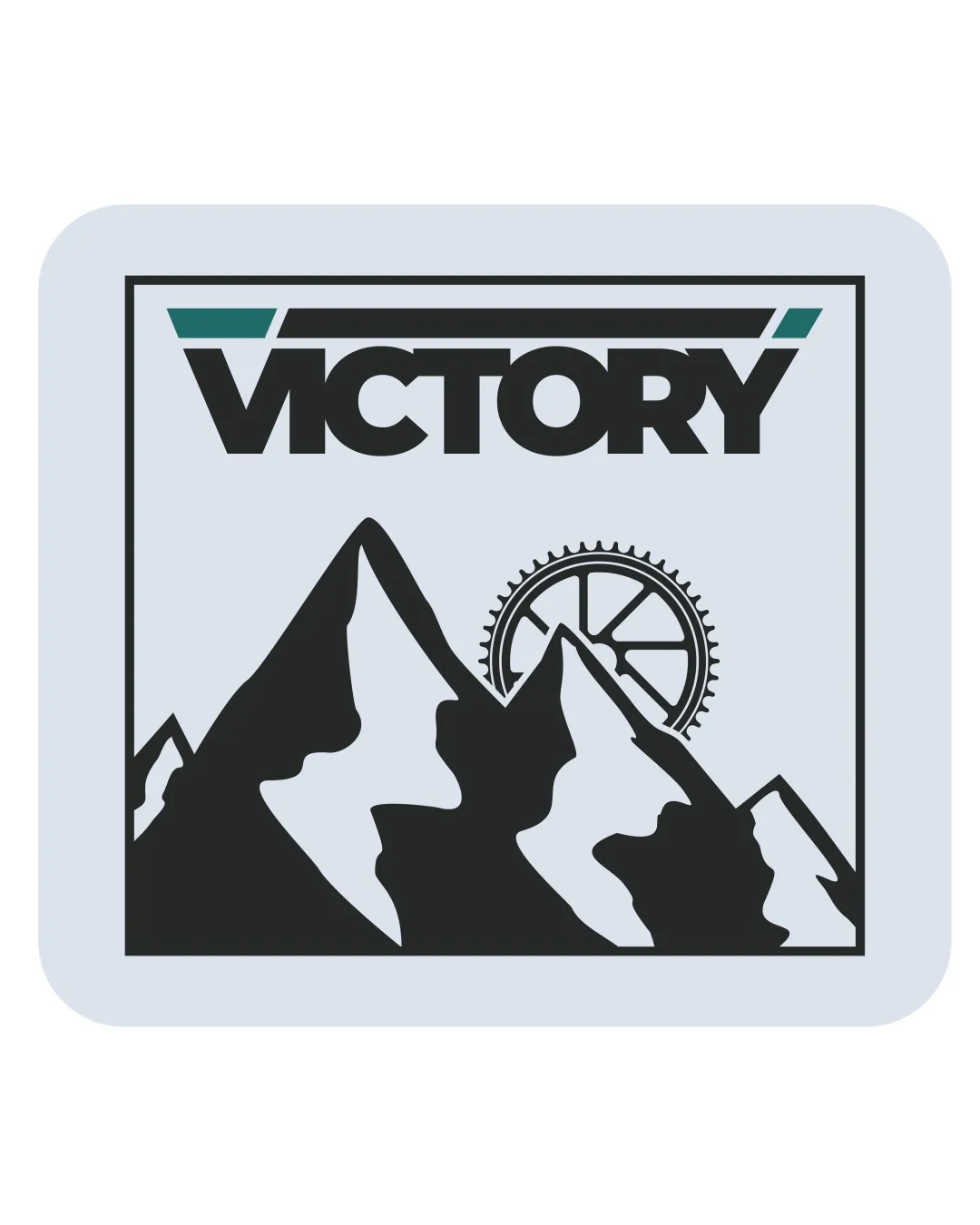
Try it Now!Logo review of VICTORY
 Logo analysis by AI
Logo type:
Style:
Detected symbol:
Detected text:
Business industry:
Review requested by JanPavlic
**If AI can recognize or misinterpret it, so can people.
Structured logo review
Legibility
![]() Bold and clear typeface enhances readability.
Bold and clear typeface enhances readability.
![]() The slight angular cut on the 'V' might be confusing at small sizes.
The slight angular cut on the 'V' might be confusing at small sizes.
Scalability versatility
![]() Distinct elements are recognizable.
Distinct elements are recognizable.
![]() Complex details in the mountain and gear may lose clarity at smaller sizes.
Complex details in the mountain and gear may lose clarity at smaller sizes.
200x250 px
100×125 px
50×62 px
Balance alignment
![]() Good alignment between text and visuals.
Good alignment between text and visuals.![]() Visually balanced composition.
Visually balanced composition.

Originality
![]() Combination of mountains and gear evokes adventure and motion.
Combination of mountains and gear evokes adventure and motion.
![]() Mountains and gears are somewhat common symbols in this industry.
Mountains and gears are somewhat common symbols in this industry.
Aesthetic look
![]() Strong contrast and simple color scheme add to the appeal.
Strong contrast and simple color scheme add to the appeal.
Dual meaning and misinterpretations
![]() No inappropriate symbols detected.
No inappropriate symbols detected.
Color harmony
![]() Minimal use of colors ensures good harmony.
Minimal use of colors ensures good harmony.
![]() Consideration could be given to a more dynamic color palette.
Consideration could be given to a more dynamic color palette.