Wondering how your logo performs? 🧐
Get professional logo reviews in seconds and catch design issues in time.
Try it Now!Logo review of Vietnam Railway
 Logo analysis by AI
Logo type:
Style:
Detected symbol:
Negative space:
Detected text:
Business industry:
Review requested by Grit288
**If AI can recognize or misinterpret it, so can people.
Structured logo review
Legibility
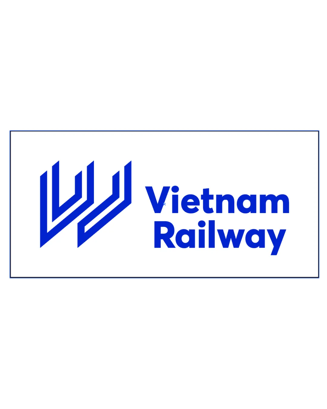
Text is clear, bold, and set in a modern sans-serif font.
Excellent contrast between blue text and white background.
All characters are highly legible and easy to read at a glance.
Scalability versatility
Bold lines and simple geometric shapes retain clarity at reduced sizes.
Symbol is recognizable for digital and large-format uses such as billboards, signage, or train liveries.
Good performance on print and web media.
Inter-line spaces in the symbol may become less distinct at very small sizes, such as favicons or embroidery.
Could be less effective if reduced to single-color applications, as the blue is essential to its current impact.

200x250 px

100×125 px

50×62 px
Balance alignment
Good proportional relationship between symbol and wordmark.
Solid horizontal alignment maintains visual stability.
Whitespace separation avoids crowding.
The vertical weight of the symbol creates a slight imbalance compared to the wordmark, drawing the eye more strongly to the left.


Originality
Abstraction of railway tracks is fresh and contemporary.
Negative space use brings subtlety and additional meaning.
Distinctiveness avoids generic railway iconography such as trains or literal rails.
The use of parallel, upward-angled lines is reminiscent of generic tech or movement-related logos, making it less instantly ownable for Vietnam Railway.
Logomark wordmark fit
Symbol and wordmark use similar line weights, which harmonizes them visually.
Both elements carry a modern aesthetic and align stylistically.
Spacing and sizing are well-considered for balanced presentation.
Aesthetic look
Modern minimalism conveys professionalism and efficiency.
Color scheme delivers energy without excess.
Well-executed geometric abstraction enhances brand perception.
Symbol could be perceived as slightly cold or non-evocative emotionally; may benefit from a more localized visual nod.
Dual meaning and misinterpretations
No inappropriate or ambiguous secondary meanings detected.
Shapes and lines clearly relate to the railway context.
Color harmony
Only two colors used for strong, memorable impression.
Blue on white is classic, trustworthy, and high contrast.
Simple palette enhances reproduction ease across media.
Science Blue
#0057FF
White
#FFFFFF

