Wondering how your logo performs? 🧐
Get professional logo reviews in seconds and catch design issues in time.
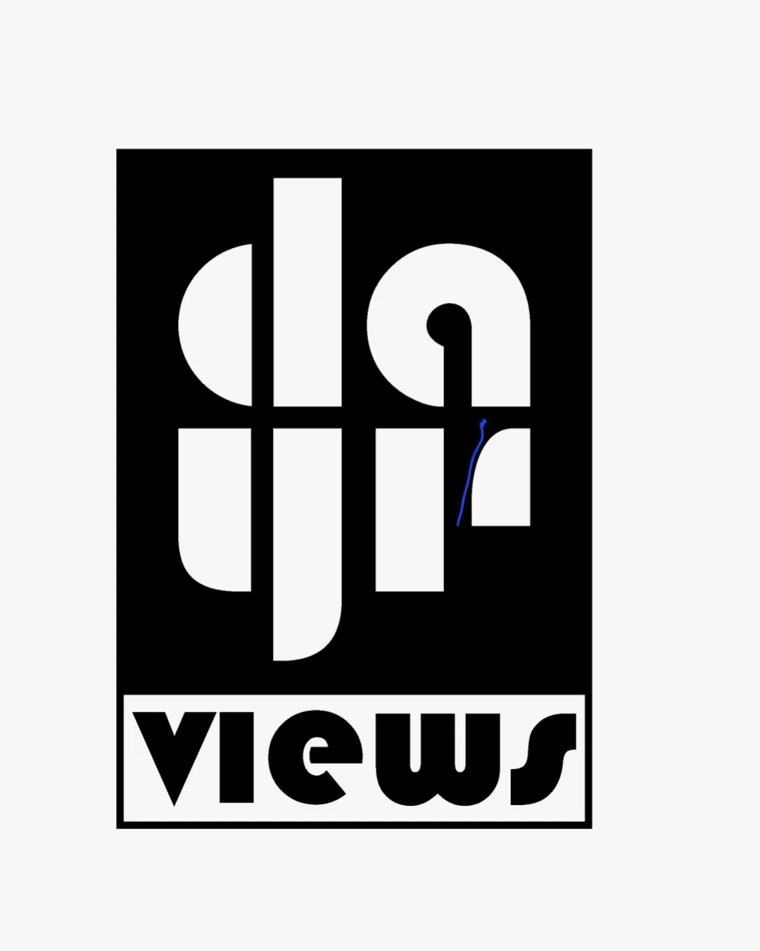
Try it Now!Logo review of 'views' in bold geometric sans-serif style
 Logo analysis by AI
Logo type:
Style:
Detected symbol:
Negative space:
Detected text:
Business industry:
Review requested by Safriye
**If AI can recognize or misinterpret it, so can people.
Structured logo review
Legibility
![]() The 'views' wordmark is clear and readable.
The 'views' wordmark is clear and readable.![]() Bold geometric forms draw attention.
Bold geometric forms draw attention.
![]() The monogram letterforms 'd', 'a', 'u', 'r' are highly abstracted, making them difficult to discern at first glance.
The monogram letterforms 'd', 'a', 'u', 'r' are highly abstracted, making them difficult to discern at first glance.![]() Potential confusion arises from the similar forms of geometric shapes, impacting immediate recognition.
Potential confusion arises from the similar forms of geometric shapes, impacting immediate recognition.
Scalability versatility
![]() Strong, thick lines ensure the main shapes remain visible even when scaled down.
Strong, thick lines ensure the main shapes remain visible even when scaled down.![]() Simple color palette is versatile for monochrome printing.
Simple color palette is versatile for monochrome printing.
![]() Complex monogram may lose detail or further diminish legibility at very small sizes, such as a favicon or embroidery.
Complex monogram may lose detail or further diminish legibility at very small sizes, such as a favicon or embroidery.![]() Could be difficult to read on mobile app icons or small merchandise like pens or lapel pins.
Could be difficult to read on mobile app icons or small merchandise like pens or lapel pins.
200x250 px
100×125 px
50×62 px
Balance alignment
![]() Monogram and wordmark are vertically centered and visually balanced within their rectangular fields.
Monogram and wordmark are vertically centered and visually balanced within their rectangular fields.![]() Symmetry in the geometric forms reflects balance.
Symmetry in the geometric forms reflects balance.
![]() The top-heavy monogram slightly outweighs the narrower wordmark area at the bottom, which could be refined for perfect balance.
The top-heavy monogram slightly outweighs the narrower wordmark area at the bottom, which could be refined for perfect balance.

Originality
![]() Unique integration of letterforms in the monogram.
Unique integration of letterforms in the monogram.![]() The retro geometric style differentiates it from more generic monograms.
The retro geometric style differentiates it from more generic monograms.
![]() Heavy abstraction can cross into confusion rather than creative originality.
Heavy abstraction can cross into confusion rather than creative originality.
Logomark wordmark fit
![]() Both logomark and wordmark are geometric and bold, sharing a stylistic coherence.
Both logomark and wordmark are geometric and bold, sharing a stylistic coherence.![]() Contained within the same border for unity.
Contained within the same border for unity.
![]() Wordmark font feels slightly softer and rounder compared to the sharpness of the monogram forms, resulting in a weak disconnect.
Wordmark font feels slightly softer and rounder compared to the sharpness of the monogram forms, resulting in a weak disconnect.![]() Size difference between the wordmark and monogram could be better harmonized.
Size difference between the wordmark and monogram could be better harmonized.
Aesthetic look
![]() Delivers a striking and memorable first impression.
Delivers a striking and memorable first impression.![]() Strong visual impact, appealing to brands wanting retro or modernist cues.
Strong visual impact, appealing to brands wanting retro or modernist cues.
![]() Somewhat busy and heavy at the top, lacking breathing room.
Somewhat busy and heavy at the top, lacking breathing room.![]() Aesthetic appeal is hindered by legibility problems of the monogram.
Aesthetic appeal is hindered by legibility problems of the monogram.
Dual meaning and misinterpretations
![]() No inappropriate, offensive, or misleading dual imagery detected in composition.
No inappropriate, offensive, or misleading dual imagery detected in composition.
Color harmony
![]() Simple black and white palette is both timeless and high-contrast.
Simple black and white palette is both timeless and high-contrast.![]() Highly versatile for different brand applications.
Highly versatile for different brand applications.
Black
#000000
White
#FFFFFF


