Wondering how your logo performs? 🧐
Get professional logo reviews in seconds and catch design issues in time.
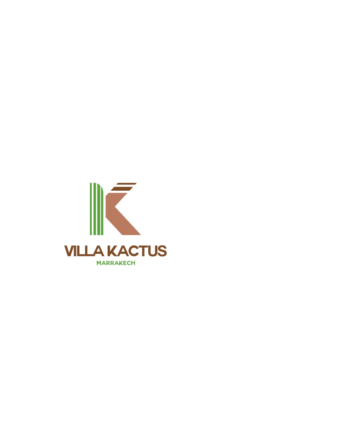
Try it Now!Logo review of VILLA KACTUS, MARRAKECH
 Logo analysis by AI
Logo type:
Style:
Detected symbol:
Negative space:
Detected text:
Business industry:
Review requested by Anne-laure
**If AI can recognize or misinterpret it, so can people.
Structured logo review
Legibility
![]() Both the main name and location are very easy to read. Good font selection and text spacing.
Both the main name and location are very easy to read. Good font selection and text spacing.
Scalability versatility
![]() Simple colors and shapes will scale decently in most print and digital applications. Should work well on signage, business cards, or social media avatars.
Simple colors and shapes will scale decently in most print and digital applications. Should work well on signage, business cards, or social media avatars.
![]() Green lines in the 'K' are thin and may be lost at small sizes, e.g., on pens or embroidery. Details may merge on black-and-white or low-res applications. Needs a more compact alternate arrangement for square formats or favicons.
Green lines in the 'K' are thin and may be lost at small sizes, e.g., on pens or embroidery. Details may merge on black-and-white or low-res applications. Needs a more compact alternate arrangement for square formats or favicons.
200x250 px
100×125 px
50×62 px
Balance alignment
![]() Logomark and wordmark are visually aligned. Good weight distribution between 'K' symbol and text.
Logomark and wordmark are visually aligned. Good weight distribution between 'K' symbol and text.
![]() Slight heaviness on the right side of the 'K' can make the mark feel subtly off-balance. The hierarchy between 'VILLA KACTUS' and 'MARRAKECH' could be improved.
Slight heaviness on the right side of the 'K' can make the mark feel subtly off-balance. The hierarchy between 'VILLA KACTUS' and 'MARRAKECH' could be improved.

Originality
![]() Creative integration of cactus elements within the 'K'. Visual reference to both name and location.
Creative integration of cactus elements within the 'K'. Visual reference to both name and location.
![]() Cactus as a motif for Moroccan hospitality is somewhat common and not groundbreaking. Geometric abstraction of the letter isn't especially unique in contemporary design.
Cactus as a motif for Moroccan hospitality is somewhat common and not groundbreaking. Geometric abstraction of the letter isn't especially unique in contemporary design.
Logomark wordmark fit
![]() Logomark and wordmark styles complement each other well. Font and geometric mark share similar thickness and modern feel.
Logomark and wordmark styles complement each other well. Font and geometric mark share similar thickness and modern feel.
Aesthetic look
![]() Clean, modern aesthetic. Cohesive color scheme. Minimal yet visually appealing.
Clean, modern aesthetic. Cohesive color scheme. Minimal yet visually appealing.
![]() Could feel generic due to heavy geometric influence. No strong or unique aesthetic element that makes it truly memorable.
Could feel generic due to heavy geometric influence. No strong or unique aesthetic element that makes it truly memorable.
Dual meaning and misinterpretations
![]() No inappropriate or confusing imagery detected. Shape is clear and easy to interpret.
No inappropriate or confusing imagery detected. Shape is clear and easy to interpret.
Color harmony
![]() Earthy brown and fresh green are harmonious and fit the industry and location. Good contrast with the white background.
Earthy brown and fresh green are harmonious and fit the industry and location. Good contrast with the white background.
Brown
#8A5A37
Green
#4BA246
White
#FFFFFF