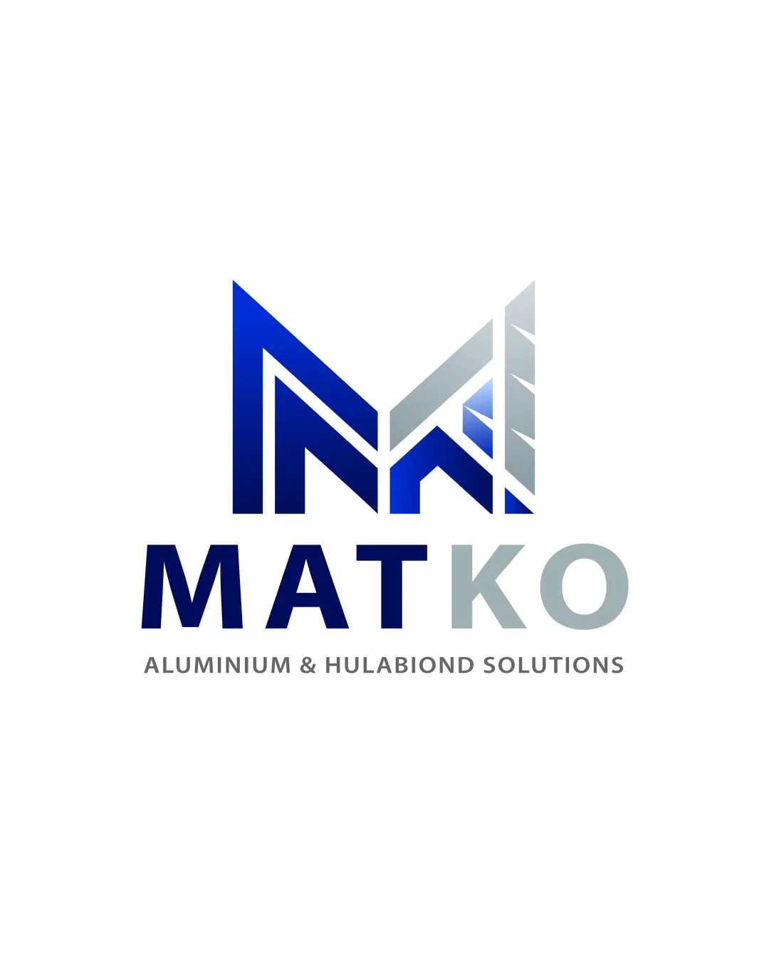
MATKO ALUMINIUM & HULABIOND SOLUTIONS logo review
3.6 / 5
Logo score
Logo review of

Matko Aluminium & Hulabiond Solutions

Solid industry fit with good basics, but lacks distinctiveness for strong branding.

Combination Mark Tech Abstract Construction/materials
5/5
Legibility
3/5
Originality
5/5
Misread
4/5
Balance
4/5
Scale
Action plan

What to fix first

The most important fixes to handle before polishing the full presentation.

1

Refine the geometric 'M' for stronger distinctiveness and better line weight to wordmark ratio.

High priority

The symbol, while functional, feels generic and could benefit from unique angular or negative space detail.

Impact: Improves Brand Uniqueness And Overall Polish · Effort: Medium

2

Develop a simplified flat version for single-color use.

Medium priority

Current gradient treatment might not render well in monochrome or at smallest sizes.

Impact: Ensures Scalability Across All Media, Particularly Print/stamps · Effort: Low

Detailed review

Logo performance breakdown

5/5

Legibility

Checkmark icon Main text and tagline are clear and readable

3/5

Originality

Checkmark icon Custom geometric 'M' with structural motif

Warning icon Overall approach and motif are somewhat common in construction/materials sector

4/5

Color harmony

Checkmark icon Blue gradient and gray palette suit industry and have good contrast

Warning icon Gradient treatment is slightly trendy and may date quickly

RoyalBlue
#064BB0

NepalGray
#7C8B93

Iron
#C9CED1

Your palette is close. Refine the color roles and combinations before updating the logo.

Build brand colors
4/5

Balance alignment

Checkmark icon Good centering of mark and wordmark; proportional spacing

Warning icon M mark slightly outweighs the text, causing slight optical heaviness above

logo 200x250 pixels scalability test alignment grid overlay
4/5

Scalability

Checkmark icon Strong simple geometry; should work well in smaller sizes

Warning icon Gradient fill in mark may lose definition or cause issues in one-color applications

logo 200x250 pixels scalability test

200x250 px

logo 100x125 pixels scalability test

100×125 px

logo 50x62 pixels scalability test

50×62 px

5/5

Misinterpretations

Checkmark icon No inappropriate, offensive, or confusing visual readings

Beta

No AI design signals found

Likely designed by a human

No typical generative-AI artifacts observed; geometry and typography are consistent and intentional.

  • Clean geometry and logical repetition indicate deliberate vector construction.
  • Text rendering is precise and free of incoherent or malformed letters.

Visual assessment; not definitive proof of authorship.

4 / 5

Logo structure & brief match

Checkmark icon Mark and wordmark style are consistent and well integrated

Warning icon M mark could be refined further to match the wordmark's sharpness

Checkmark icon Industry Suitability: Structural geometry clearly references construction and material supply, fitting aluminium and hulabond context.

Try your own review

Wondering how your logo performs?

Get a clear logo score, key risks, and priority fix ideas before your client or audience sees it.

Review my logo