Vinetka Gallery
MINIMAL MEANINGFUL MEMORABLE
ESTD... logo review
3.5/5
Logo score Combination category

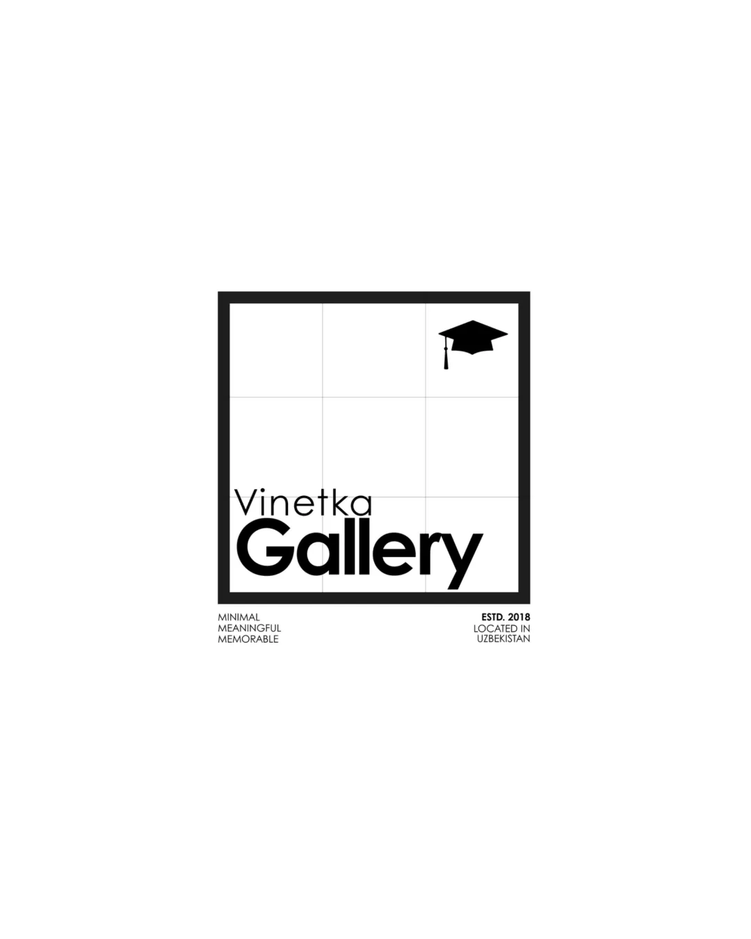
Vinetka Gallery MINIMAL MEANINGFUL MEMORABLE ESTD...

creative996849 Essential logo review

A clear and relevant visual concept for a school yearbook brand, but text weight and small-size details should be refined for full professional readiness.

Symbols recognized:
Square frame with a subtle grid and a graduation cap in the top right corner.
Legible text:
Vinetka Gallery MINIMAL MEANINGFUL MEMORABLE ESTD. 2018 LOCATED IN UZBEKISTAN
Combination Minimal Geometric Wordmark + Symbolic Icon Education, School Photography/yearbooks
3/5
Legibility
4/5
Originality
3/5
Balance
3/5
Scale
Your next steps

What to fix first

Focus on the changes that matter. Keep what makes the logo work.

What to preserve

A minimal, framed wordmark with grid and graduation cap symbol directly suggests school albums and yearbooks with clarity.

Spelling & grammar

Confirm the wording

‘Vinetka’ may be an intentional or local word; unknown to reviewer. All other words are clear and correctly spelled.

1

wordmark

Increase the weight or adjust placement of 'Vinetka' for better balance and small-size retention.

High priority Visible issue Low effort

The thin 'Vinetka' sits above the bold 'Gallery', creating a sharp contrast that may cause 'Vinetka' to disappear at smaller sizes.

See the category review
2

Standalone mark

Test the graduation cap for clarity at smaller scales or supply a simplified micro version.

Medium priority Worth testing Low effort

Graduation cap icon is minimal but may lack detail or visibility at tiny sizes within the outlined box.

See the category review
Detailed review

Logo performance breakdown

4/5

Brief & logo match

The logo visually fits the graduation/school theme and is suitably memorable, with minor caveats in text treatment.

3/5

Legibility

  • Large 'Gallery' is highly readable.
  • The thin 'Vinetka' sits above the bold 'Gallery', creating a sharp contrast that may cause 'Vinetka' to disappear at smaller sizes.

    Visible issue wordmark

    Try: Increase the weight or adjust placement of 'Vinetka' for better balance and small-size retention.

4/5

Originality

  • Graduation cap in a grid box inventively suggests yearbook pages.
  • Minimalist layout distinguishes the identity from generic education brands.
3/5

Balance alignment

  • Geometric grid and box create an orderly feel.
  • Optical weight is bottom-heavy due to thick 'Gallery' and light 'Vinetka'; may benefit from subtle adjustment to better center the visual mass.

    Optional refinement wordmark

    Try: Review baseline or vertical positioning and weight balance between text lines.

Uploaded logoAlignment guide overlay

Inspect spacing with the guide. Optical balance may differ from geometric centering.

3/5

Scalability

  • Minimal geometric mark with limited fine detail.
  • Graduation cap icon is minimal but may lack detail or visibility at tiny sizes within the outlined box.

    Worth testing Standalone mark

    Try: Test the graduation cap for clarity at smaller scales or supply a simplified micro version.

5/5

Misinterpretations

  • No negative or confusing alternate readings are supported.
4/5

Symbol & text fit

  • Graduation cap aligns with the yearbook/gallery concept.
Try your own review

Wondering how your logo performs?

Get a clear logo score, key risks, and priority fix ideas before your client or audience sees it.

Review my logo