Wondering how your logo performs? 🧐
Get professional logo reviews in seconds and catch design issues in time.
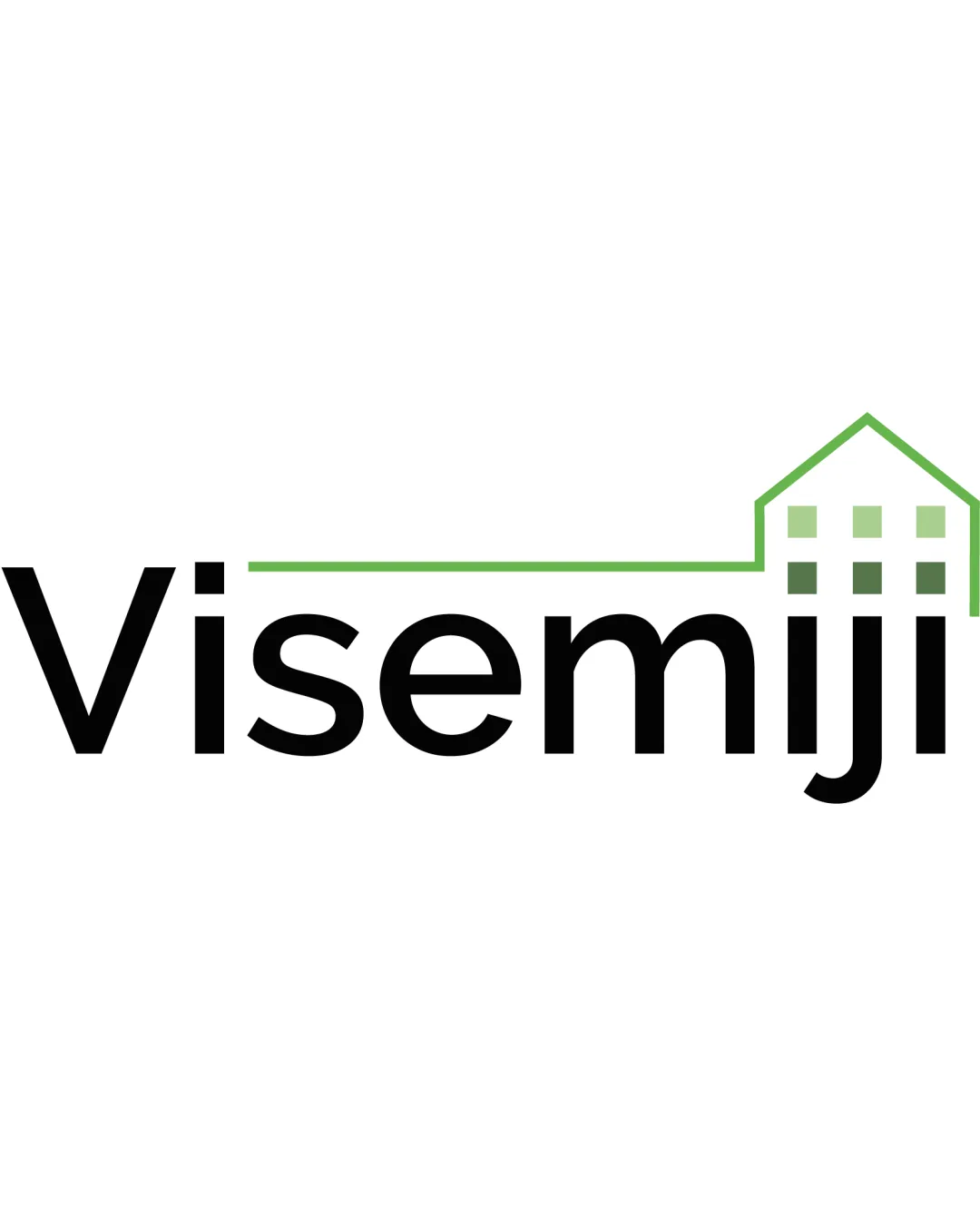
Try it Now!Logo review of Visemiji
 Logo analysis by AI
Logo type:
Style:
Detected symbol:
Detected text:
Business industry:
Review requested by Vincentzo
**If AI can recognize or misinterpret it, so can people.
Structured logo review
Legibility
![]() The typography is clear and highly readable.
The typography is clear and highly readable.![]() Letterspacing and font weight are balanced.
Letterspacing and font weight are balanced.
Scalability versatility
![]() Minimal details allow good scaling for most applications.
Minimal details allow good scaling for most applications.![]() Will be recognizable on business cards and moderate sizes like packaging or digital assets.
Will be recognizable on business cards and moderate sizes like packaging or digital assets.
![]() Thin green outline on the house may lose clarity at favicon or embroidery scale.
Thin green outline on the house may lose clarity at favicon or embroidery scale.![]() House window details become indistinct at very small sizes.
House window details become indistinct at very small sizes.
200x250 px
100×125 px
50×62 px
Balance alignment
![]() Balance between wordmark and house outline is visually decent.
Balance between wordmark and house outline is visually decent.![]() Green house seamlessly extends from text baseline.
Green house seamlessly extends from text baseline.
![]() Right side feels slightly heavier due to stacked house elements and spacing.
Right side feels slightly heavier due to stacked house elements and spacing.![]() Lack of baseline alignment between the roofline and the wordmark may disrupt flow.
Lack of baseline alignment between the roofline and the wordmark may disrupt flow.

Originality
![]() Custom integration of a house with the text gives a mild sense of uniqueness.
Custom integration of a house with the text gives a mild sense of uniqueness.
![]() House outline is a generic symbol in real estate logos.
House outline is a generic symbol in real estate logos.![]() Window/grid details are clichéd and do not add a fresh or creative touch.
Window/grid details are clichéd and do not add a fresh or creative touch.
Logomark wordmark fit
![]() Consistent modern style between the typeface and the house symbol.
Consistent modern style between the typeface and the house symbol.![]() Color match enhances unity.
Color match enhances unity.
![]() House mark is slightly less bold than the text; could create visual dissonance, especially on larger signage.
House mark is slightly less bold than the text; could create visual dissonance, especially on larger signage.
Aesthetic look
![]() Minimalist appearance, avoids excessive decoration.
Minimalist appearance, avoids excessive decoration.![]() Modern and approachable impression.
Modern and approachable impression.
![]() Visual weight distribution could be more refined with a stronger roofline or offset house to strengthen structure.
Visual weight distribution could be more refined with a stronger roofline or offset house to strengthen structure.
Dual meaning and misinterpretations
![]() No inappropriate or misleading visual interpretations.
No inappropriate or misleading visual interpretations.
Color harmony
![]() Two-tone (black and green) with white negative space is harmonious.
Two-tone (black and green) with white negative space is harmonious.![]() Strong contrast with excellent professionalism.
Strong contrast with excellent professionalism.
Black
#000000
Olivetone
#7CB342
White
#FFFFFF